I had 315 respondents before I closed off my survey on font terms. In general, the results were along the same lines I would have quessed, but less strong/clear in many areas, and there were a couple of surprises.
(On a side note, I am currently recovering from jaw surgery this past Monday. The surgeon cut through my jaw in three places, and also removed three wisdom teeth. So I’m a wee bit sore….)
SUMMARY
There is no consensus, but the overall opinion is that in today’s world of digital typography “a typeface” means the general design, including all its styles, regardless of how it’s instantiated, while “a font” means a single style of a typeface, such as Myriad bold condensed italic, in a specific file format.
This is the same usage I prefer, but I’ll point out that there are some smart people who are prominent typographers who disagree. However, they’re in the minority, even among type industry professionals (which I will sometimes refer to as just “industry” in the results).
There doesn’t seem to be any single preferred terminology for indicating a “superfamily,” which might contain related typefaces, such as Stone Serif and Stone Sans.
The most popular term for a family of only up to four linked font styles, including bold and italic, seems to be simply “family,” to my surprise.
The painful details below are probably only of interest to hard-core font geeks, and while writing it up I wondered if I was perhaps getting a little too detailed….
ANALYSIS
I used features of SurveyMonkey to do such things as randomize the order in which different answer options were shown from one user to the next, to avoid any systematic bias due to presentation order.
I analyzed the differences between groups looking at both font expertise and geography (questions 8 and 9). Geography rarely made a significant difference in results, but level of font expertise often did.
(Sorry this analysis has taken so long, I’ve been remarkably busy with other things lately, such as being diagnosed with diabetes and getting a new job. I expect to remain pretty busy for the next couple of months, so my blog posts may be few for a while.)
SEE FOR YOURSELF
You can see the survey results yourself, as aggregate results in simple charts on SurveyMonkey.
You can also look at these PDFs I made of the results. Sorry about the lousy page breaks in them, but they retain the formatting of the SurveyMonkey HTML version, and show the various filters I applied:
- All respondents
- Type industry professionals: type designers, font developers, font sales and support, etcetera
- Advanced users: typographers, software developers who work closely with fonts, graphic/web designers who are “into” fonts
- Advanced users + industry pros: the two groups above, combined
- Average graphic designer or web designer (and a few average users): there weren’t many average users, so I lumped them in here.
- Outside USA/Canada
- Western European
In general, I didn’t find much interesting difference by geography, and the differences by expertise seemed to be on a fairly linear scale. That is to say, the more “advanced users” were always in between the industry professionals and the regular graphic designers in their take on any given issue. I was most interested in the opinion of industry pros, but if this differed a lot from more common usage, that was interesting, too.
ANALYSIS
I report below on each question, and commenting when some particular sub-group(s) answered that question significantly differently than the average. I analyzed results by level of font expertise, and by geography.
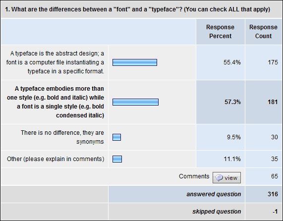
Q1. What are the differences between a “font” and a “typeface”? (You can check ALL that apply)
- 57% say “a typeface embodies more than one style (e.g. bold and italic) while a font is a single style (e.g. bold condensed italic)”
- 55% say “a typeface is the abstract design; a font is a computer file instantiating a typeface in a specific format”
- 11% say for “other” and made comments
- 9.5% say “there is no difference, they are synonyms”
With increasing expertise, people were much more likely to pick the “abstract design” option and somewhat less likely to go for “more than one style.” Type industry professionals went 73%/48% on these, while average users went 46%/63%, differences of 27% and 15%, respectively.
Given the industry expert responses on question 2, I think one key issue here was that a typeface can have more than one style, but doesn’t necessarily. The other key thing is that there is much more consensus around the definition of “font” than the definition of “typeface.”
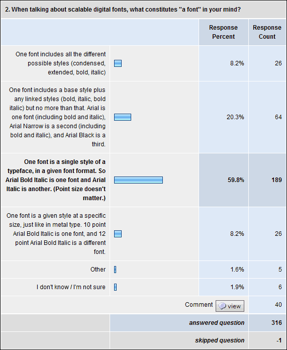
Q2. When talking about scalable digital fonts, what constitutes “a font” in your mind?
- 60% went for “One font is a single style of a
typeface, in a given font format. So Arial Bold Italic is one font and Arial Italic is another. (Point size doesn’t matter.)” That went up to 85% for font industry professionals. - 20% went for “One font includes a base style plus any linked styles (bold, italic, bold italic) but no more than that. Arial is one font (including bold and italic), Arial Narrow is a second (including bold and italic), and Arial Black is a third.” Only 5% of industry professionals said this.
- 8% say “one font includes all the different possible styles (condensed, extended, bold, italic)” (4% of industry professionals)
- 8% wanted the extra specificity of size being included, the traditional definition from metal type: “One font is a given style at a specific size, just like in metal type. 10 point Arial Bold Italic is one font, and 12 point Arial Bold Italic is a different font.” Interestingly, only 4% of industry pros picked this.
- 2% each went for “other” or “don’t know / not sure”
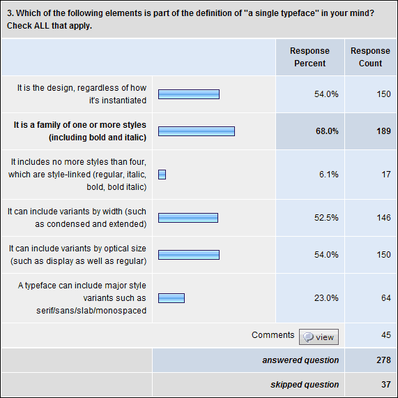
Q3. Which of the following elements is part of the definition of “a single typeface” in your mind? Check ALL that apply.
- 68% say “It is a family of one or more styles (including bold and italic)” (64% of industry pros)
- 54% say “It is the design, regardless of how it’s instantiated” (62% of industry)
- 54% say “It can include variants by optical size (such as display as well as regular)”
- 52.5% say “It can include variants by width (such as condensed and extended)” (48% of industry)
- 23% say “A typeface can include major style variants such as serif/sans/slab/monospaced” (17% of industry)
- 6% say “It includes no more styles than four, which are style-linked (regular, italic, bold, bold italic)”
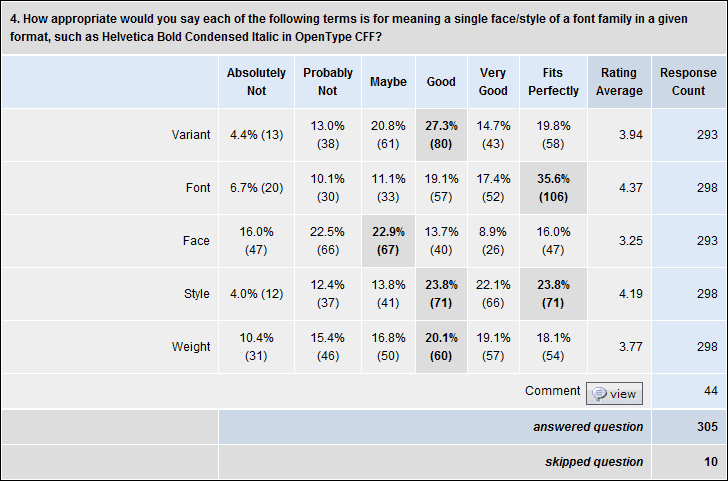
Q4. How appropriate would you say each of the following terms is for meaning a single face/style of a font family in a given format, such as Helvetica Bold Condensed Italic in OpenType CFF?
Available responses ranged from “Absolutely Not” (1) to “Fits Perfectly” (6). So for each term, one can give the average rating on this 1-6 scale, as well as percentages who gave each specific rating.
- “Font” was the highest rated at 4.4 on average, with 36% saying it “fits perfectly.” This dominance was greater with industry pros, at 4.7 and 45%.
- “Style” was rated 4.2 on average, with 24% saying it “fits perfectly” (just as many said it was a “very good” or “good” option). It tied with “variant” for having the fewest people hating it at 4%.
- “Variant” was rated 3.9 on average, with 20% saying it “fits perfectly” (27% said it was a “good” option)
- “Weight” was rated 3.8 on average, with 18% saying it “fits perfectly” (20% said it was a “good” option). Industry gave this a 3.5 on average
- “Face” was rated 3.3 on average, with 16% saying it “fits perfectly” (and 23% saying “maybe”). Industry gave it a 3.1.
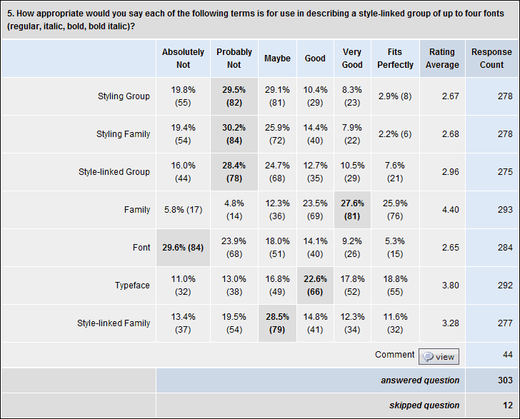
Q5. How appropriate would you say each of the following terms is for use in describing a style-linked group of up to four fonts (regular, italic, bold, bold italic)?
Same response options as above, yielding the same 6-point scale equivalent.
- “Family” came out on top with a 4.4 average, which surprised me. I’ve always thought the term better suited to a broader group, perhaps a synonym for “typeface.” But I may need to broaden my thinking.
- “Typeface” got 3.8 on average for this (3.4 from industry), which also surprised me because it was higher than I expected. Seems to me that industry agrees that “typeface” is broader than this, but too many people think of typefaces as only having four members.
- “Style-linked Family” got 3.3 on average (but 3.7 from industry). I have previously gone with “style-linked group” but I think I’ll adopt this instead. It’s the most popular term which is still unambiguous.
- “Style-linked Group” got 3.0 on average. This is the term I have previously used.
- “Styling Group,” “Styling Family” and “Font” all got 2.7 on average, which is below the midpoint (and even lower from industry, with 2.5, 2.3 and 1.9, respectively). Adam Twardoch recently invented “styling group” to be his preferred term for FontLab tutorials, which is why I put it in the survey. I don’t think I would suggest sticking with it, though.
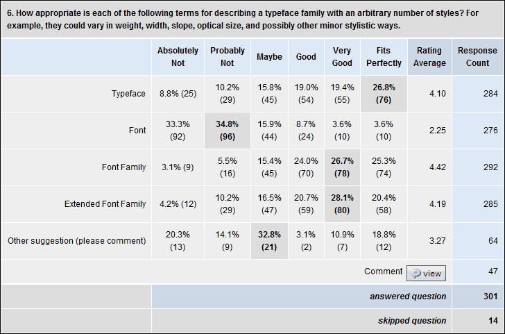
Q6. How appropriate is each of the following terms for describing a typeface family with an arbitrary number of styles? For example, they could vary in weight, width, slope, optical size, and possibly other minor stylistic ways.
Same response options as above, yielding the same 6-point scale equivalent.
- “Font Family” got a 4.4. I have long considered this a synonym for “typeface,” and may start using it more.
- “Extended Font Family” got a 4.2.
- “Typeface” got a 4.1.
- “Font” got 2.25 (the surprising part for me was that 4% of respondents thought it “fits perfectly”!)
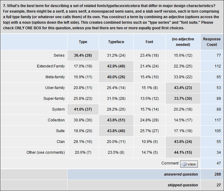
Q7. What’s the best term for describing a set of related fonts/typefaces/etcetera that differ in major design characteristics? For example, there might be a serif, a sans serif, a monospaced semi-sans, and a slab serif version, each in turn comprising a full type family (or whatever one calls them) of its own. You construct a term by combining an adjective (options across the top) with a noun (options down the left side). This creates combined terms such as “type series” and “font suite.” Please check ONLY ONE BOX for this question, unless you feel there are two or more equally good first choices.
i sort of threw this question in to attempt to explore the question, and maybe narrow the range of reasonable options a bit.
“Collection,” “Extended Family,” and “Suite” were the most popular main terms, with optionally sticking in “Typeface” as in “Typeface Collection,” “Extended Typeface Family” and “Typeface Suite.”
Personally I prefer “Type” as an adjective if one is to be used at all, but that was only popular in conjunction with second-tier popularity terms such as “Type System” and “Type Series.” (The other second-tier term was “Super-family” which was most popular with no qualifier at all, or with “Typeface.”)
I don’t really get why anybody would want to put “Typeface” and “Family” in the same term. It seems redundant to me.
Other terms ranked much lower, including “Type Series,” “Typeface Meta-family,” “Clan” and “Uber-family.”
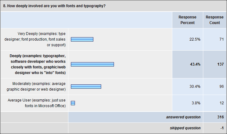
Q8. How deeply involved are you with fonts and typography?
- 22.5% Very Deeply (examples: type designer; font production, font sales or support)
- 43% Deeply (examples: typographer, software developer who works closely with fonts, graphic/web designer who is “into” fonts)
- 30% Moderately (examples: average graphic designer or web designer)
- 4% Average (example: just use fonts in Microsoft Office)
Q9. Where are you from, and where do you live?
(Update: I deleted the chart version of this, because SurveyMonkey really made a mess of what it did with percentages. But the results are….)
Mostly educated in:
- 59% USA/Canada
- 30% Western Europe
- 4% Central or Eastern Europe
- 4% Australia / New Zealand
- 5% elsewhere
(Adds up to more than 100% because some people checked more one location, and because of rounding.)
Live:
- 59% USA/Canada
- 28% Western Europe
- 4% Central or Eastern Europe
- 4% Australia / New Zealand
- 5% elsewhere
Almost identical to the results for “educated.”
[Post updated 8 April 2009 to correct a couple of minor transcription errors. These did not materially effect the results, being differences of 0.5% and 1.5%. – T]
[Post formatting updated 3 May 2011 to work better with current CSS template.]