Tag: font

  • What does it cost to have a custom typeface designed?”

    For example, how much would it cost (roughly) for someone like Hoefler to design a new font family for Mastercard?”
    (Originally a Quora question, and my Quora answer. But given Quora’s increasingly anti-​user choices, I migrated the question here and updated my answer for current pricing.)

    For a typeface of four styles, from a famous name type designer, with temporary exclusivity, you are probably looking at $100,000–250,000 and up as a rough ballpark. It might take them a year or more, although that won’t necessarily be full time on your typeface. This assumes no horribly extensive OpenType features, just basic ligatures and oldstyle figures, maybe small caps. I’m also assuming a western + CE character set (which is pretty common these days).

    For ~ the same thing from a decently established but not famous type designer, you might expect to pay $30,000–75,000, roughly.

    One rare public sharing of info about what a designer/​foundry “should” charge was from Bruno Maag of Dalton Maag, a fairly prestigious type designer /​ foundry. He wrote “IMO, I think that a price of around US$ 20-​25k per weight is appropriate for a Western European glyph set (ANSII), giving the client three years exclusivity. If they want to own the rights, double the price.” (December 2013 price quotation for a new custom font on typedrawers.com.) Add about 65% for inflation to 2024, then reduce that to only 50% because of heavy competition in type design, and that would make it about $30–38k per style.

    So with permanent exclusivity, maybe double the price to USD $60–76K per style. Add CE coverage as well as exclusivity, but no small caps, and that “suggested price” perhaps goes to $70–88K per style. (Bruno says “weight” but presumably means style, so a regular four-​member family is four styles—although only two literal weights, plus their matching italics.)

    From a designer early in their career, or based in a developing country, or if the customer has lower quality expectations than mine and is willing to go with somebody who does lower quality and faster work, or some combination of such factors, you could end up with considerably lower prices, as low as $8,000–25,000 per font style.

    Now, all this gets kind of weird and warped once one gets into variable fonts. Those might be prices per master, and then add somewhere between a quarter and half again at the end, depending on how extreme the masters are.

    Some designers (e.g. John Hudson at Tiro Typeworks) try to figure out how complex the typeface design is in general, and then charge a price-​per-​glyph for that typeface. They figure that easier and harder glyphs will average out over the whole set. This seems reasonable to me, and I gather he is happy with it. (I have tried to estimate work by actually assessing a difficulty multiplier individually on different glyphs, and that was an absurd amount of work. I do not generally recommend it unless you have a specific reason, such as needing to assess relative work done by different people on the same project.)

    These are pretty rough guidelines, based on my own experience in soliciting fonts for development from a variety of type designers, what I have been paid, my discussions with other type designers, plus discussions among type designers in a couple of fora.
  • Cristoforo lives! Re-​launched Kickstarter project & revised intern position

    Cristoforo promo image

    If at first you don’t succeed….

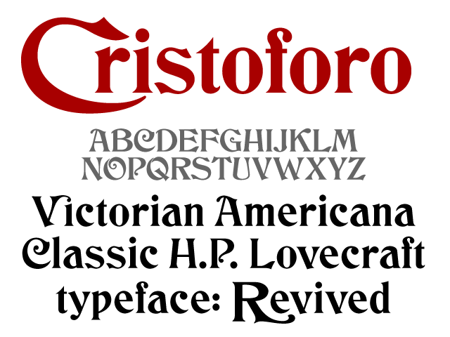
    My first go didn’t quite make it, so I reconfigured the reward structure and relaunched my Kickstarter campaign to find backers for my new typeface, Cristoforo, a revival of some classic Victorian typefaces by Hermann Ihlenburg. It’s also known as the typeface of Call of Cthulhu (the H.P. Lovecraft roleplaying game), and as the original logo for Cracker Jack. The campaign will only last until midnight on Saturday June 17. Basically, people pledge money up front for the fonts (and other goodies) so I know the project is viable. Reward options for backers depend on their funding level, and include not only the fonts, but computer desktop wallpaper, T-​shirts and posters.

    Kickstarter is all or nothing. Only if the total pledges exceed the minimum funding target are people’s credit cards charged and the project moves forward.

    If funding exceeds the minimum by enough of a margin, I can add more language support for central/​eastern Europe (including Cyrillic), and even pay an intern! Otherwise, the intern will be an unpaid position. I hope to make intern decisions in a week, and just revised the job description again.

    Check it out the typeface on Kickstarter and/​or my intern wanted posting.

  • Cristoforo: back my new crowd-​funded typeface

    Cristoforo promo image

    [UPDATE 26 May 2012: The first try didn’t quite make it, so I revised the reward structure and re-​launched! Link now points to the revised project.]

    Yes, I’m starting a Kickstarter campaign to find backers for my new typeface, Cristoforo, a revival of some classic Victorian typefaces by Hermann Ihlenburg. It’s also known as the typeface of Call of Cthulhu (the H.P. Lovecraft roleplaying game), and as the original logo for Cracker Jack. The campaign will only last until midnight on Saturday May 19 [revised: June 17], which is 26 days from now. Basically, people pledge money up front for the fonts (and other goodies) so I know the project is viable. Reward options for backers depend on their funding level, and include not only the fonts, but computer desktop wallpaper, postcards, T-​shirts and posters.

    Kickstarter is all or nothing. Only if the total pledges exceed the minimum funding target are people’s credit cards charged and the project moves forward.

    If funding exceeds the minimum by enough of a margin, I can add more language support for central/​eastern Europe (including Cyrillic), and even pay an intern!

    Check it out!

  • Cristoforo: looking for American Italic

    American Italic 2 med res
    American Italic 2 med res

    American Italic 1 med res
    American Italic 1 med res

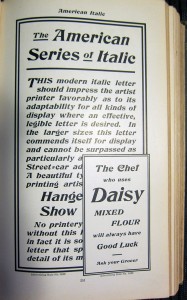
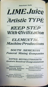
    As mentioned previously, I’m working on a revival of the Hermann Ihlenburg typeface Columbus (1892, MacKellar, Smiths & Jordan /​ American Type Founders), under the name Cristoforo. But now I’m looking for samples of its differently-​named italic companion, American Italic (Hermann Ihlenburg, American Type Founders, 1902). I have two from the ATF 1906 specimen book, shown at right. But neither shows a complete character set at a reasonable size. If anyone has the actual metal typeface, especially in a medium to large size, I would love to get a full specimen. Or, if you have a printed sample showing all or most characters at a largish size, that would also be great!

    [Update April 21/​22: Just got some great pics from Jackson Cavanaugh (Okay Type), showing the relevant pages from the ATF 1899, 1900, and 1903 specimen books! Amelia Hugill-​Fontanel at the Cary Library is also digging into it. I am still thinking about scans, but the pics are a fab start. I am already in good shape for Columbus Initials, the swash caps font. I’d love to hear from anybody who has metal type for any of these faces!]

    Columbus charset showing
    Columbus charset showing

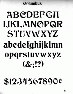
    I’m already in decent shape for a sample of the upright version of Columbus, unless it turns out the full typeface has more characters?

    Click on any image for a larger version.

    Watch this space for news on the related Kickstarter campaign coming in a few days! Get in touch if you would like a sneak preview.  [UPDATE 23 April 2012: I am now funding development of this typeface on Kickstarter! Deadline is May 19.]

  • A font by any other name?

    [UPDATE 5 Mar 2009: Survey is now closed. I am analyzing and writing up the results.]

    I’ve noticed over the years that there isn’t a perfect consensus on the use of certain terms, such as “font” and “typeface.” I am of the opinion that there is a strong majority usage, and historical precedent, but I’m curious to understand better current usage, and how it differs by degree of font expertise (a.k.a “geekiness”) and/​or geographic location.

    Please take my survey. I’ll let it run until I feel like I’ve got enough responses, then I’ll post the results and my analysis.

    I’m eager to learn more. Is there a gap between expert usage and the average user? Maybe we’ll discover that I’m just a stick in the mud regarding terms that have mutated over time… or maybe I’ll get ammunition to defend the Wikipedia definitions from the clueless, and persuade type foundries to standardize their langauge. Stay tuned!

    SPOILER ALERT! Please don’t read the comments below until after you’ve done the survey! There are definitely some… well, not spoilers, but potential influencers and links to other pieces on the subject. Thanks!

    [UPDATE: Survey results are here.]