It’s easy enough to determine that a point is 1/72 of an inch, and used to be about 1/72.27 in the days before digital type. But the challenging question is, when you look at printed type on a page, what part of a 12-point font is 12 points high? The short answer is “none.” Seriously. For metal type it’s the “body” which is not something you see in print, and for digital type it’s the “em,” which is completely virtual.
Font Size Measurement Confusion
The background to this is long and complicated, so I hope you’ll forgive me if I first explain how this is the question that just refuses to die, and the confusion it can cause… in painful detail.
- In current litigation, Microsoft is contesting Apple’s trademark of the term “App Store.” In the latest salvo, Microsoft says Apple’s most recent brief in the case is too many pages, and in too small a font size. Interestingly, they say how many pages it is over by, but they don’t actually mention the exact font size. I am not convinced this is because of the measurement issues described elsewhere in this blog post, as one can easily check the font size in Acrobat (except for docs that are scanned in to create a PDF). The font size is supposed to be at least 11 point, and at a cursory examination it appears to be… 10.98 pt (according to the Acrobat Touch-Up text tool, anyway—I didn’t spelunk the PDF the way I would have if I were advising one side or the other). What happened? I can’t be sure, but I will note that there are some workflows that can cause this kind of minute shrinkage inadvertently. For example, when a PDF is printed, and Acrobat “helpfully” tries to make sure the document’s margins fit within the printable area on the currently targeted output device. Perhaps that (or something similar) happened here. It seems unlikely the person making the doc did it on purpose, since they did not fit within the page limit anyway, and many applications do not even allow people to adjust type size in increments that small.
- The other day I looked at a bunch of lesson slides from a university-level typography course. One of them claimed that the distance from the baseline (bottom of a letter such as H) to the cap height (top of a letter such as H) was the point size. I wish that were true, as it would be much simpler than the reality. On average, the cap height is about 70% of the point size.
- When Apple first released the Zapfino script font, they sized it relative to the largest and swashiest capitals in the font. But this made the size of the lowercase letters look very small indeed, relative to most other fonts. Around 2002, they revised it for Mac OS 10.2, so that for any given point size, it was 2.5× as large. This was mostly a marketing/usability decision; neither version is more “correct” from a technical point of view.
- In a closely related issue, the “em” is a typographic measurement equal to the current point size (usually an “em square” or “em quad” in two dimensions), but since it relates to point size, it too has no precise measurement relationship to anything one sees in print or on screen. I have sometimes had difficulty convincing non-typographers of this fact, notably for the relevant article on Wikipedia.
- Some years ago, I was contacted by the San Diego District Attorney’s office. A snail-mail spam-scammer was mass mailing a document that included a legal disclaimer, which the scammer was trying to make as unobtrusive as possible. The legal disclaimer was required by law to be in 12 point type. The font turned out to be a free version of Empire, with its ultra-narrow and super-thin caps and small caps. I downloaded it and as best as I could determine from a physical print-out comparison, it had indeed been printed at 12 points. Of course (for reasons described more below), one could easily have modified in the reverse of the change Apple did with Zapfino, so that 12 point type would be half as big when printed. But the real problem was that Empire is an ultracondensed sans serif, rather like what one often sees in movie poster credits, and is pretty well unreadable at 12 points. If the objective was to get people to not notice the legally-required disclaimer, the company that wrote the letters did a great job, and seemed to have done so within the law as far as point size was considered. I told the DA’s office I was sorry, but I didn’t think I had anything that could help them.
- A couple of months ago, I was contacted by New York City lawyer Brad Richter about pretty much the same issue. Recently passed legislation around Power of Attorney in New York state requires that forms granting power of attorney be printed in 12 point type. Brad had done enough reading to strongly suspect the truth: point size doesn’t relate to anything specific in size of printed letters! Yes, given a specific font, the size of 12 point text in print is related to the font data. But 12 point in one font can be bigger or smaller than 12 point in another. If the objective was to provide useful guidance to people using typical fonts, then I’d say the law is just fine. But if we take that the objective is, as Brad described it to me, to legislate the “literal size of text – a minimum physical printed size so that the elderly can easily read the form,” then the law is useless. (Below I propose some wording that might come closer to achieving the desired effect.)
Historical Background
Back in the days of metal type, the answer was simple, even if it didn’t relate to anything one saw in the printed output. The point size of the type was simply the height of the metal body the type was cast on. Additional line spacing was added by means of thin strips of lead between the lines, hence the term “leading” (pronounced “ledding”) for line spacing.
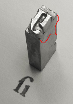
Above is shown a piece of traditional metal type (photo courtesy Daniel Ullrich, licensed under Creative Commons Attribution Share-Alike 3.0). The added red bracket shows the body height, which one would measure to determine the type size.
In metal type, without leading, the distance from the baseline of one line to the next would be the same as the point size. However as you can see in the example, once the metal type was printed, there was no direct means of knowing what the original point size had been, unless one also knows either the original typeface or the amount of leading used with some certainty.
Today’s Answer & Implications
In digital type, the font’s letters are drawn on a grid, where an arbitrary number of units (often 1000 or 2048) are set to equal the “em” which is then scaled to the current point size for output. So to get 12 point type in print, with a 2048-unit em, that digital space is scaled so that the 2048 units in the design space are equal to 12 points. As Karsten Luëcke put it in a recent discussion on Typophile:
In digital type, the EM does not refer to a “real” box. You better consider the EM as a yardstick – an abstract letter-height yardstick which establishes a link between micro and macro level, between font-internal unit system and font-external unit system: The font-internal unit system is defined via UPM, i.e. as the number of units per EM. It is the letter-design grid or resolution. The font-external unit system may be typographic point, millimeter, pixel, etc. And this abstract EM serves to project the font-internal unit system onto the font-external unit system.
An example. You have a font with 2048 units per EM, internally, which is to be projected on 12 pt type size, externally. So 12 pts = 2048 M-units or 1 M-unit = 12/2048 pt.
So to image the font at 12 point, one scales the abstract EM to equal 12 points.
The catch for purposes of measurement and standardization is that while there are some restrictions on how large one can draw letters in the design space, there is no necessary and required relationship between the size of the letters and the em. On average, with Latin-based languages such as English, the “cap height” of capital letters is about 70% of the point size, and the “x-height” of lower-case letters is about 70% of the cap height, or about half the point size. But (and I cannot stress this enough), those are only averages, and there is no technical requirement whatsoever that one be close to those averages. Indeed, x-height relative to cap height is one of the ways typographers describe typefaces (“high x-height” vs “low x-height”).
[UPDATE : I did some research for a client, and verified that as expected, cap size varies substantially between different fonts. In my sample, cap size was most usually 62%-78% of the em square, averaging right around 67-70%. Or to put it another way, if you take an “average” font printed at a given point size, other fonts at the same point size will commonly have capitals as much as 10% smaller or 10% larger than the capitals from the average font. At the extreme you can find fonts “in the wild” with caps barely over half the average size! (I expect you could also find fonts with caps close to half again the average size, but I wasn’t looking so hard in that direction.)]
Moreover, the Zapfino example given earlier shows how a given font could be at a radically different size relative to the point size and still be a legitimate font. Indeed, anyone knowledgeable in modifying fonts could in a matter of minutes, take almost any font and create a modified version, with the only visible difference being that text at a given point size is only a fraction of the size.
What About the Web?
The web can use points, but just defines them in terms of pixels. It has inherited the Windows definition of that ratio, so on the web by default 1 pt = 4/3 pixels, so 12 pt = 16 pixels (but see below).
It used to be that Mac browsers used the Mac relationship of points to pixels, which was one-to-one, but that has been abandoned just a few years ago. so at least points vs screen pixels are now consistent across platforms, though how big a point is on screen (or a nominal browser pixel for that matter) depends on your screen resolution, what zoom level your browser happens to be set to at the moment, and (on Windows) whether you have set something other than the default screen resolution of 96dpi.
But the relationship between pixels and points is broken in some browsers on Windows (such as Internet Explorer 7 and earlier) when the user has a non-standard resolution set. For example, if you actively tell Windows your screen resolution is 120 dpi instead of 96 dpi, that means that point sizes get multiplied by 5/4, but sizes in pixels do not. So at 120 dpi, a font set to 9 pt will instead show up at 15 px, but a font set to 12 px will still be 12 px, and now smaller. Arguably this is a reason never to do font sizes in px. (Bitmapped grapics generally are not scaled by the 5/4 ratio in browsers, but they are in other apps such as Word or the usual graphics previewing programs.)
This may get even less standard in the future, as CSS 3 is threatening to make pixels a truly imaginary thing, always equal to 4/3 the point size. This would cause pixels to scale into virtual pixels when non-standard resolutions are set.
Of course, some users (like me) are constantly changing the zoom level in their browsers, which also plays hob with any notion of fixed sizes for points, though at least relative sizes are maintained by browser zoom.
Things get kinda weird on the web, in another regard. CSS can use “ems” as a measurement unit. Okay, that makes sense, right? I mean, why not set an indent or margin in ems? No problem. Where it gets weird is that you can set the type size in ems. Now, logically based on the “normal” definition of the em, this makes no sense, because the size of an em is always the same as the type size, so the size of the type is always one em. But CSS allows you to break that assumption by setting an em to some specific number of points or pixels, and then setting the type size to some multiple of that. It gets even weirder, actually, because you don’t need to define the em in the first place. If you don’t define it, the standard browser assumption is that one em = 16 pixels (Firefox and possibly Chrome), or 12 points (Internet Explorer). The difference between IE and the rest doesn’t matter with default Windows resolutions, but it gets interesting at non-standard Windows resolutions because IE then scales the default em, while Firefox does not…. Ouch.
[Note: edited and expanded this section several times on 21 March 2011 to better reflect system scaling setting issues. Thanks to Beat Stamm for pointing out the omission and helping me with details I hadn’t yet encountered.]
How to Legislate Type Size Today?
First, a disclaimer: One can implement reasonable precautions, but it’s not possible to stop determined people with sufficient knowledge of fonts and typography from creating customized fonts, which can in turn be used to create either illegible documents, or disclaimers that most people would never read. To even attempt to cover all possibiities would probably yield many pages of added law, which frankly somebody like me could probably still find a loophole in with a moderate investment of time and thought. What reasonably can be done, however, is to make the laws tight enough that it would take significantly more expertise, creativity and effort to work around them than is currently the case.
So what variables does the law need to control when it wants to legislate a minimum size and legibility?
- Instead of (or even in addition to) declaring a minimum point size, one could declare both a minimum cap height (defining that as the height of the smallest of the capital letters A-Z), and a minimum x-height (defining that as the height of the smallest of the lowercase letters a-z), both in physical units. For example, one could require a cap height of at least 7 points and an x-height of at least 5 points, which would be met by 12 point type in most everyday text typefaces.
- As evidenced by the case described above from San Diego, adequate width also needs to be legislated. You don’t have to be a font geek to go out and license an ultracondensed font. One way of avoiding this would be to say that the total advance width of the letters a-z and A-Z, at the chosen font and size, meet some minimum. Times set at 12 pts clocks in at roughly 208 pts for A-Z and 143 pts for a-z. After checking many other fonts, I believe one could go with minimums of perhaps 162 pts (2.25”) wide for A-Z and 120 pts (1 2/3”) for a-z as minimums.
- I probably ought to add something on stroke thickness as well. However, given that stroke thickness varies within a font, and differs between horizontal and vertical strokes as well, the best way to cover this is not obvious. The desire would be to avoid extra light (or ultra bold) fonts. I wouldn’t feel too sad if it also outlawed typefaces such as Bodoni for legal documents, due to their very thin horizontals. Hmmm.
Most common system fonts a reasonable person would think of using would mee these requirements, including Times/Times New Roman, Arial, Helvetica, Courier/Courier New, Verdana, Trebuchet, Georgia, Calibri, Consolas, Constantia, and Corbel.
Of course, I’ve only addressed the font size part of the equation. There are many other components to legibility of text in print, such as line spacing, letter and word spacing, line length, and the color of the text and the paper.
[EDITED various times to clarify minor points and improve wording. Most recently to correct that Zapfino was rescaled by 2.5x, not 4x, and replace a dead link.]
ADDENDUM 16 August 2012:
This stuff just doesn’t go away! A recent decision of the Michigan Supreme Court hinged on exactly this issue. The underlying subject matter was the hottest state political issue of recent years, an attempt to put in place a ballot measure that would in effect stop the ongoing removals of collective bargaining rights for folks doing business with cities. Here’s the Detroit Free Press about the case, and the actual court decision (including concurring and dissenting opinions).
