Category: Type Design

  • Cristoforo: back my new crowd-​funded typeface

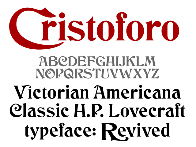
    Cristoforo promo image

    [UPDATE 26 May 2012: The first try didn’t quite make it, so I revised the reward structure and re-​launched! Link now points to the revised project.]

    Yes, I’m starting a Kickstarter campaign to find backers for my new typeface, Cristoforo, a revival of some classic Victorian typefaces by Hermann Ihlenburg. It’s also known as the typeface of Call of Cthulhu (the H.P. Lovecraft roleplaying game), and as the original logo for Cracker Jack. The campaign will only last until midnight on Saturday May 19 [revised: June 17], which is 26 days from now. Basically, people pledge money up front for the fonts (and other goodies) so I know the project is viable. Reward options for backers depend on their funding level, and include not only the fonts, but computer desktop wallpaper, postcards, T-​shirts and posters.

    Kickstarter is all or nothing. Only if the total pledges exceed the minimum funding target are people’s credit cards charged and the project moves forward.

    If funding exceeds the minimum by enough of a margin, I can add more language support for central/​eastern Europe (including Cyrillic), and even pay an intern!

    Check it out!

  • Cristoforo: looking for American Italic

    American Italic 2 med res
    American Italic 2 med res
    American Italic 1 med res
    American Italic 1 med res

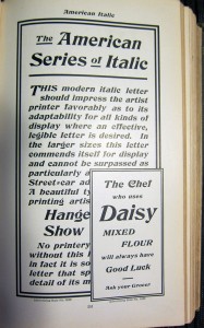
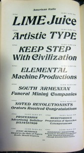
    As mentioned previously, I’m working on a revival of the Hermann Ihlenburg typeface Columbus (1892, MacKellar, Smiths & Jordan /​ American Type Founders), under the name Cristoforo. But now I’m looking for samples of its differently-​named italic companion, American Italic (Hermann Ihlenburg, American Type Founders, 1902). I have two from the ATF 1906 specimen book, shown at right. But neither shows a complete character set at a reasonable size. If anyone has the actual metal typeface, especially in a medium to large size, I would love to get a full specimen. Or, if you have a printed sample showing all or most characters at a largish size, that would also be great!

    [Update April 21/​22: Just got some great pics from Jackson Cavanaugh (Okay Type), showing the relevant pages from the ATF 1899, 1900, and 1903 specimen books! Amelia Hugill-​Fontanel at the Cary Library is also digging into it. I am still thinking about scans, but the pics are a fab start. I am already in good shape for Columbus Initials, the swash caps font. I’d love to hear from anybody who has metal type for any of these faces!]

    Columbus charset showing
    Columbus charset showing

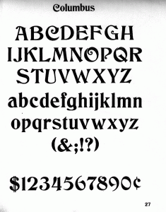
    I’m already in decent shape for a sample of the upright version of Columbus, unless it turns out the full typeface has more characters?

    Click on any image for a larger version.

    Watch this space for news on the related Kickstarter campaign coming in a few days! Get in touch if you would like a sneak preview.  [UPDATE 23 April 2012: I am now funding development of this typeface on Kickstarter! Deadline is May 19.]

  • Cristoforo: Reviving Columbus and font quality

    Many years ago, the very first digital font I ever worked on was a version of Hermann Ihlenburg‘s 1892 typeface Columbus, for American Type Founders. I had an interest in it because it was used in the logotype for the Call of Cthulhu roleplaying game, which I had long enjoyed. I never did anything serious with it, both because I did my revival by eye without benefit of scans or good quality originals, and because I didn’t know what I was doing back then. [UPDATE: I funded this typeface on Kickstarter in mid-​2012! As of Feb 2013 backers have received pre-​release versions of the regular and italic, but they are not “done.”]

    Type specimen
    Specimen — click for higher-​res sample

    Ihlenburg is pretty darn obscure, btw. He had the misfortune to be prolific back in the late 19th century, when type designers got very little recognition, and typefaces were just starting to be given unique names. The main available info about him is in a 1993 article David Pankow wrote about Ihlenburg for the American Printing History Association’s journal, on the occasion of an archive of Ihlenberg material being assimilated by the Cary library at RIT (Pankow was then curator of the Cary, and editor of the APHA journal).

    Fast forward almost 20 years to 2010-​11. While unpacking some boxes, I ran into some photocopies I had made of some good quality type specimens of Columbus, from early ATF specimen books. This was handy, because the earliest ATF book I have is about 1906, and the design had already been dropped by then. A quick search online verified that nobody had done a decent digital version yet. There’s a free version called by its original name, Columbus, by a fellow named Sam Wang, and an $18 commercial font called Beaumarchais from Scriptorium that is particularly awful, worse then the free font. Each has about 100 glyphs.

    So I’ve been working on and off on doing a better version from digitized scans. It’s not “done” exactly, but it is already a whole lot better than either of the other versions currently available. I’m still tuning spacing and additional glyphs. I plan about 260 total glyphs, of which about 106 are in good shape right now, including alternate swash caps, which were not done in the previous digital revivals. I am using my old typeface as a placeholder and replacing glyphs as I fix them up.

    I did a little bit of work on this font during the type busking at TypeCon New Orleans, and got some good feedback on the eszett and the spacing while I was there (thanks to Gary Munch et al).

    I can’t call it Columbus, however: ATF’s trademark lapsed, and Monotype trademarked the same name for a 1992 Patricia Saunders typeface (celebrating the 500th anniversary of Columbus’ famous arrival, while Ihlenburg’s typeface was so named for the 400th anniversary). My previous attempt had for a while been called “Columbine” but that has taken some unfortunate connotations, so for now I’m calling it “Cristoforo,” after the sailor’s first name.

    I’m still not sure what I’ll do with it. For now I am licensing it on special one-​off terms to a very small handful of companies doing material related to the Call of Cthulhu roleplaying game. Maybe I’ll do a commercial release at some point, who knows?

    Here are samples of my work-​in-​progress and its nominal competitors. I’ll leave telling which is which as an exercise for the viewer—make your guess before you hover your cursor over the images, or read the comments.

    Font 1 sample

    Font 2 sample\

    Font 3 sample

  • Type Design & FontLab 4-​day Workshop

    Noted type designers Veronika (“Vik”) Burian and Jose Scaglioné are poised to do a 4-​day type design and FontLab workshop right here in Portland, Oregon, in July. It’s being sponsored by the Portland Type Foundry (Pete McCracken), and hosted by the Pacific Northwest College of the Arts.

    Type Design & FontLab 4-day workshop
    Type Design & FontLab 4-​day workshop

    Note that the poster offers two additional options if you work through Portland Type Foundry (details on the poster) and register through them by Thursday April 28: either get a $100 discount on the whole four-​day event, or if you already have some type design and FontLab experience you can attend just the last two days for an even cheaper rate.

    Check out the poster for more details, or go to the PNCA to register if it’s after April 28 and the poster special is over. 

    Unfortunately, PNCA is understandably nervous about getting enough registration for such a specialized event, and are considering cancelling the seminar if they don’t get at least a dozen people registered by the end of April! So sign up now to guarantee that it actually happens. Maybe we can at least extend the cut-​off until the end of May if it looks close, but no guarantee.

    Personally, I’m jazzed to hear that Vik and Jose are coming to town to do this. I’ve been fans of their work for many years, which is why their foundry TypeTogether was among the first I got signed up for the WebINK web fonts service. They are part of a new(er) generation of type designers who have been working with advanced tools and OpenType from very early in their careers.

    They also have a particularly international perspective: Vik is based in Prague, Czech Republic, while Jose is in Buenos Aires, Argentina. They met while both working on their MAs in typeface design at the University of Reading in the UK (one of only two such programs in the world). I’ve done a number of guest lectures at the Reading program over the years, and watched as it has turned out a number of outstanding type designers and type tech geeks. Recommended for folks who are really serious about getting into type design, as is the TypeMedia program at the Royal Academy of Art in the The Hague.

    BTW, this isn’t the first collaboration between TypeTogether and Portland Type Foundry: Pete McCracken and Vik Burian worked together on a typeface called “Spore” (seen in the poster).

  • Hypatia Sans typeface finally shipping

    As many folks in the font biz already know, a while back I designed a typeface called Hypatia Sans. The upright faces were made available as a registration incentive for Adobe Creative Suite 3, but the typeface wasn’t available at retail, awaiting the completion of italics to go with it. Three years (!) later, the italics are finally available, and Adobe has released the typeface as a regular retail item. The italics in particular are available at a heavy discount, for those who already have the upright faces as part of CS3 (something I had arranged when I was at Adobe, as I wanted there to be an inexpensive upgrade for existing users). The new version of Hypatia Sans also adds a few more characters, and corrects some minor bugs.

    Hypatia Sans poster style sample

    Hypatia Sans poster on Adobe’s site, click for high-​res PDF.

    All told, it took me five years part time to do the upright faces, and then a total of three years for first me and then Paul Hunt to finish the italics. Both Paul and I had considerable input from master type designer Robert Slimbach, and he and Miguel Sousa did the kerning of the upright faces when I ran out of time before the CS3 ship.

    You can read about the design process of the italics and get some idea of why it took so long from Adobe’s type blog, or go to the Adobe store to buy the typeface (links to the US store, international stores should have it soon):

    With the upright faces having been available for so long, it has already seen a fair bit of use, despite the lack of italics. Although I occasionally spot it myself, colleagues often send me examples of it in use. I’ve now seen it in plenty of documents, not only for headings, but even for body text in places ranging from a Sharper Image gadget catalog to $pread, a magazine by and for sex workers. I’ve seen it on business cards from graphic designers and in a visual identity for an architect. Besides those, here are a few of the other uses I’ve collected over the years (click on any one to get a bigger picture or go to a web site):

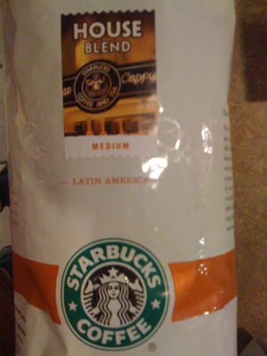
    Starbucks uses Hypatia Sans for the titling on the label of its House Blend coffee.
    photo of Starbucks House Blend package

    This Seattle garage door company uses Hypatia Sans… it’s not great typography, but their pickup truck was the first time I saw Hypatia Sans on a vehicle. (I drove by it several times over the course of a couple weeks before I stopped and took a picture. It was parked in between home and the hospital, and I was driving to the hospital every day for two months.)
    photo of truck with lettering on the side

    Here’s a more impressive vehicular use: a banner for the USS Pampanito, a WW2 submarine docked in San Francisco.
    photo of submarine at dock

    In the same city, the SF Asian Art Museum used Hypatia Sans to promote their exhibition of the art of Bhutan.
    photo of front of museum, displaying banner

    Finally, here are a couple of web sites that use Hypatia Sans. I was reminded of Mint.com in particular earlier this week when I saw their site used as an example in a talk at “An Event Apart” in Boston.

    Mint.com uses Hypatia Sans throughout. Their logo uses it as well, but customized with modified serifs.
    image of Mint.com web site

    This dental site is a more basic use:
    image of Valley Dentistry web site

  • Font Remix Tools (RMX) and Multiple Master Fonts in type design

    A little while back, Tim Ahrens asked me if I’d write a testimonial for his Font Remix Tools (“RMX Tools”), a set of plug-​ins for FontLab Studio 5. I was more than happy to share my thoughts:

    The Font Remix Tools are an essential toolkit for anyone who wants to develop sophisticated typefaces with much greater efficiency. I can’t imagine willingly working without them. Type designers owe it to themselves and their sanity to check out RMX Tools.” — Thomas Phinney, Senior Fonts Product Manager at Extensis, designer of Hypatia Sans Pro for Adobe

    (FontLab Studio is the primary type design application used by the overwhelming majority of professional type designers. FontForge and DTL FontTools (including FontMaster) are its fellow high-​end alternatives, while TypeTool and Fontographer are the primary low to mid-​range options.)

    Tim has a interesting/​useful demo version for free download, while the full version starts at €179 for one computer.

    I think of the Remix Tools as having two sets of functions. First are several very useful things that work with just about any typeface:

    • harmonize” curves: this takes the “lumpiness” out of malformed curves. Very cool, even for moderately experienced type designers, though the experts may not need it.
    • intelligent slant: slants glyphs while keeping vertical tangents straight. A useful step towards making italics, at least for sans serifs.
    • tabular figures from proportional with only a couple of clicks

    But the real power of RMX comes when you start with a font file that has a Multiple Master weight axis. Yeah, I know MM fonts are pretty nearly dead as a deliverable format for end users. Apple’s support for MMs is flaky enough that Extensis tech support has suggested Suitcase should warn people they won’t work reliably, and Windows has no reasonable native support (an ATM install can be hacked on Vista and probably Windows 7 to make them work well, or you can do manual registry entries for every single font).

    Yet Multiple Master fonts are still very useful as a font development tool, even if what gets delivered is a bunch of separate fonts. Although Adobe hasn’t shipped a new MM font since the 90s, virtually all their internally developed type families use MM technology, and many other typeface designers use it as well. If you start with a font that has master outlines for two different weights, RMX can incredibly easily:

    • create true condensed and extended versions (again, generally without distortion!)—or add a full “width” axis for infinite variation
    • tune the width, height and weight of single letters interactively
    • automatically generate small caps with the “right” weight and width (as determined by you, the designer, but with some very clever defaults)
    • generate superiors, inferiors, numerators and denominators similarly
    • make even better automatic tabular figures

    Most of these functions still seem like magic when I see them working. Most of it works insanely well almost all the time. Of course it still needs to be checked by humans, and there can be problems on occasion, but dang….

    What about Superpolator?

    Aside from the Font Remix Tools, another insanely powerful option for working with font development using the power of MM space is Superpolator from Just van Rossum and Erik van Blokland, a.k.a. LettError. It has always looked great, but back when I was doing a lot of type design, my main box for doing so was Windows based, and Superpolator is a Mac-​only tool, so I never really gave it a fair try. It’s available from €250.

    More on MM fonts:

  • Browser Choice vs Font Rendering

    This post by Jeffrey Zeldman on font rendering in web browsers is a good introduction to the subject in a number of respects, but unfortunately repeats a pernicious myth: that web browsers on Windows all render text differently, and that this interacts with the OS rendering. There are a couple of caveats (see below), but for the most part, this a this is a system level setting. On any given Windows computer running XP or Vista or Windows 7, you will generally get >pixel-​for-​pixel identical glyph rendering in Internet Explorer, Firefox, Chrome, or Safari. (As also shown in Si Daniels’ presentation at ATypI 2009 in Mexico City).

    Why is this? All of today’s major web browsers on Windows (IE, Firefox, Chrome, Safari) simply use the OS’s user-​adjustable GDI text rendering settings, whatever those may be. Similarly, all today’s major web browsers on Mac OS simply use the system text rendering.

    (Yes, there are a couple of caveats. Internet Explorer 7 actually ignores the OS setting in favor of its own prefs setting, which is to use the OSes ClearType rendering regardless. Safari for Windows has an optional setting to use Apple’s “Quartz” text rendering, even on Windows—this was the one-​and-​only rendering option in Safari 3 for Windows, but Windows users “freaked,” so Apple changed it for Safari 4 for Windows. Also, Firefox can use the kerning built into fonts, which affects spacing, though it doesn’t actually impact rendering of individual glyphs. Every major browser uses the same rendering as some version of OS rendering, however; none does something unrelated to Mac or Windows text rendering.)

    So why does rendering vary so much? Windows XP, Vista and Windows 7 can be set to one of three settings for “font smoothing” (a.k.a. anti-​aliasing). These settings affect all applications using the old-​school GDI APIs for text rendering, which as of late 2009 means all the major web browsers. The font smoothing settings are:

    • off (uncheck the box that says “use the following method to smooth the edges of screen fonts)
    • Standard (grayscale)
    • ClearType (optimization for color LCD screens)


    Note that the standard vs ClearType distinction only affects fonts with TrueType outlines. Fonts in PostScript Type 1 or OpenType CFF formats get a less sophisticated type rendering/​smoothing which, well, seems less than stellar these days.

    Standard” (grayscale anti-​aliasing) is the default on Windows XP, although installing Internet Explorer 8 will change that setting to “ClearType” (even if one then proceeds to use a different web browser). Windows Vista and Windows 7 default to ClearType. So, most folks on Windows are seeing ClearType rendering, one way or another. However, 

    Besides GDI (all of today’s browsers), there is a completely different rendering mode used by applications which are programmed to use the “DirectWrite” text APIs (similar rendering also available to the largely-​ignored WPF APIs). This uses ClearType, but a ClearType which is improved over the GDI version. For TrueType outlines, It offers moderate but noticeable improvements, such as options for improved spacing, and anti-​aliasing in the Y direction. OpenType CFF fonts see a truly dramatic improvement, going from really mediocre rendering under GDI to rendering roughly equally well with TrueType under DirectWrite (or under its predecessor, WPF)! Minion Pro and Myriad Pro in OpenType CFF render pretty well down to 9 pixels per em (ppem), and just fabulously at 12 or more.

    This is worth knowing and noting because it has already been announced that Internet Explorer 9 will use DirectWrite, and apparently FireFox is working on it as well.

    [Post updated 8 Jan 2010 to correct IE 7 having a built in pref for which OS rendering it uses. Thanks to commenters! – T]
  • Matthew Carter in WaPo

    There was a new article about famous type designer Matthew Carter by Rachel Saslow, last Thursday in the Washington Post.

    It’s mostly a really good article. Well written, entertaining, gets to a few good truths about the work and type design (though it never mentions that that most people would find the work insanely tedious).

    There is just one goof that jumped out at me, which led me to some other thoughts:

    When Carter designs a typeface, he typically starts with a lowercase h. It has an ascender (the stroke going up on the left), but it also reveals a lot about the character of the typeface. From a lowercase h, he explains, you can tell what a lowercase l, m and n will look like. Graphic designers, however, usually identify typefaces by more flamboyant letters of the alphabet, such as a capital “Q” or a lowercase “g.” The fact that Carter is more of a lowercase h guy says much about his design style.

    I hate to break it to Ms Saslow, since it’s a great line, but no, it doesn’t say much about Carter’s design style:

    • Folks should look at Carter’s full body of work. He’s just as comfortable with the flamboyant (Shelley Script, Walker, the italics in Galliard) as with the subtle. I’m not sure I would even call his low-​res work for Microsoft (Verdana, Georgia) subtle designs, although there are some lovely subtleties in the details of their execution.
      Shelley Script by Matthew Carter
      Galliard italic by Matthew Carter
    • The overwhelming majority of typeface designers start designing with the most representative letters. This is true whether the typeface itself is subtle or flamboyant. There are whole threads on Typophile about “which letters to start with” and the common wisdom is usually something like “hamburgefonstiv.”
    • Type design and typeface identification are two different things. People identifying a typeface from a sample will tend to focus on the most distinctive elements available in the sample text to identify the letters. I know I do, and I’ll bet Matthew does, too.

    None of which is to put down the article in general. I’m just a typographic curmudgeon, is all.