Category: Publishing

  • Fonts and Typography for Writers and Non-Designers

    What are some good resources for non-​designers, who perhaps write, edit or publish professional documents? Somebody recently asked this in the comments to my blog. There are quite a lot of resources I could suggest, but given limited time, we should limit the complexity/​depth/​scope of the resources. So given that….

    Before getting into the depths of font selection, teach typography. I think Matthew Butterick’s Practical Typography is a great place to start. Short, straightforward, no-​nonsense, useful, and little I could disagree with.

    After that, for an intro to selecting and combining fonts, this article from Smashing Magazine is good.

    At the next level of complexity, there are plenty of good longer introductions, mostly aimed at designers. Ellen Lupton’s Thinking With Type is a good start here. Nothing wrong with reading Butterick first, before moving on to this, btw!

    For more advanced thought, the closest thing to a typography bible remains Robert Bringhurst’s The Elements of Typographic Style. It is better as a reference book or to read a chapter at a time, rather than try to take it all in at once.

    The original query from a business writing teacher at the University of Colorado, Colorado Springs:

    I teach business writing at a university and we have a document design unit. I try to get the students to understand fonts, but don’t have a good exercise, video, material, etc. about effectively using fonts. DO you have any tips, links, etc. that I might be able to use with the students to help them discover fonts beyond Times Roman and Arial and understand how to use them effectively? Thank!

  • Save $400M printing cost from font change? Not so fast…

    I am really bummed that the idea trending hot online now, popularly represented as “the US government could save $400 million dollars a year by switching fonts,” is a bit off-​base. It is not the change of design that saves toner; it is that their chosen font is smaller at the same nominal point size than the comparison fonts. Not to mention that the $400 million figure being bandied about is not actually the main number suggested by the kids, which was $234 million. Unfortunately, those fonts that use less ink/​toner at the same actual size are generally less legible.

    That said, it is great that middle school kids (the study has two authors, although one has gotten all the media attention) are doing creative problem solving and applying scientific thinking! No sarcasm intended. It is not their fault that non-​obvious aspects of the problem mess up the idea.  (Readers of my blog may remember that point size and font size have a rather nominal relationship.) Garamond* lowercase is about 15% smaller than the average of the fonts they compare it to, while its caps are only about 7.5% smaller. So it is no surprise that it uses less ink at the same point size.

    This is why most scientific studies comparing typefaces first compensate by resizing the fonts to eliminate differences in the lowercase height (called “x-​height” by us font geeks). This study failed to do that. As a result, they actually get results that are the exact opposite of other studies. Century Gothic has a very large x-​height, so printed at the same nominal point size it uses more ink than Times. If it were instead printed at the same x-​height (as in other studies), due to its relatively thin strokes, it would use less ink.

    Setting any font 15% smaller would save 28% of its ink usage. This is because the font letters are two-​diemensional, so the ink usage is based on the square of the size:.85 x .85 = .7225. Of course, there are some caps in the texts as well, which would make the savings a bit less. Interestingly, this is pretty exactly much what the study found. So, you could just as easily save ink by setting the same font at a smaller point size.

    For a moment though, let us pretend that the study did in fact equalize the x-​height, and found that a typeface change saved noticeable amounts ink. With a “normal” typeface such as Garamond, this would mean that the strokes making up the font were just thinner at the same size (“stroke” is a virtual thing here; modern digital fonts essentially trace the outlines of the letter). If that were good and useful, why not go further? Why not make the strokes even thinner? Maybe there is no font bundled with common operating systems and software that would meet these needs, but one could just commission one. Even a master type designer could do a basic four-​member family for $100K or so, which is a lot less than the hundreds of millions at stake. Make it razor thin and save even more!

    But any of those changes, swapping to a font that sets smaller at the same nominal point size, or actually reducing the point size, or picking a thinner typeface, will reduce the legibility of the text. That seems like a bad idea, as the % of Americans with poor eyesight is skyrocketing as our baby boomers (and even their children, like me) age.

    Aside from that, the reduction in toner/​ink usage probably would save less money than claimed in the study. The claim is based on the proportion of total cost of ownership of a laser printer that goes to toner. There are sadly two big problems with the idea that using less ink (or toner) will save that amount of cash, based on that proportion.

    First, large offices that use printers and copiers do so under a maintenance agreement that includes the cost of toner. They pay per page printed, and actual toner consumption is generally ignored. In such cases, a font change will only save based on the page count, not the toner. (Certainly, smaller fonts can also use less paper—I will get to that.)

    Second, the study makes the interesting claim in a footnote: “Ink and toner are used synonymously in this study. Even though traditional ink is more expensive than toner, a focus on determining the percent savings in cost rather than the magnitude of the cost obviates this difference.” Urm… how? They are assuming that the percentage of printing cost ink or toner accounts for is the same for all classes of output.

    This is untrue. Many of the documents that account for a substantial percentage of the government’s overall printing costs are printed on a printing press, using offset lithography. For offset printing, the percentage of the cost of  that is associated with ink is in fact much smaller than for laser or inkjet printing. But it isn’t a fixed percentage, either, due to the large proportion of the cost that is associated with setup. It will be a higher percentage for short runs, and lower for long runs. Additionally, because of the huge cost of owning printing presses, many or most offset litho jobs will be printed out of house, using third-​party printers.

    So, for in-​house printing-​press printing, the savings will be a much smaller proportion than the quoted 26%. For outside printers, they will not charge based on minor variations in ink usage; they just check things like whether it’s a page of text vs graphics. Either way the savings will be less.

    There is a different way an effectively smaller font will definitely save money: by allowing multi-​page documents, especially long ones, to take fewer pages! So maybe it all works out—if you don’t worry about legibility.

    There is another practical issue with Garamond in particular. The version bundled by Microsoft (from Monotype Imaging) does not have a bold italic, which is an unfortunate lack if one wants to promote its use for all government documents. (Yes, you can turn on bold and italic in your word processor anyway. You will just get a faked font instead of the actual one, which is ugly and less legible.)

    The question that should be asked is: what font and size combination could be used to maintain or increase legibility while saving money on printing, by reducing page count and/​or ink/​toner usage, with a font that is bundled with common apps (or free), and has all the required font styles?

    But that is a far more complex question, and most folks covering the issue much prefer simple and appealing messages like “high school kids tell gov’t how to save $400 million!”

    I like innovative ideas to save money. Really, I do. But I wish the media and public had consulted some experts on this area before going nuts promoting this idea, because it just doesn’t hold water—or save money—without losing legibility.

    Thomas is currently CEO of ATypI, the international typography society, since 2004. In other relevant background, he was a teaching assistant for a senior level stats course in his second and third years of undergrad, has an MBA from UC Berkeley, and an MS in printing, specializing in typography, from the Rochester (NY) Institute of Technology.

    Updates & notes

    This post has seen some editing for grammar, clarity, adding a few more details, and to be less of a jerk. Also to update my background to be current. Again, I am impressed as heck that a high middle school student is attempting serious research. I would not be analyzing it critically ,like a serious adult study ,if not for the fact that the media initially largely embraced it uncritically as if it were.

    * The student study does not specify which Garamond they used, but it was obvious (to me) in the samples that they were using the Monotype version that is bundled with Microsoft Windows. Because Garamond goes back to the 1500s, and there is no trademark on the name, there are literally dozens of typefaces by that name, with about four or five being fairly common.

    Since I wrote this, there has been some interesting coverage. The Guardian UK was in with the initial pack, with some caveats, but then their Nadja Popovitch wrote about this blog post and interviewed Jackson Cavanaugh of Okay Type for his reaction and analysis.

    Meanwhile, John Brownlee did a nice job of explaining the point-​size part of my analysis in layman’s terms, for Fast Co Design.

    I did more elaborate checking on the study’s original sources and found that their five government test documents each used different body text typefaces: New Century Schoolbook, Minion (with Myriad headlines), Melior with a little Helvetica, Times with Helvetica headlines, and Book Antiqua. The average of these was almost identical to my original estimate using two of them, but I updated my numbers appropriately.

    Given that the five source documents all use different fonts, one could reasonably wonder if they are a representative sample. Generally, as a rough guideline, you need a sample of about 30 to get sufficient statistical reliability for something like this.

    CNN quoted Suvir: “”Ink is two times more expensive than French perfume by volume,” Suvir says with a chuckle.” This may be true, but that stat is not original to him—it dates back ten years, and is specifically about inkjet printer ink. Such printers may still be common in schools (although even there I expect laser printers are taking over), but government agencies are definitely not using inkjet printers for much of their output. Most high-​volume government printing is on laser printers, or even printing presses, whose ink is even cheaper still.

  • Bookbinding: When nice books are illegal

    The Problem

    Sometimes printing a PDF is legal, but making a really pretty book might not be.

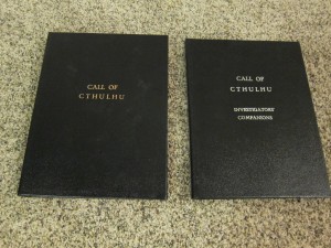
    I just want to make pretty hand-​made hardcover books, like these I did years ago:

    Call of Cthulhu hand-bound hardcovers
    Some of my hand-​bound hardcovers

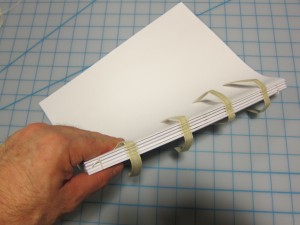
    Using real sewn signatures like these:

    Sewn signatures to bind into a hardcover
    Sewn signatures ready to bind into a hardcover book (click to enlarge)

    Without becoming a criminal.

    I’m trying to make some one-​off fancy hardcover books from some PDFs I have. Unfortunately, doing so may often be illegal, even when printing the document to make a less nicely bound book would be legal.

    What the heck,” you say? Well, here’s the thing….

    Making a really high end hardcover from a document such as a PDF involves rearranging the pages (“imposition”) in order to print them in sets on sheets with more than one page per side, so that you can fold them and sew them in groups (“signatures”).

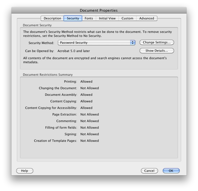
    Commercial e-​books sold as PDFs are often encrypted with flags on the PDF permit printing, but not modification. Nor do they permit “document assembly” which is exactly what I need: the ability to rearrange, add and delete pages in the PDF. Unfortunately, common approaches to doing imposition involve generating a modified PDF: one in which the pages are at least rearranged and put more than one to a (now larger) page. So far, it looks like many (perhaps all?) imposition apps do it this way and don’t work with PDFs that have restrictions on modification (perhaps on PDFs that have *any* access restrictions?).

    Now, I can easily break the encryption on a PDF, if that PDF allows opening but just has restrictions on specific uses like modification. If I do that, I can then use imposition software on a PDF that allows printing but not modification, and make a fancy book.

    But (at least as I understand it, and admittedly I’m not a lawyer) the Digital Millenium Copyright Act says that circumventing an access restriction is always illegal, regardless of why I do it. That makes me a criminal if I do that, even if for the sole reason of making a pretty hardcover book. Even when printing the pages out normally and slapping glue on the spine, like a typical softcover “perfect-​bound” book, is permitted and legal.

    (Perhaps a lawyer could successfully argue that the flags on PDFs that allow some uses but not others are guidance, rather than effective technological measures creating access restrictions? That is, unlike encryption of the entire PDF with a password needed to open it. That argument worked for Adobe v Monotype over the embedding flags in fonts. But I have neither the interest nor the deep pockets needed to fund making that argument in court.)

    [Update: As seen in the comments on this post in the first 18 hours, the legal situation is more complicated and more uncertain than I thought. Fair use may indeed offer a defense. Given the uncertainty, and my desire to stay on the right side of both copyright law and the DMCA, my behavior is not going to change much with this knowledge, though it is comforting.]

    Why are PDFs set this way in the first place?

    So I was wondering, “why do publishers use the particular combo of settings they do, that is bugging me?” It turns out the answer is “because that’s the only reasonable option Adobe makes easily available to them.”

    Although the PDF format allows for very granular permissions settings, the Acrobat Pro and InDesign UIs do not. They give the choice of “no protection” or one of four option combinations, which determine the settings of the 10 different permissions.

    Options Adobe presents for PDF security

    Most publishers of commercial PDFs are going to want to allow commenting, and disallow document modifications. That gives them exactly one choice, which also disallows “document assembly.”

    The common choice for security

    Nobody is going to go for the “everything but page extraction” option:

    Option for "everything but page extraction"
    Option for “everything but page extraction”

    … and short of that, allowing document assembly disallows commenting, for some reason I don’t understand! Perhaps Adobe thought that this would only be used by books going to a professional high-​end print production house, who would not need to stick comments on the PDF? Teh broken.

    The standard combination that allows “document assembly”

    Of course the use case for comments in general is much broader than for imposition, so publishers quite reasonably pick the option that is bugging me.

    I see there are third party tools that do allow such granular option choices (e.g. Nitro PDF), but of course they are not so widely used.

    Solutions?

    Ideally Adobe would change their content creation and Acrobat Pro applications to allow more granular settings of the 10 different functionality permissions in PDFs, without forcing content creators to resort to specialized apps.

    We could also fix this by changing the Digital Millenium Copyright Act (DMCA). I gather circumventing an access control mechanism is always illegal unless a specific exemption is carved out for that use. Allowing an affirmative defense for cases where the access control mechanism is circumvented to enable functionality which is either generally allowed by the licensor, or allowed by fair use, would be cool. I’m sure it won’t happen, though, and it would be a long wait.

    What else can I do?

    I can go to the copyright holders and ask their permission to break the encryption on their PDFs for the purposes of making a fancy book from each, for my personal use. Getting the permission of the copyright holder gets one off the hook for DMCA violation.

    (I would also consider it okay to sell such a book to somebody else, if that third party could prove to me that they had licensed the printable PDF as well. But that isn’t my intent in making the books, I really just have personal use in mind.)

    I have in fact been doing this, with good luck to date. Kind of a pain to track them down, but authors so far have been really great. They say sure, I can break the encryption on my PDFs for this specific purpose. I guess they quite rightly figure that if I were an evil hacker I wouldn’t be asking nicely about something that I can do easily enough without permission. 🙂

    Printing Books?

    Hey, I love e-​books. I read more than I used to thanks to e-​books and my Kindle. But there are some books that for various reasons I would like to have a really nice physical hard copy of. Some of these I have already licensed as a PDF, and that PDF and the license allows me to print it out. So I’d like to do that, and not end up breaking the law just because I want to make a really nice book out of it, not just pages stuck together with glue, like a paperback.

    More About Signatures

    A “signature” is a group of sheets of paper, folded in half, which can then be stitched through the spine of the group (the fold), and also stitched to the other signatures. In traditional offset printing the signature usually starts out as a single huge sheet, folded repeatedly, and trimmed so that the pages are only linked at the spine at not at top and bottom. But if you want to make a fancy book from a PDF, you could just use pages twice the size of the pages of the original PDF document, folded in the middle, to make four pages per sheet. As almost all my originals were 8 1/​2″ x 11″, and I have a printer capable printing 11″ x 17″ pages, double-​sided, I decided to do that.

    Books using sewn signatures instead of glue alone are much sturdier and more resistant to pages coming loose. If the sewn signatures are also sewn to thick cloth tapes which attach to the covers, the book can be extra resistant to the entire book block coming loose from the binding as well. This is the style of binding I am doing in current projects.

    More About Imposition

    Now, the interesting thing about signatures is that it complicates the positions of your pages. To understand what I mean, try taking three sheets of paper in a stack. Fold the whole set in half to make a booklet. Now start numbering the top right corner of each page. You’ve got 12 numbers.

    When you take the stack apart, the first sheet has page 1 on the right half and page 12 on the left. and on the other side it’s pages 2 and 11. Let’s call it 12-​1/​2-​11. The next sheet is 10-​3/​4-​9, and the final sheet is 8-​5/​6-​7. In a full on book there would be multiple signatures, each starting in this kind of sequence. So if I’m printing 8.5×11 pages on 11×17 sheets, I need to rearrange the original pages, and put more than one on each side of a sheet, to get the right pages on the right sheets. Add in possibilities like throwing in some blank or unnumbered pages at the beginning, and multiple signatures, and it can get quite complicated.

    Luckily this is an old and fairly well-​understood printers’ problem. It’s called “imposition,” which is the art of figuring out which page numbers go where. Of course, in serious offset printing a single sheet might be folded a bunch of times before cutting it apart… that’s really complicated! So there’s imposition software that sorts this out for us. The one I’ve heard the most about is called Quite Imposing and deals with the complexities faced by printers putting many pages on a sheet, among other things. It’s a plug-​in to Adobe Acrobat. But it costs $475 USD.

    However, for my purposes I only need two pages on each side of the sheet. For that use, I found the amusingly named Cheap Impostor software does everything I need for a fraction of the price of the high end applications. It’s only $35, and it’s shareware so you can try before you buy. I’ve already pumped over a thousand pages through it. The author was quite responsive for tech support, as well. Highly recommended.

  • Magazines, Newspapers & ePub pricing madness

    Some current subscription rates:

    The Economist:

    • digital-​only subscription $110 for one year
    • paper plus digital $127 for one year, $223 for two years
    • special offer: paper plus digital for $51 for one year

    New York Times:

    • paper plus digital: $7.40/week, $384.80 per year
    • digital only: $8.75/week for same level of digital access as a paper subscriber, $455 per year

    Time magazine:

    • $30/​yr paper
    • $36/​yr Kindle (without graphics and photos)

    Why the craziness? These publishers want me to pay more for the electronic version than the printed one, even though their marginal costs are lower. Publishers are so worried about protecting their paper publishing business that they are hobbling the digital one in ways that make no sense in terms of their overall business and especially in terms of their future.

    I didn’t just look up publications that happen to be crazy. The first two are publications I like and enjoy reading and would like to subscribe to. I don’t want the printed versions, which pile up in my home and use up resources for insufficient value (to me, anyway). I want to get the digital versions. I am perfectly willing to pay a “fair” price. Time was the first other big periodical that came to mind, and did not surprise me in having an equally crazed pricing model.

    But these sorts of pricing decisions just piss me off, and leave me feeling that the publishers are trying to use digital-​only revenue to prop up their failing paper-​based businesses. As a would-​be digital-​only subscriber, I feel exploited. Or I would if I actually gave them my money… which I won’t do under these conditions.

    End result of this kind of pricing? Those who continue it will find their market share eaten by those who don’t make that mistake. They will find competitors who either are perfectly willing to let their digital business take over some of their print business, or just don’t have a printed paper business to worry about.

    Just as I finished writing this piece, I found an article that sums up the problem nicely:
    http://www.betatales.com/2011/04/24/the-word-that-should-be-banned-in-all-media-companies/

    Print media businesses are so worried about cannibalization that they are shooting themselves in their heads. I hope it stops before we lose some fine publications, or they become shadows of their former selves.

    NOTES:

    Yes, I call them “print media businesses,” because that is how they are behaving: at some level they have not figured out that they need to become simply “media businesses.”

    Yes, I’m omitting some details and extra options. For exmaple, the NY Times offers a discount on the first two months of digital, and cheaper digital-​only options are available from NYT as well, but those offer trimmed-​down access choices instead of allowing people access from whatever device they want. Still, the all-​digital version that is equivalent to the digital options the print subscriber gets is more expensive, as best as I can tell. Without getting the paper copy, whose price includes home delivery.

    Finally, I kept on looking, and sure enough, there are publications that have sane policies in this area. For example:

    Seattle Times:

    • $5.60/wk paper
    • $1.99/wk digital

    I’m voting with my pocketbook.

  • Winners, losers and fonts in the eBook revolution

    A couple of weeks ago I bought a Kindle, Amazon’s dedicated eBook reader device. This enabled me to carry a whole bunch of reading around with me in a compact form and way less than a pound of weight. This has been a great convenience, because I have been taking the bus to and from work since moving to a new house recently (though I miss the convertible), and I’ve been traveling a lot and like to read on the plane, such as on a recent press tour I did in my day job at Extensis (Portland > Minneapolis > Denver > SF Bay Area > Portland).

    I love many things about books as artifacts: the variety in their appearances/​layout/​typography, the smell of paper and ink, and the refined look of printed type. Yet I am quite certain that within a decade, the majority of what was once print publishing will be electronic (some estimates are as high as 75% by then). The advantages and economics are just too compelling… although of course physical books have their advantages as well.

    My interest was initially sparked because, like web fonts, eBooks are a growth area for fonts and typography, while the traditional print usage continues its inexorable slow decline. It’s clear now that after years of false starts, eBooks are finally taking off. Amazon says they’ve sold 40% more eBooks than hardcovers over the last three months, and in the past month it’s been 80% more eBooks than hardcovers.

    Now of course, that’s hardcovers and not paperbacks, and that’s units and not dollars. (Some books in the Kindle top 10 non-​free list cost as little as $1.16.) If one looks at the data from the Association of American Publishers, which includes all retailers and not just Amazon, it seems in the month of May, eBooks were more like 4.4% of all book sales in the USA. or for “trade books” 8.5% year-​to-​date, up from 2.9% fir the same period last year. (The AAP figures are based on dollars, not units, by the way.) That may not sound like much, but factoring in the growth rate, we’re looking at the beginning of the explosion. eBook market share of all books three years ago, rounded to the nearest whole percent, was zero.

    In that same time the price of eBook devices has plummeted. The original Kindle was $399 when it came out in November 2008. Now the third-​gen Kindle, announced July 28, is to come out in late August for $139 (wi-​fi only) or $189 (3G and wi-​fi). Many of these prices are set in response to similar pricing/​drops on the price of Barnes & Nobles’ “Nook” eBook reader. Then there’s the Borders/​Chapters Kobo, Sony’s Reader, and perhaps most importantly the iPad…. Even if prices don’t drop for Christmas, you could see a lot of these things under the tree for Christmas. Next year? I’m thinking in 2011 you could easily see, in terms of US sales in dollars, 20% of trade books and 10% of all books in general being eBooks. Maybe more.

    Given the usual topics of this blog, I would be remiss not to comment on eBook fonts and typography. Generally, I’m impressed with the current crop of eBook devices in their display and font choices. All the dedicated eBook devices (but not the iPad) use eInk tech for screen display, which is currently limited to B&W (plus greyscale), but has the advantage of using a lot less power than LCD or even LED, and not requiring any power to maintain an image on the screen. It’s also reflective rather than transmissive, making it more “paper-​like” and meaning the screen doesn’t wash out in bright sunlight, though you’ll need a night light to read in bed

    On the font side, slab serifs are in, with the occasional sans or Dutch-​English oldstyle. Apparently the new Kindle has the same PMN Caecilia typeface (slab) as the previous editions, and adds a condensed version of Caecilia, and an unspecified sans serif option. The Nook uses Amasis (a slab), Helvetica Neue (sans, and a horrid choice for on screen legibility), and “Light Classic” (serif). Sony’s Reader uses Dutch 801 (a Times knock-​off) as the default, with Courier and Swiss 701 (a Helvetica knockoff, again an awful choice) as options. Apple’s iBooks on the iPad offer a bunch of serif faces (Baskerville, Cochin, Georgia, Palatino and Times New Roman) and one sans (Verdana). Kobo offers Baskerville Georgia, Verdana and Trebuchet. With all these devices there are a bunch of complications around whether font embedding is respected (mostly not, unless it’s a PDF) and such, but that’s probably for another post. See also here for font support details.

    Many of the eBook reader devices have limited language support, often just for western European languages. The newly-​announced Kindle’s bundled fonts are a dramatic improvement in this area. Now they have Latin, Greek, Cyrillic, Chinese (simplified and traditional), Japanese and Korean. Given the rest, I’ll bet the Latin is extended Latin that covers central/​eastern Europe, Baltic languages, the Balkans, Turkey, etc. One can reasonably expect competitors to take similar steps, of course.

    One thing that fascinates me about the eBook revolution besides fonts is the economics of it. One thing most people focus on is “which device will win?” What’s interesting is that the e-​stores and devices are not always tightly tethered to each other. The eBooks I buy via Amazon for the Kindle, I can access via Kindle software on either my iPhone, the just-​acquired iPad from work, my home Windows laptop, or my work Mac laptop—and other devices I don’t even have around. Same thing goes for the Nook, by the way (B&N is currently rebranding its eReader apps to share the same name as their hardware device, like Amazon has been doing for a while.)

    Side note: I have surprised myself on several fronts with my own preferences in reading eBooks. I thought I’d like the Kindle DX (the oversize model) better than the base model, but the opposite is true: I didn’t find any real advantage of bigger pages in reading mostly fiction, and the lighter weight of the base model (240 to 290 g, 8 to 10 oz.) was quite important to me. The iPad is heavier (a pound and a half, or 680 to 730 g) even than the Kindle DX (540 g, 19 oz) though of course far more versatile… so it’s further from my ideal reading device. I was particularly shocked to discover that, if I was already half-​way through a Kindle book and into it, I didn’t find it problematic to read it on the iPhone, either! I would have thought the tiny iPhone screen would have made that unpleasant. Clearly the big screens will be helpful for more highly structured content, such as textbooks and some kinds of reference works, but I think the dedicated eReader device folks got the size/​weight tradeoffs about right in their standard models.

    Anyway, with all these different delivery vehicles for a single eBook store, it’s possible that either Kindle or Nook eBooks could be dominant without the same being true of their corresponding hardware. I wonder if Apple’s iBooks will do the same, allow other devices to run the software? I expect they’ll do it like iTunes, and restrict it to Apple devices, plus full-​blown computers (Macs and PCs).

    The companies who I expect to lose out in all this are publishers and authors’ agents. Not for all kinds of books, and not at all levels of the industry, and not eliminated completely. But for your basic fiction novel, these entities may sometimes be “disintermediated,” cut out of the middle.

    In fonts, we see this with MyFonts.com, where the server is a giant aggregator. The folks who make fonts can directly put their fonts on MyFonts, and take a big slice of the revenue, while 95% of the process of getting the fonts up there is automated. There are some advantages to folks banding together as a foundry, because of collaborative work, specialization of font production tasks (including testing), and marketing. But they no longer have to, or they can do so without handling distribution and marketing.

    There are similar advantages to having an agent and/​or getting your book in with a print publisher—most notably the potential for physical publication, which will still be where most of the money is for a few more years. Some authors also benefit immensely from having a relationship with an editor to help refine their books.

    But eBooks reduce the friction in the system and grease the way from author to reader. So last week we saw mega-​agent Andrew Wylie eliminate the publisher entirely for a bunch of classic novels, cutting an exclusive eBook deal with Amazon under his new agent-​owned imprint, “Odyssey Editions.” Publishers such as Random House are freaking out, and understandably so.

    Yet there’s nothing stopping the authors from bypassing the agents as well. It’s just a matter of time until folks like Amazon set up a route for authors to self-​publish eBooks… nope, wait, I just checked and to my lack of surprise, they already have, and they offer royalties of 35% or 75%. I am not sure whether publishers or agents will go away entirely, because they can in fact add value. But I am sure that some authors will bypass them in favor of a more direct route to the reader, with a better percentage of the revenue pie.

    [Small update on writers cutting out publishers, from the authors of Draculas.]


    That’s the future for books and fonts both. Aggregators like Apple and Amazon for books, MyFonts for desktop fonts, or (my own employer’s) WebINK for web fonts are the only thing really needed besides the creators. Yet just as we see many surviving vendors for fonts even in today’s all-​digital era (as in, few people buy fonts on disk today, unless it’s a huge collection), I expect we will continue to see several major vendors for eBooks as well. Somebody with an iPad might have iBooks, Kindle and Nook apps all running on one device, allowing them to access even the content that is exclusive to one or another e-​store. Similarly, even if the market settles out at some point, there’s room for multiple major vendors of eBook reading devices.

    And… what about the consumers of books in all this? Sure, we can be sad about the loss of book-​as-​artifact. But for mass-​market paperbacks, the artifacts were not that exciting, and relatively undifferentiated in appearance, beyond the cover. There are some advantages to print, but not enough to stop the rise of eBooks: consumers will find the advantages compelling and will vote with their money. Freedom from the costs of printing (whether economies of scale or the higher unit costs of one-​off print-​on-​demand) will cause a huge explosion in the number of different works available. I know some folks writing hyper-​specialized academic works with huge page counts and short print runs, which cost hundreds of dollars for a single copy today. That can now change. Similarly, books out of print for decades or centuries have come back in print as eBooks.

    It is a great time to be somebody who enjoys reading.