Category: Font tools

  • Why Did Adobe Discontinue Font Chameleon in the 90s?

    Back in the mid to late 90s, Adobe acquired a company called Ares Software. Ares made font-​related software products, including doing the programming (but not owning or distributing) of Letraset FontStudio, which in its day was one of the best font editors. They are best known for a remarkable application and technology called Font Chameleon.

    There is a popular myth that Adobe bought Font Chameleon to kill a threatening technology. Actually, no, removing it from the market was not a motivation for the acquisition. The team that made fonts and would have cared one way or another had nothing to do with those decisions, and were simply not interested in Font Chameleon.

    Adobe’s purchase of Ares was done to acquire Font Chameleon technology, and was entirely driven by the PostScript group at Adobe, to use the technology for font compression purposes to fit more, cheaper, in the ROM of PostScript 3 printers. All Ares retail products (not just Font Chameleon) were discontinued as Adobe put the two Ares principals to work on adapting the Chameleon tech for Adobe’s use.

    (Also, Font Chameleon was in some respects massively more powerful than MM, but also had huge limitations. It could only handle the axes it knew about, and could only handle the characters it knew about.)

    I joined Adobe in mid-​1997, shortly after the acquisition, and thought it was an interesting tech. I ended up deeply involved in helping make the whole system work together (chameleon fonts in ROM including CE fonts, printer drivers, and supposedly matching fonts on end user computers). All the systems were optimized to make an individual piece work in a static environment, according to known schema. Real end-​to-​end testing of these things hadn’t really been needed in years. But because there were numerous technical changes being made at the same time to all these pieces, suddenly end-​to-​end testing was critical. I got involved in pointing that out and pushing everyone to make sure their pieces played together instead of them all trying to point at specs that had been made before any of the pieces actually existed. 

    Through some internal asking around at Adobe, I was able to get my hands on Ares’ Font Chameleon editor: the company’s internal tool used to make a Chameleon “font descriptor” that could be blended with others. These font descriptors as individual files were also super compact, which is why the PostScript team wanted the tech. They relied on a (large) mutatable “master” font , plus the descriptors; the master + descriptors for 136 PostScript 3 fonts were a LOT smaller than the set of fonts themselves, and allowed support for central European accented characters with hardly any size impact.

    What was super interesting to me was how insanely fast it was to create such a font descriptor—which could also be exported as a stand-​alone font if one wished, not to mention instantly manipulated in weight, width, x-​height, etcetera. At the time I thought it could have been an incredible rapid prototyping tool. With it I could do in a day what would otherwise take me weeks. But the limitations of the tech, and tendency to encourage some degree of blandification meant… nobody in a position of power and influence within the type group was interested. They had looked at it, and decided it had inferior results and wasn’t worth pursuing.

    It is also worth noting that the lead programmers from Ares were freakin’ brilliant, but the code was not entirely stable/​reliable. I certainly had quite a few crashes using the Chameleon editor—although to be fair, it was only intended as an internal app, not a retail/​external app.

    So, Font Chameleon died because the Adobe hardware team that bought it wanted it for underlying tech, and didn’t do retail software products. Whereas the team that did retail fonts had no interest in it, thought there were quality issues, and there was a general perception that maintaining/​developing any of the Ares products as retail software would have been painful.
  • Thomas Joins FontLab

    As reported yesterday, I have joined the good people at FontLab, as Vice President.

    I am very happy for the opportunity to work more directly in the field of type design software. FontLab is a great company with a long history. I still have my original FontLab manual (from before it was FontLab Studio) from 20 years ago!

    It has its challenges, what with getting new app versions on a new codebase out the door, and new competition in recent years, but these are all part of a healthy evolution. I am enjoying getting up in the morning to tackle new things each day!

  • More free FontLab encoding files for type designers

    Last week I wrote about posting five FontLab encoding files for Adobe Latin character sets.

    Today I posted in the same Github repository three FontLab encoding files for Adobe Cyrillic character sets, and updated the five Latin files with a few added currency symbols and glyph name changes (as I expected I might).

    The character set definitions underlying these files were built on a bunch of research I did at Adobe back in 2006–08, with additional work by Miguel Sousa. The headers include much detail on the differences between each set, and the languages covered. Both of these character sets reflect the latest data from Adobe on how they name glyphs and what they are including in current fonts (not including OpenType alternates and features, mind you). The headers of the files have some interesting details and history, especially on the Cyrillic side.

    Thanks as always to my old friends at Adobe, including Miguel and David Lemon, for their willingness to share production information with the type design community.

    I dedicate this post and my work on the Cyrillic encoding files to the memory of Emil Yakupov, CEO of the ParaType type foundry in Moscow, who passed away just a month ago at the age of 56. His advice and feedback on Cyrillic character sets—among many things—was invaluable to me. I remember one of our first meetings, when Emil gave me a pair of ParaType catalogs as I was first becoming involved with Cyrillic type design. I still consult them to this day when trying to internalize what forms different Cyrillic characters can take in different font styles.

    Also, Emil remembered by Adam Twardoch.

    Прощай, Эмиль.


  • Some free FontLab scripts for type designers

    I have started posting a few scripts in my own repository on GitHub. They are libre (free, open source) under an Apache 2.0 license.

    tphinney-github-repo

    • Generate-substitutions.py: Select some glyphs in the font window. Run the script. It will automatically generate useful OpenType feature code (in .fea/​AFDKO syntax) in the Output window, which you can copy/​paste right into the appropriate feature. The script works with both simple substitutions and ligatures as long as you follow standard Adobe glyph naming standards (appropriate use of period and underscore). It does not work with complex cases involving multiple-​feature interaction, sorry.
    • Make-numbers-from-dnom.py: First you need to create some numbers sized and positioned for use as denominators. The script will take all the glyphs in your font ending in “.dnom” and create numerator, superscript and subscript versions using the dnom glyphs as components. If the font is an italic font, it will use the italic angle of the font to calculate how much to shift the components horizontally while moving them vertically. NOTE: the vertical shifts are hardcoded in the script now, but easily edited. Future improvement ideas: pop up a dialog to enter the vertical shift numbers, and/​or try to auto-​calculate them.

    Unfortunately, my “best” (or at least most complicated) script is very specific to my workflow on developing my Cristoforo family (it does the steps detailed at the bottom of this blog post). It is a heavily modified version of Ben Kiel’s “Better Generate Font” script. I chose not to post it as the workflow is just so very peculiar to my needs and does things like put my license URLs in the font, but if you want it for some reason, perhaps as a starting point, ping me.


  • Font Remix Tools (RMX) and Multiple Master Fonts in type design

    A little while back, Tim Ahrens asked me if I’d write a testimonial for his Font Remix Tools (“RMX Tools”), a set of plug-​ins for FontLab Studio 5. I was more than happy to share my thoughts:

    The Font Remix Tools are an essential toolkit for anyone who wants to develop sophisticated typefaces with much greater efficiency. I can’t imagine willingly working without them. Type designers owe it to themselves and their sanity to check out RMX Tools.” — Thomas Phinney, Senior Fonts Product Manager at Extensis, designer of Hypatia Sans Pro for Adobe

    (FontLab Studio is the primary type design application used by the overwhelming majority of professional type designers. FontForge and DTL FontTools (including FontMaster) are its fellow high-​end alternatives, while TypeTool and Fontographer are the primary low to mid-​range options.)

    Tim has a interesting/​useful demo version for free download, while the full version starts at €179 for one computer.

    I think of the Remix Tools as having two sets of functions. First are several very useful things that work with just about any typeface:

    • harmonize” curves: this takes the “lumpiness” out of malformed curves. Very cool, even for moderately experienced type designers, though the experts may not need it.
    • intelligent slant: slants glyphs while keeping vertical tangents straight. A useful step towards making italics, at least for sans serifs.
    • tabular figures from proportional with only a couple of clicks

    But the real power of RMX comes when you start with a font file that has a Multiple Master weight axis. Yeah, I know MM fonts are pretty nearly dead as a deliverable format for end users. Apple’s support for MMs is flaky enough that Extensis tech support has suggested Suitcase should warn people they won’t work reliably, and Windows has no reasonable native support (an ATM install can be hacked on Vista and probably Windows 7 to make them work well, or you can do manual registry entries for every single font).

    Yet Multiple Master fonts are still very useful as a font development tool, even if what gets delivered is a bunch of separate fonts. Although Adobe hasn’t shipped a new MM font since the 90s, virtually all their internally developed type families use MM technology, and many other typeface designers use it as well. If you start with a font that has master outlines for two different weights, RMX can incredibly easily:

    • create true condensed and extended versions (again, generally without distortion!)—or add a full “width” axis for infinite variation
    • tune the width, height and weight of single letters interactively
    • automatically generate small caps with the “right” weight and width (as determined by you, the designer, but with some very clever defaults)
    • generate superiors, inferiors, numerators and denominators similarly
    • make even better automatic tabular figures

    Most of these functions still seem like magic when I see them working. Most of it works insanely well almost all the time. Of course it still needs to be checked by humans, and there can be problems on occasion, but dang….

    What about Superpolator?

    Aside from the Font Remix Tools, another insanely powerful option for working with font development using the power of MM space is Superpolator from Just van Rossum and Erik van Blokland, a.k.a. LettError. It has always looked great, but back when I was doing a lot of type design, my main box for doing so was Windows based, and Superpolator is a Mac-​only tool, so I never really gave it a fair try. It’s available from €250.

    More on MM fonts:

  • Greek Support in Fonts: Truth & Lies

    A recent thread over on Typophile prompts me to explain why one sometimes sees OpenType CFF fonts that don’t actually support Greek, claiming that they do (by means of the Unicode Range and Codepage bit settings).

    Originally, when Adobe converted the Adobe Type Library to OpenType, in the early stages we were thinking we wanted to be as compatible as possible with the Type 1 versions of the fonts.

    In the absence of codepage bits and the like in Type 1 fonts, Windows GDI used to do a test for specific codepoints in the font to determine whether given codepages were supported, I believe one codepoint per codepage. I believe the codepoint to determine Greek support was the one for the “mu”… but it was definitely a test for a character that was present in the basic ISO-​Adobe character set (now Adobe Latin 1). This even though the character set didn’t really support Greek, it just had a few Greek characters because of their use as math symbols.

    So, the Type 1 fonts were (arguably erroneously) detected as supporting Greek by GDI. The idea at the time was that the OpenType fonts with the equivalent character set should behave the exact same way, and therefore the determination of whether to give them the flag saying they support the Greek codepage should be based on the same test… so basically all the fonts would claim to support Greek, even though they really didn’t.

    Somehow, even though the idea of near-​perfect compatibility between the OpenType fonts and their Type 1 predecessors was abandoned, this principle stuck during the initial conversion of the Adobe Type Library (“Alchemy”). Unicode ranges were set more-​or-​less in compatibility. Additionally, the AFDKO “makeOTF” tool used to build fonts would automatically do this, unless specifically over-​ridden. So you could see third-​party fonts doing this as well if they were made with older versions of Adobe tools.

    I thought this was a mistake, and eventually convinced other folks of my opinion, so this decision was changed in the revision of the Adobe Type Library (“Facelift”) a couple of years ago, released about October 2007. The AFDKO was changes as well, to match this new preferred behavior.

    So, you’ll find that the 1.x version of Adobe Caslon Pro built in 2001 has bits set to claim it supports the Windows Greek codepage and the Greek Unicode range, but this claim was dropped in the 2.0 version of 2007.

  • AFDKO 2.5 released

    Adobe has just released a new version of the Font Development Kit for OpenType (AFDKO). This is an important milestone for font developers.

    Why care?

    Even if you don’t use it yourself, the AFDKO code is licensed at no cost to developers of other font tools such as FontLab and DTL FontMaster. It forms the basis of the OpenType generation and OpenType features support in those tools. So very often new functionality in the AFDKO is a preview of new functionality in these other tools, and hence indirectly of capabilities of both Adobe and other vendors’ fonts. It’s reasonable to suspect that features in the AFDKO will preview new features in future versions of FontLab Studio (maybe 6.0?) and DTL FontMaster (look at the DataMaster tool in particular).

    So, with the new FDK, and one hopes in future versions of FontLab Studio and DTL FontMaster, users are able to build fonts which support complex scripts (Arabic, Indic, etc.), without using Microsoft’s VOLT as a separate process. All (yes all) OpenType GSUB and GPOS lookup types are supported. There’s support for Unicode Variation Sequences, especially useful for Japanese and ideographic languages. Plus one can give “friendly” names to stylistic sets, although this last will also need to be supported by applications, and I wouldn’t hold my breath waiting for that. Plus there are various bug fixes and lesser features.

    What is the AFDKO, exactly?

    The AFDKO is a set of command-​line (yes, really) font development tools available for Mac, Windows and Unix. They cover compiling, proofing, testing and some editing of OpenType fonts. Compiling a font requires a basic TrueType, Type 1 or OpenType font as input; what the AFDKO does is add OpenType layout features to an existing font (as in, you still need a font editor).

    I’m particularly fond of the “CompareFamily” tool, which is unusual in that it not only does tests on individual fonts, but looks at how information and key values are coodinated across a family. This is very useful for checking things such as style linking, or making sure your trademark statement is identical in all members of the family.

    Because this stuff is command-​line driven, it may not be for the average user. Besides which, many folks may prefer to use functionality which is integrated with their font editing environment. But for those who need reliability and a controlled, repeatable build process, the FDK is a nice option to have.


    \

  • DTL OTMaster, a new font investigation/​fixing tool

    So, my old friend Frank Blokland over at the Dutch Type Library recently asked me to take a look at a new tool they were developing. DTL has a whole suite of tools collectively known as DTL FontMaster. OTMaster (OT being short for OpenType), along with its free “Light” version, is a new addition to this suite, and has just shipped.

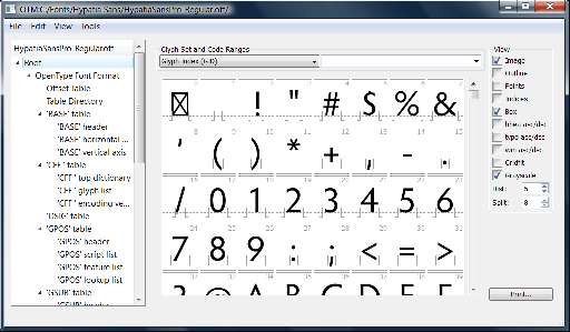
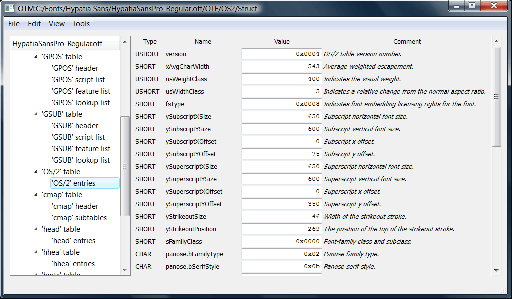
    Basically, OTMaster is a tool for cracking open and looking inside OpenType fonts (or plain old Windows  TrueType fonts). It shows a fairly literal/​direct representation of what’s in the various tables and subtables. It has a bit of unobtrusive interface and allows direct editing of various fields. This is an excellent tool for font geeks/​developers, but not really appropriate for the average end user of fonts.

    Here are a couple of screen shots (click on each for full size version):


    OT Master glyphs display
    OT Master glyphs display

    OT Master display of OS/​2 table
    OT Master OS/2 table

    Currently, if I want a simple and accurate representation of the contents of a TrueType or OpenType font, and possibly to edit the info, I have been using the wondrous open source TTX tool, which is based on the FontTools library. This dumps the font info to an XML text file, which can be viewed/​edited in any text editor or anything that can handle XML. It can also recompile the text file back into a font.  (In fairness, Adobe’s FDK for OpenType also has table dumping/​recompiling tools, just not quite as slick as TTX. Even Adobe folks often use TTX.)

    Why would I use either OTMaster or TTX instead of, say, FontLab Studio 5? FLS is a great program which I use a lot, but it interprets the OpenType font into its own internal format. It can’t open a font, make a tiny change and re-​save it as a font without potentially changing other things. To give a really concrete example, FLS displays font embedding settings in terms of its interpretation of the settings, rather than the actual bits. So if I’m looking at a font with a bogus/​illegal embedding setting, I can’t tell, because FontLab won’t show me that, it’ll just default to showing the end result as some legit setting instead. So tools like TTX or OTMaster are really handy for that, because they show the unvarnished truth of what’s in the font, without interpretation.

    The downside to tools like TTX and OTMaster is that they make little effort to tell you the meaning of the various cryptic values for various fields (or the exact meaning of the field itself), even when said values are legal/​legit. So you need to also have a copy of the OpenType or TrueType specification handy, and optionally a more descriptive, hand-​holding tool like FontLab Studio (though one must beware the possibility of it adding or reinterpreting data, as mentioned).

    Here’s the public announcement DTL made for OTMaster, on the ATypI mailing list (a great resource, and a major benefit of ATypI membership):

    The Dutch Type Library and URW++ Design & Development proudly present DTL OTMaster (OTM), a highly sophisticated application for reviewing, editing and saving tables of fonts with a snft file structure, as there are CFF and TTF flavored OpenType fonts, TrueType fonts and TrueType Collection fonts.

    Font editors, like for instance the DTL FontMaster suite, FontLab Studio and FontForge, rely on their own internal data formats for type design and font production. From these data, binary fonts for the end-​user are compiled as the last step in the font production process. OTM is a tool for inspecting and adjusting such binary fonts, irrespective of the font editor used for their creation.

    OTM makes the editing of tables possible from a graphical user interface. It comes with built-​in tools like the Glyph Editor for proofing and editing contours or even drawing glyphs from scratch. A ‘kern’ Table Viewer is available for proofing and refining the kerning, and a ‘GSUB’/’GPOS’ Viewer to visually test (and in case of GPOS also adjust) these OpenType Layout tables.

    DTL OTMaster was programmed in Hamburg, Germany at URW++ Design & Development, renowned for pioneering in the field of font technology development for more than thirty years. The FM Team (Dr. Juergen Willrodt, Axel Stoltenberg, Hartmut Schwarz, Peter Rosenfeld and Frank E. Blokland) was joined by Karsten Luecke as advisor and also author of the extensive and detailed OTM manual and Nikola Djurek for the design of the function icons.

    OTM is available for Mac OS X, Windows and Linux. Free Light versions are available for:

    The downloads also contain the OTM manual in PDF format.