Category: Font Production

  • Why Did Adobe Discontinue Font Chameleon in the 90s?

    Back in the mid to late 90s, Adobe acquired a company called Ares Software. Ares made font-​related software products, including doing the programming (but not owning or distributing) of Letraset FontStudio, which in its day was one of the best font editors. They are best known for a remarkable application and technology called Font Chameleon.

    There is a popular myth that Adobe bought Font Chameleon to kill a threatening technology. Actually, no, removing it from the market was not a motivation for the acquisition. The team that made fonts and would have cared one way or another had nothing to do with those decisions, and were simply not interested in Font Chameleon.

    Adobe’s purchase of Ares was done to acquire Font Chameleon technology, and was entirely driven by the PostScript group at Adobe, to use the technology for font compression purposes to fit more, cheaper, in the ROM of PostScript 3 printers. All Ares retail products (not just Font Chameleon) were discontinued as Adobe put the two Ares principals to work on adapting the Chameleon tech for Adobe’s use.

    (Also, Font Chameleon was in some respects massively more powerful than MM, but also had huge limitations. It could only handle the axes it knew about, and could only handle the characters it knew about.)

    I joined Adobe in mid-​1997, shortly after the acquisition, and thought it was an interesting tech. I ended up deeply involved in helping make the whole system work together (chameleon fonts in ROM including CE fonts, printer drivers, and supposedly matching fonts on end user computers). All the systems were optimized to make an individual piece work in a static environment, according to known schema. Real end-​to-​end testing of these things hadn’t really been needed in years. But because there were numerous technical changes being made at the same time to all these pieces, suddenly end-​to-​end testing was critical. I got involved in pointing that out and pushing everyone to make sure their pieces played together instead of them all trying to point at specs that had been made before any of the pieces actually existed. 

    Through some internal asking around at Adobe, I was able to get my hands on Ares’ Font Chameleon editor: the company’s internal tool used to make a Chameleon “font descriptor” that could be blended with others. These font descriptors as individual files were also super compact, which is why the PostScript team wanted the tech. They relied on a (large) mutatable “master” font , plus the descriptors; the master + descriptors for 136 PostScript 3 fonts were a LOT smaller than the set of fonts themselves, and allowed support for central European accented characters with hardly any size impact.

    What was super interesting to me was how insanely fast it was to create such a font descriptor—which could also be exported as a stand-​alone font if one wished, not to mention instantly manipulated in weight, width, x-​height, etcetera. At the time I thought it could have been an incredible rapid prototyping tool. With it I could do in a day what would otherwise take me weeks. But the limitations of the tech, and tendency to encourage some degree of blandification meant… nobody in a position of power and influence within the type group was interested. They had looked at it, and decided it had inferior results and wasn’t worth pursuing.

    It is also worth noting that the lead programmers from Ares were freakin’ brilliant, but the code was not entirely stable/​reliable. I certainly had quite a few crashes using the Chameleon editor—although to be fair, it was only intended as an internal app, not a retail/​external app.

    So, Font Chameleon died because the Adobe hardware team that bought it wanted it for underlying tech, and didn’t do retail software products. Whereas the team that did retail fonts had no interest in it, thought there were quality issues, and there was a general perception that maintaining/​developing any of the Ares products as retail software would have been painful.

  • Reliably Changing Versions of Fonts

    For people who design fonts, swapping versions of your font can be a problem, as your operating system or apps have font caches which may become confused when you replace your fonts on the fly. The app you are using a font in may sometimes still display/​use the old version, even though you replaced it! So for people who need to be absolutely sure they are getting the new version, here are some options. Note that latest versions of Adobe CC apps may recognize fonts swapped on the fly. Office 360 as well, at least on Windows. So if you are not having trouble, and you are swapping fonts some other way, good for you! But if you are having trouble, here are some more options.

    Here are some approaches for reliably swapping versions of fonts that have the same internal names, to new versions. This applies to both Mac and Windows, and across all apps as well. When working this way, as best as I recall, in the past 10–15 years, I have only hit font caching problems once! I suspect that was just a failure to apply my method religiously enough. There are two options for fonts with the same internal names on the desktop, plus to avoid the problem entirely, there is an approach to making font names unique, and some links to web-​based test sites.

    Option 1: Brute force (cross-​platform)

    1. Close apps that you are using the fonts in, particularly those which cache your fonts, including Adobe CC apps and Microsoft Office.
    2. Then, uninstall the “old” font version from your OS. Don’t just overwrite it in place with the new version! (If you are using a font management app, you can just deactivate, but I usually nuke them anyway, I don’t need 170 versions of the same font kicking around.)
    3. Relaunch those darn font-​caching apps, including Adobe CC apps and Microsoft Office. That’s after you uninstall the font. Even open a doc that uses the now-​missing font! This gives the app and its cache a chance to recognize the font is no longer there and update appropriately.
    4. Quit Office apps (without saving your docs, no need). Note: no need to quit Adobe CC apps, they can recognize newly-​installed fonts on the fly.
    5. Install your new font versions; or activate them in your font manager.
    6. If you are using Office apps with your fonts, you can launch them apps again and work normally.

    Option 2: FontNuke (Mac only)

    I forgot about this option for a while, but was reminded of it by James Montalbano in a thread on TypeDrawers. FontNuke is a Mac utility that clears font caches, and then reboots your system. It’s available through major utility aggregators like MacUpdate and CNet. I’ve used it occasionally, and it works fabulously. Downside: it requires a system restart. That’s why I ended up tending to go with Option 1. (Also, Mac restarts used to take longer than they do nowadays. Yay for SSDs!) Upside: if your system font caches have gotten messed up, or you don’t want to go through all the steps above, it becomes the simplest solution.

    Option 3: Font Naming Tricks (cross-​platform)

    Option 1 seem like too much freakin’ work? Or you need something that works on Windows, or reboots suck? I hear you. That’s why as a font designer, I sometimes work with a system where instead of keeping the internal names the same, I actually put the build version number right at the end of the gosh-​darned family name, so it shows in the menu with the version number. I also put it on the end of the file name. I leave it this way as long as possible during development. Sure, this has its limitations, as the new font won’t just automatically substitute for the old one in existing documents. And it has to be changed before releasing the font. But if I am in the midst of frequent font revisions, it also means I can swap out font versions constantly, as often as I like, and not worry in the least about my apps or OS getting confused. That is pretty sweet.

    1. Before generating the actual TTF or OTF font, increment a build number at the end of the font family name
    2. Remember that your existing docs won’t recognize this as being the same font family.  🙁  But you don’t have to worry about caching and conflicts! 🙂

    Option 4: Test in the browser instead

    If you don’t have to test in a desktop app, you can avoid a lot of grief! There are sites for testing fonts in a web browser. You can drag the font into a browser window and test it there. Impallari’s is great

    If you are doing browser-​based font testing—or font testing anywhere, really—with an incomplete character set, consider Miguel Sousa’s Adhesion Text to get useful words for test purposes. (Don’t miss the options for other languages, and more!) 

  • Why Variable Fonts Will Succeed

    Third time’s the charm? Why OpenType Font Variations (variable fonts) will likely succeed where predecessors failed.

    OK, this is kind of funny: a post I wrote in November 2016 that languished in my “drafts” afterwards when I was busy with work, waiting on illustrations/​graphics that I never did add. Just for fun, I’m going ahead and publishing it exactly as is, showing what I was thinking at the time, just after Variable Fonts were announced. The only other note I want to add is that if you want to play with variable fonts, check out Axis-​Praxis.

    OpenType 1.8 was announced in September, featuring variable fonts. In short, variable fonts allow for packaging an entire family of fonts in a single font file, using master designs and interpolating between them, on what are called “design axes.” The type designer who makes the font can use this for whatever they like, but varying weight or width are among the more common standard uses.

    What makes this exciting is that in a savvy environment, someone using the fonts can specify any in-​between variation they like, within the “design space” (dynamic range) covered by the font. So for example, in a font with weight and width axes, a user could dial in the precise degree of boldness and level of condensing or expansion they desire.

    Font families built as variable fonts are vastly more flexible than before, yet can use less file storage than traditional font families—vastly less if you have large, complex families with a ton of styles.

    More details:

    Which is all very well, but this kind of tech has been tried twice before: GX Variations (the basis of the new tech) from Apple, and Multiple Master from Adobe. Neither ever got very far. Why should this time be different?

    First, I will note that when it comes to traditional design, it is only when there is support for the designer/​user picking their own arbitrary instances from the design space of the font, rather than just relying on pre-​specified instances, is there a benefit to designers. This means that traditional desktop design/​authoring apps need to implement sliders or some user interface to reap the benefits of the technology (although this is not so much of an issue for the web).

    Second, the other benefit of variable fonts, more compact representation of large families, was barely noticed the first time out. But with web fonts being a big deal and file size a huge concern, this is a newly important benefit.

    So, right off the bat, it is clear that it is more work to make this work with desktop apps, and that the circumstances make the web benefit more and get easier adoption.

    Speaking of adoption, it is worth noting that neither all existing nor all future font families need to be delivered as variable fonts for the format to be useful and successful. It may always be a minority of fonts available, yet still be a success with strong niche use in some areas (such as web design).

    Why GX Variations Failed

    Apple introduced what is essentially the same tech back in 1991, as GX Variations, part of TrueType GX. While many other aspects of TrueType GX survived in varying degrees, I can’t even find a good list of GX Variations fonts. I know only three offhand: the OS-​supplied Skia GX (by Matthew Carter), the Monotype demo masterpiece Buffalo Gals (by Tom Rickner), and Adobe’s Tekton GX (by David Siegel).

    GX Variations, in its original instantiation, would have required apps to give up control of their line layout to Apple’s line layout engine. Of course, this would also mean that any such app would have been Mac-​only. Although there are certainly some Mac-​only design apps, the Mac-​only aspect meant that the relevant heavyweights of the era, Quark and Adobe, never supported it.

    Apple supported GX with font dev tools, but they were largely command-​line based and hardly designer-​friendly. None of the font editing tools of the era supported GX Variations, either.

    With only a tiny handful of demo fonts, no major app support, and no major font tool support, GX Variations has never seen much pickup.

    Why Multiple Master Failed

    Adobe developed their multiple master (MM) tech at the same time as Apple did GX Variations, but completely independently. MM is a slightly less sophisticated/​complicated version of the same concept as GX variations, handled as an extension to Adobe’s PostScript Type 1 format. The MM technology was even briefly (1996–98) incorporated in the original OpenType spec, although only for OpenType fonts with PostScript outlines.

    MM did a tad better than GX Variations in terms of real-​world use. There were 27 families offered by Adobe in the MM format, one by Monotype, and about eight free families from four different independent designers. Adobe also used MM internally in Acrobat’s font-​substitution technology. Illustrator added “sliders” for MM fonts, but only just before Adobe pulled the plug.

    And pull the plug, Adobe did, back in late 1998. Adobe was already moving away from Type 1 fonts, and they withdrew the MM functionality from OpenType. The then-​manager of the Adobe type group, Dan Mills, believed that OpenType adoption might be significantly hampered if we were telling people they had to support this major added complication in order to properly support OpenType. Plus, OpenType ally Microsoft had never been very enamored of MM and had no interest in the tech at the time. So, Adobe pulled the plug.

    Why didn’t MM get better traction before that? Well, it was an Adobe invention competing with a similar Apple technology. The folks on the Adobe font team failed to realize early enough how important it would be to actively evangelize this technology to Adobe’s own apps as well as outside apps, and devote real resources to that effort. Because Adobe apps competed with third party apps, this hindered Adobe outreach to third party app developers. And few others were involved and supporting MM, outside the Adobe type team: it was an Adobe thing.

    Axis-​based Fonts Behind the Scenes

    Although development of new MM fonts ceased around 1998, many type designers saw that axis-​based font technologies were very helpful in developing large families. Crude support in Fontographer followed by more sophisticated support in FontLab allowed type designers to use MM capabilities to design fonts. It is simply easier to design two weights and interpolate the rest, than to design three, six or ten weights separately. If one adds in width variations or other axes as well, that can further multiply the savings in design work. One doubts that Robert Slimbach would have designed 156 styles of Kepler individually!

    Even more sophisticated tools emerged in later years, such as Erik van Blokland’s Superpolator.

    As a result, even while MM and GX Variations died off, and only about three dozen families used those technologies, scores more families have since been developed using the exact same concepts—just upstream in the design process.

    Other Lessons

    Two other font technologies have launched later, and were informative in their own ways.

    The Microsoft/​Adobe collaboration on OpenType, which later widened further into an open standard, has done well and become the primary font standard for the future. Many choices made in that process reflected learning from the MM and GX history, and it shows.

    More recently, the addition of color font support to OpenType has been more disjointed; I blogged about that at some length, explaining how this served as a bit of a wake-​up call to the big players as far as the need to cooperate and collaborate on variable fonts.

    What’s Different with Variable Fonts

    Variable fonts are being backed from Day One by a much broader coalition than ever got behind MM or GX. The same four players who came up with four different solutions for color fonts are backing a unified approach to variable fonts. Apple, Microsoft, Adobe and Google made the initial announcement jointly (at ATypI 2016 in Warsaw), with representatives of all four companies on stage and presenting. Every one of the major players in type design tools and related utilities (including my company, FontLab) have already started implementing support, many of us having started that work before the announcement.

    Assuming Mozilla joins in, this stuff is just going to work in all the latest web browser versions in pretty short order.

    Because of the ongoing behind-​the-​scenes role of axis-​based fonts in development of regular fonts over the past 15-​20 years, many type designers already know how to design type families in this way, understand the flexibility and power inherent in variable fonts, and even already have existing type families that could be “relatively easily” re-​issued as variable fonts (with varying degrees of added work).

    There are no guarantees. The variable fonts story still has some weaknesses, notably around formatted text interchange, and of course with desktop app support for an interface to interact with the variability. But the odds are good of at least moderate success. The alliance supporting it is strong. There are significant benefits, albeit not as compelling as OpenType as a whole.

    Some Predictions

    • Variable fonts will see rapid adoption in a few very high-​impact and high-​visibility places, including as system fonts.
    • Variable fonts will take a little time to become popular or widespread on the web, but some sophisticated and design-​intensive web sites will love them.
    • Within three years, variable fonts will become a common format for many new fonts, particularly for large or sophisticated families from major foundries and high-​end boutique foundries. But for (at least) the next few years, the same families will usually be issued as static (non-​variable) fonts as well.
    • Success of variable fonts is partly dependent on app support. Thanks to subscription models for Creative Cloud and Microsoft Office (and live app updates for Google Docs), any support from apps will be rapidly seen by end users, but… these big companies tend to operate in fairly siloed ways. Cool though this tech is, it is unlikely to attract the attention that results in a top-​down dictate from on high that everyone in the company must support it. This means that the Adobe, Microsoft and Google fonts teams’ support for the fonts is no guarantee at all of front end app support by Creative Cloud, Microsoft Office or Google Docs. Such support, or the lack of it, will influence type foundries in their adoption.
    • Because Apple’s existing GX Variations represents a large subset of the variable fonts technology, system-​level and desktop app-​level support for variable fonts is likely easier for Apple than for just about anyone else. Yet I still won’t bet on how quickly Apple will support this in iWork (their Keynote, Pages, and Numbers apps).
    • Very few foundries, and no large ones, will release what Ben Blom calls “static variable fonts” that in essence prevent interpolation and work like a family of old static fonts while preventing user interpolation. It misses on the big advantage of variable fonts, which is the ability to pick arbitrary points in the design space. The sole advantage of such fonts is smaller file size, but potential (or actual) user confusion will cause most foundries and users to avoid this experiment.
    • Variable fonts will not be the majority of retail font revenue ten years from now. They will not completely displace static fonts any time soon, if ever.
  • The Lesson of Color Fonts for Variable Fonts

    Today’s announcement of variable fonts in OpenType 1.8 represents a renaissance of the functionality of multiple master and GX Variations capabilities in mainstream fonts. With the announcement made jointly by Microsoft, Google, Adobe and Apple, it also marks a surprising and new level of multi-​company cooperation in font standards, at a level I for one have never seen in my nearly two decades in fonts.

    The need for increased cooperation has been brought home in the past couple of years with the lurching and dispersed movement towards color fonts. The idea with color fonts is that there are uses for being able to spec multiple specific colors in the glyphs of a font, whether for colorful emoji or multi-​color letters. For color fonts, there were four different approaches that all deployed and are now in OpenType. Microsoft invented one, Apple another, Google a third, and Adobe plus Mozilla a fourth. One can debate the merits of each approach, but clearly developing them in isolation and putting four competing approaches into the OpenType spec has not helped the adoption of any or all of them. (Apple originally said their approach was only intended for internal use and did not submit it for OpenType standardization, but changed their mind and submitted it at the last minute for OpenType 1.8, so the spec just went from three to four color fonts approaches.)

    In the end, although developing separately allowed for the secrecy and control, it did not yield an ideal long-​term outcome. Sure, each vendor can make fonts that work in isolation in their environment, but it should come as no surprise that users and font creators have been slow to embrace these color font solutions that worked with only  platform and limited browsers.It seems clear that the decision-​makers and reps of the companies involved were at least somewhat chastened by this outcome. I believe this lesson helped inspire increased cooperation on variable fonts.


    More reading:

  • My massive page of type design info

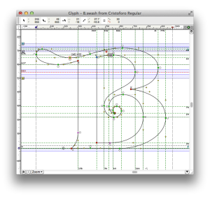
    Cristoforo swash B in FontLab Studio.
    Cristoforo swash B in FontLab Studio. (No, you probably wouldn’t show all these layers at once during normal work.)

    I just finished creating an organized  page of type design info and links. Enjoy!

  • More free FontLab encoding files for type designers

    Last week I wrote about posting five FontLab encoding files for Adobe Latin character sets.

    Today I posted in the same Github repository three FontLab encoding files for Adobe Cyrillic character sets, and updated the five Latin files with a few added currency symbols and glyph name changes (as I expected I might).

    The character set definitions underlying these files were built on a bunch of research I did at Adobe back in 2006–08, with additional work by Miguel Sousa. The headers include much detail on the differences between each set, and the languages covered. Both of these character sets reflect the latest data from Adobe on how they name glyphs and what they are including in current fonts (not including OpenType alternates and features, mind you). The headers of the files have some interesting details and history, especially on the Cyrillic side.

    Thanks as always to my old friends at Adobe, including Miguel and David Lemon, for their willingness to share production information with the type design community.

    I dedicate this post and my work on the Cyrillic encoding files to the memory of Emil Yakupov, CEO of the ParaType type foundry in Moscow, who passed away just a month ago at the age of 56. His advice and feedback on Cyrillic character sets—among many things—was invaluable to me. I remember one of our first meetings, when Emil gave me a pair of ParaType catalogs as I was first becoming involved with Cyrillic type design. I still consult them to this day when trying to internalize what forms different Cyrillic characters can take in different font styles.

    Also, Emil remembered by Adam Twardoch.

    Прощай, Эмиль.


  • Free FontLab Latin encoding files for type designers

    I just posted some free FontLab “.enc” encoding/​character set files for the five Adobe Latin character sets, in my Github repository.

    To install, quit FontLab, find the “Encoding” folder in the shared “FontLab” folder, and drop the files in there. Restart FontLab and these will be available as encodings.

    NOTE: These were later updated to reflect minor tweaks Adobe has made since I described the character sets and posted the data, almost six years ago. I added currency symbols such as the Indian rupee, Turkish lira, Russian ruble and Ukrainian hryvni, and changed a few glyph names to match current Adobe practice. Thanks as always to my old friends at Adobe, including Miguel and David Lemon, for their willingness to share production information with the type design community.

    This follows a couple of possibly-​useful FontLab scripts I posted a couple of weeks ago, in the same place.

  • Some free FontLab scripts for type designers

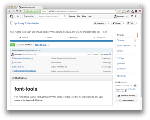
    I have started posting a few scripts in my own repository on GitHub. They are libre (free, open source) under an Apache 2.0 license.

    tphinney-github-repo

    • Generate-substitutions.py: Select some glyphs in the font window. Run the script. It will automatically generate useful OpenType feature code (in .fea/​AFDKO syntax) in the Output window, which you can copy/​paste right into the appropriate feature. The script works with both simple substitutions and ligatures as long as you follow standard Adobe glyph naming standards (appropriate use of period and underscore). It does not work with complex cases involving multiple-​feature interaction, sorry.
    • Make-numbers-from-dnom.py: First you need to create some numbers sized and positioned for use as denominators. The script will take all the glyphs in your font ending in “.dnom” and create numerator, superscript and subscript versions using the dnom glyphs as components. If the font is an italic font, it will use the italic angle of the font to calculate how much to shift the components horizontally while moving them vertically. NOTE: the vertical shifts are hardcoded in the script now, but easily edited. Future improvement ideas: pop up a dialog to enter the vertical shift numbers, and/​or try to auto-​calculate them.

    Unfortunately, my “best” (or at least most complicated) script is very specific to my workflow on developing my Cristoforo family (it does the steps detailed at the bottom of this blog post). It is a heavily modified version of Ben Kiel’s “Better Generate Font” script. I chose not to post it as the workflow is just so very peculiar to my needs and does things like put my license URLs in the font, but if you want it for some reason, perhaps as a starting point, ping me.


  • Overlapping Paths in Type Design

    One problem with releasing lots of pre-​release builds to my Kickstarter backers is that I don’t test every single one as much as I otherwise would. Generally any errors are minor, but earlier today I managed a moderately important one: I didn’t remove overlapping paths in my outlines during the build process. Well, actually, I did remove overlap, but as I did not first decompose my composite glyphs, it didn’t fix most of the problem cases.

    Why would you want to have overlapping paths in your glyph outlines, and why/​when would it be a problem?

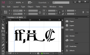
    Here are several glyphs (as shown by H. James Lucas) that had overlapping paths in this last build:

    image of overlapping paths in a font
    Overlapping paths rendering badly in Adobe InDesign

    So, clearly it’s a problem if they render badly in some apps. Interestingly, this is dependent on not only what is doing the font rendering, but also what size the glyphs are rendered at. Adobe’s core rendering engine has three or four different rendering modes, and what it picks is size-dependent.

    Overlapping paths are sort of okay in TrueType fonts—the rendering engines will deal with them better. But they will still produce bad results if a user does something like apply an outline or stroke to the text.

    So why do I leave these things in while developing the font? Well, during development, it is useful to keep the basic elements separate, and only remove overlap later on. So for example, if I change the underlying swash H glyph, I want the Swash-​H-​with-​bar to automatically pick that up. Similarly, the C shape seen in the colon currency symbol (used in Costa Rica and El Salvador) is shared between the Ghanaian cedi, the euro symbol, and a stylistic variant of the cap C. I used the same primitive elements in the ffj ligature in numerous other ligatures (including ffi). And so on.

    Of course, as leaving overlaps in the final font causes problems, normally I take care of this as part of each build. My  usual build sequence for creating OpenType OTF fonts from my FontLab file:

    • Create a “next version” and make sure version string has been correctly incremented (in several places), including in the file name itself.
    • With the current version of the file 
      • Remove all hinting (shift-​F7 in FontLab Studio 5 for Mac)
      • Select all glyphs in font (Cmd-​A in FLS)
      • Autohint all glyphs (F7 in FLS)
      • Save file
    • Then the following actions, done without saving the file again, to preserve original data in the FontLab file: 
      • Decompose all composite glyphs
      • Remove overlap (Cmd-​F10 in FLS)
      • Export OTF font (Cmd-​Opt-​G in FLS) with correct version number in the file name
      • Change license URL string to point at the personal license
      • Export OTF font again with “-NC” (non-​commercial) in the file name, in addition to the version number
      • Close font without saving file

    Anyhow, in this particular build I missed the “decompose” step, so all overlaps involving composite glyphs (most of them) still overlapping. Of course I have fixed this, and am sending revised fonts to my backers.

  • On Kerning (and Spacing) Fonts

    Adding kerning is one of the very most tedious tasks in developing a font, if it is done well. It is also the final major production task in type design.

    As I am finishing this stage on the Regular style of my Kickstarter typeface Cristoforo, and about to send updated fonts to my backers, I find myself needing to explain what this kerning business is, anyway. So I thought I would post something here for general public consumption, and point to it from my latest Kickstarter update.

    In fonts, each glyph is placed in a slot with a certain amount of space allocated to it, which generally includes white space on either side. The total horizontal space allocated to a glyph is its “advance width.” The distances between the furthest extent of each side of the glyph and the ends of the allocated space are the “sidebearings”—which can even be negative numbers, if part of a glyph sticks into a neighboring space.

    In high-​end type design, spacing is an especially complex art and craft. But many junk fonts don’t even get the basics right, and that is easily detected. Decent spacing is consistent, and follows certain general principles about shapes. Consistency means the “same” elements should get the same space across different glyphs, and similar elements spaced similarly. So the left sidebearings of OCGQ and the right sidebearing of D are all usually either the same or very close.

    Designing even spacing is about keeping a relatively consistent amount of white space between letters. In a typical sans serif font, a letter like O only needs 50–60% as much in the way of sidebearings as an H. Something like a T or a V might have sidebearings at or close to zero. Lowercase letters are generally spaced slightly closer than their cap brethren.

    picture of bad spacing
    Inconsistent treatment of sidebearings makes this geometric sans serif typeface less useful. (click for full-​res image)

    Passable spacing image
    Consistent and reasonable (if uninspired) spacing in a sans serif font. (Click for full-​res image.)

    ADDED: Here is a video tutorial I did on spacing.


    Kerning

    The word “kerning” can refer to any of three things:

    1. noun: data in a font that adjusts spacing for particular letter combinations.
    2. verb: the act of creating such data
    3. verb: when setting text, the act of adjusting space between particular letters in text. This is an operation done by a typesetter in text setting software, and is not a font editing operation. Also, not to be confused with tracking, which is adjusting the overall spacing of a block or range of text all at once.

    For purposes of this article, I’m concerned with the first two definitions: kerning data built into fonts, and how to create that data. We’ll get to the “how” later, first let’s talk about the “what.”

    It’s critical that the basic spacing be done well in any font, but for particularly difficult combinations, the font should also contain built-​in kerning (which can help avoid the need for the end user to do manual kerning). Kerning is a set of adjustments to the default spacing for specific troublesome letter combinations, so as to deal with fact that, without intervention, “AV” will be set too far apart, or that in some fonts “f)” will make the top terminal of the f collide with the parenthesis. Vast amounts of kerning are not always a necessity for a well-​made font, but if there is no kerning, or if it does not deal with common situations like “LT” and “To”. . . then there is something wrong.


    Making Kerning

    In the “old days” prior to about 10–15 years ago, kerning was done by defining pairs and adjusting the spacing. So combinations such as To and Te would be separate pairs, as would VA and WA. This was a pain, but still manageable as long as fonts still only have <256 glyphs per font, although some would end up with thousands of kerning pairs, and some apps would break (in different and interesting ways) when working with very large amounts of kerning data.

    But it is not unusual for an OpenType font to have a thousand glyphs or more. Cristoforo Regular has 1324 glyphs now. Luckily, OpenType allows for “class kerning,” in which glyphs can be grouped into classes, and then the classes are kerned instead of individual glyphs.

    So the first thing to do is to define those kerning classes! I spent days on and off just doing that for Cristoforo Regular. Some of them only apply when the class is on the left, some when the class is on the right, and a few apply to either side. I had 96 kerning classes before I started kerning. I made a few additions and deletions during the process, and am sitting with 101 right now, with 632 distinct adjustments between classes (the class equivalent of “kern pairs”). Probably a week or more of work, if it was full time.

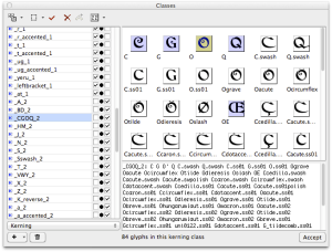
    Here’s the display of classes in FontLab Studio 5.1.4. Most of my classes for Cristoforo have anywhere from 4–30 glyphs, but some have just one or two, and the largest has 84.

    Kerning class definition in FontLab Studio 5.2 (image)
    The left listing has all the classes, along with whether they are left side, right side, or both. The selected class is a left side class, composed of capital letters with round left sides, such as CGOQ. (Click for full size image.)

    Getting the class definitions right is critical. If a glyph is missed out, it doesn’t get kerned. If a glyph appears in two left-​side or two right-​side classes, it causes an error that means that a bunch of the kerning will never be applied when the font is used. (FontLab Studio warns appropriately, but debugging can take a while.)

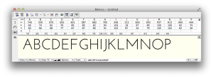
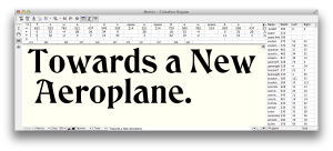
    Here is how the spacing can be viewed with arbitrary strings of text in the metrics window. At the moment the effect of kerning is not being shown.

    unkerned text image
    FontLab Studio metrics window showing advance widths and sidebearings for unkerned text. (Click for full size image.)

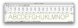
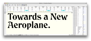
    Below you can see the same text only with kerning applied.

    Kerned text
    Effects of kerning are shown. The metrics listing above the text only shows those pairs for which both members are considered the primary exemplar; other combinations are often kerned as a result of class membership. (Click for full size image.)

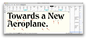
    The next version, below, highlights the points where kerning is happening. Mostly kerning makes the combinations closer together, except the “e.” combination, where the period has to be moved a smidge further away.

    Kerned text annotated
    FontLab Studio metrics window showing advance widths and sidebearings for unkerned text. (click for full size)


    Application Support

    Most graphics and publishing apps simply use the kerning data in the font by default. You have to do something special to avoid it or get different results. This is true of Photoshop, InDesign, Illustrator, and QuarkXPress.

    The Adobe apps refer to the kerning built into the font as “Metrics” kerning, as opposed to no kerning or Adobe’s automatic “Optical” kerning. In a well-​made font Metrics kerning produces the best results, but even then Optical kerning can be handy for combinations the type designer missed, or situations that can’t be handled by kerning built into the font (such as kerning between different font sizes or two entirely distinct fonts).

    Even WordPerfect, back around 1990, had kerning on by default, if I remember correctly. But not Microsoft Office.

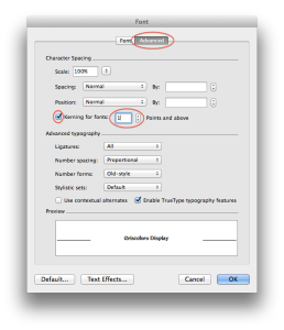
    Microsoft Word has allowed you to turn on kerning pretty much forever, it just defaults to being off. To turn it on, in recent versions, go to Format > Font or hit Ctrl-​D (Cmd-​D on Mac). You’ll get a big dialog. Select the “Advanced” tab.

    Then in the top “Character Spacing” section, check the box that says “Kerning for Fonts.” The default is to set kerning on for 12 point and above, but you can reduce it—I generally set it to 1 point because I want kerning on all the time. Unless I am writing an article about kerning I never want it off.

    Word kerning dialog
    Kerning dialog in Microsoft Word 2011 for Mac (Word 2010 for Windows is similar)

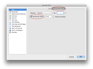
    PowerPoint has more recently started supporting kerning. In more recent versions, go to Format > Font or hit Ctrl-​T (Cmd-​T on Mac). In the resulting dialog select the “Character Spacing” tab. Then check the “Kerning for fonts” option.

    PowerPoint kerning dialog
    Kerning dialog in Microsoft PowerPoint 2011 for Mac (PowerPoint 2010 for Windows is similar)

    So that’s all you need to know to use and appreciate kerning!

    NOTE: About 1/​4 of the text of this post is borrowed from my article “Know If a font Sucks,” currently in press for the March–April issue of Communication Arts.