Category: Cristoforo

  • Font Production & Type Design Intern Wanted

    [Updated June 1 & May 29 on deadline and minor details, May 26 on time/​duties/​pay, previously May 6 on funding chances, possibility of part-​time, clarified total working hours, and discussed what will happen if the Kickstarter campaign fails.]

    General

    Deadline for applications: 2 pm PST, Saturday June 2nd. (Though earlier is better, interviewing the week of May 29th.)

    I’m looking for a type design intern, probably just for the summer, though I’m open to a longer period. This will be an unpaid position, but with an unusually good ratio of learning-​plus-​even-​working-​on-​your-​own-​projects to ruthless exploitation. The duties of the position will be dependent on the success of the Kickstarter funding campaign for the Cristoforo typeface. I expect the project will be funded, but without enough money for a stipend. Assume it’s unpaid and you won’t be disappointed.

    If the Kickstarter campaign fails? I am still considering that. I may still proceed to work on the typeface just to get it done. It’s nice to finish things. That would eliminate most of the graphic design work in the position, as that was all for the “rewards” for Kickstarter backers. I might still do the desktop wallpapers, and just maybe digitally printed T-​shirts. It would also make a part-​time situation make more sense, with less total work and less time pressure involved.

    Details

    I’m located in Portland, Oregon. Helpful if you are too, or willing to relocate for the summer.

    I’m open to negotiation, but as a starting point, I envision this position as roughly equal parts of the following areas of work:

    • Helping me with font production on Cristoforo (in process) and especially Cristoforo Italic (not even started). There is room for some actual type design here.
    • Helping create and deliver the rewards for the Cristoforo Kickstarter project (t-​shirt, poster, 3 desktop designs; taking the lead on design, if possible)
    • Reading suggested books from my substantial library on typography and type design. Expect to read at least one book every week, more if possible.
    • Working on your own type design project(s) much as you would if you were doing a University course
    • Receiving direct type design instruction as well as detailed and constructive feedback and critiques from me on your work, both on your own type design project and your help on Cristoforo

    I initially viewed this as totaling a full-​time position, but I had concerns that I will have enough work to keep my intern busy, given the limitations on my own time. Part-​time is more plausible, maybe 15-​25 hours a week. Mind you, it depends on how much you can do on your own type design as well.

    The position will start in June. It could be remote initially if you are coming out later.

    Salary is unlikely. If the Kickstarter campaign exceeds its funding target, then half the excess will go to my intern. It probably won’t be much, but I am hopeful the fringe benefits will compensate.

    If you are working with me in Portland, you would likely be spending a significant amount of time in the finished basement of my home, in a small office area. (Perhaps not my existing home office space, we might take over the storage area for more space!) You’ll have a 24 monitor to work with, and if you don’t have your own laptop I will provide a Windows laptop to use with the monitor. We could also meet elsewhere, as long as it is not too distant from my SE location.

    I do not discriminate on the basis of age, race, gender/​identification, sexual orientation, national origin, etc. If you do, we might not be the best match.

    Requirements:

    • Obsessive, detail-​oriented personality
    • Strong ability to follow through and finish lengthy projects
    • Comfortable and able to both work substantially independently (for your own type design) and with considerable guidance/​interference/​supervision (on Cristoforo and possibly on the Kickstarter rewards).
    • Some background in typography and graphic design
    • Quick learner
    • Very good English reading skills or ability to put in extra hours to make up for it
    • Fair spoken English communication skills
    • Solid computer skills. I am happy to teach type design and font production, but you need to be good on a computer already
    • Either bring your own laptop or be happy working on Windows
    • Be really sharp—brainpower is good.
    • Able to work evenings and especially weekends. That’s when I’m free—though much work could also be done during weekdays when I’m busy at my day job. I am not talking about working more than 40 hours a week, it is a question of when we meet and work together.

    Highly Desirable:

    • Able to relocate to Portland, at least for the summer. If not, we’d be doing a bunch of work by Skype and email and such. But a local (or relocatable) candidate would be preferred.
    • Substantial graphic design skill/​experience, able to take the lead in designing the poster, t-​shirt, and desktop designs called  for by the Kickstarter project. BFA in design, or working on a BFA, or equivalent experience, would be great.
    • Do not require a special visa to work in the USA, or are willing to work for free. I am not inclined to deal with US visa/​immigration bureaucracy unless you are an extraordinary candidate (in which case you ought to be getting paid more than I can afford to pay you!)

    Bonus Points For:

    • Quite comfortable with both Mac and Windows. I go both ways and my main box right now is a Mac.
    • Have your own laptop to bring with you
    • Have done noticeable reading or have real experience relating to type design
    • Have some familiarity with FontLab Studio or other font development software (CorelDraw does not count)
    • Experience with screen printing and/​or letterpress printing
    • Being a geeky intellectual type

    Next Steps:

    Submit a resume, write-​up, or whatever you like. References appreciated! Samples of, or links to, your previous work would be great, especially anything that shows your attention to detail and ability to complete long projects. If you have done any type design or font production, I’d like to see the actual font file, along with any comments you have on things you think are good and things that you know need work.

    My email address is tphinney and the domain is cal.berkeley.edu.
  • Cristoforo: back my new crowd-​funded typeface

    Cristoforo promo image

    [UPDATE 26 May 2012: The first try didn’t quite make it, so I revised the reward structure and re-​launched! Link now points to the revised project.]

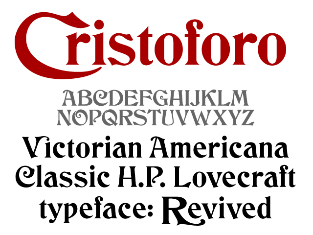
    Yes, I’m starting a Kickstarter campaign to find backers for my new typeface, Cristoforo, a revival of some classic Victorian typefaces by Hermann Ihlenburg. It’s also known as the typeface of Call of Cthulhu (the H.P. Lovecraft roleplaying game), and as the original logo for Cracker Jack. The campaign will only last until midnight on Saturday May 19 [revised: June 17], which is 26 days from now. Basically, people pledge money up front for the fonts (and other goodies) so I know the project is viable. Reward options for backers depend on their funding level, and include not only the fonts, but computer desktop wallpaper, postcards, T-​shirts and posters.

    Kickstarter is all or nothing. Only if the total pledges exceed the minimum funding target are people’s credit cards charged and the project moves forward.

    If funding exceeds the minimum by enough of a margin, I can add more language support for central/​eastern Europe (including Cyrillic), and even pay an intern!

    Check it out!

  • Cristoforo: looking for American Italic

    American Italic 2 med res
    American Italic 2 med res
    American Italic 1 med res
    American Italic 1 med res

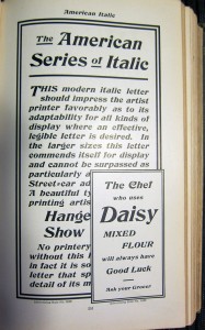
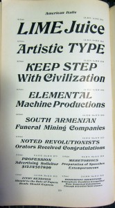
    As mentioned previously, I’m working on a revival of the Hermann Ihlenburg typeface Columbus (1892, MacKellar, Smiths & Jordan /​ American Type Founders), under the name Cristoforo. But now I’m looking for samples of its differently-​named italic companion, American Italic (Hermann Ihlenburg, American Type Founders, 1902). I have two from the ATF 1906 specimen book, shown at right. But neither shows a complete character set at a reasonable size. If anyone has the actual metal typeface, especially in a medium to large size, I would love to get a full specimen. Or, if you have a printed sample showing all or most characters at a largish size, that would also be great!

    [Update April 21/​22: Just got some great pics from Jackson Cavanaugh (Okay Type), showing the relevant pages from the ATF 1899, 1900, and 1903 specimen books! Amelia Hugill-​Fontanel at the Cary Library is also digging into it. I am still thinking about scans, but the pics are a fab start. I am already in good shape for Columbus Initials, the swash caps font. I’d love to hear from anybody who has metal type for any of these faces!]

    Columbus charset showing
    Columbus charset showing

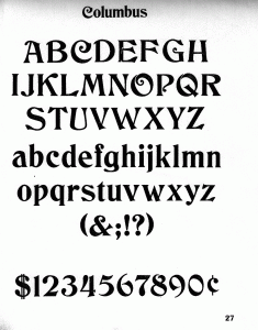
    I’m already in decent shape for a sample of the upright version of Columbus, unless it turns out the full typeface has more characters?

    Click on any image for a larger version.

    Watch this space for news on the related Kickstarter campaign coming in a few days! Get in touch if you would like a sneak preview.  [UPDATE 23 April 2012: I am now funding development of this typeface on Kickstarter! Deadline is May 19.]

  • Cristoforo: Reviving Columbus and font quality

    Many years ago, the very first digital font I ever worked on was a version of Hermann Ihlenburg‘s 1892 typeface Columbus, for American Type Founders. I had an interest in it because it was used in the logotype for the Call of Cthulhu roleplaying game, which I had long enjoyed. I never did anything serious with it, both because I did my revival by eye without benefit of scans or good quality originals, and because I didn’t know what I was doing back then. [UPDATE: I funded this typeface on Kickstarter in mid-​2012! As of Feb 2013 backers have received pre-​release versions of the regular and italic, but they are not “done.”]

    Type specimen
    Specimen — click for higher-​res sample

    Ihlenburg is pretty darn obscure, btw. He had the misfortune to be prolific back in the late 19th century, when type designers got very little recognition, and typefaces were just starting to be given unique names. The main available info about him is in a 1993 article David Pankow wrote about Ihlenburg for the American Printing History Association’s journal, on the occasion of an archive of Ihlenberg material being assimilated by the Cary library at RIT (Pankow was then curator of the Cary, and editor of the APHA journal).

    Fast forward almost 20 years to 2010-​11. While unpacking some boxes, I ran into some photocopies I had made of some good quality type specimens of Columbus, from early ATF specimen books. This was handy, because the earliest ATF book I have is about 1906, and the design had already been dropped by then. A quick search online verified that nobody had done a decent digital version yet. There’s a free version called by its original name, Columbus, by a fellow named Sam Wang, and an $18 commercial font called Beaumarchais from Scriptorium that is particularly awful, worse then the free font. Each has about 100 glyphs.

    So I’ve been working on and off on doing a better version from digitized scans. It’s not “done” exactly, but it is already a whole lot better than either of the other versions currently available. I’m still tuning spacing and additional glyphs. I plan about 260 total glyphs, of which about 106 are in good shape right now, including alternate swash caps, which were not done in the previous digital revivals. I am using my old typeface as a placeholder and replacing glyphs as I fix them up.

    I did a little bit of work on this font during the type busking at TypeCon New Orleans, and got some good feedback on the eszett and the spacing while I was there (thanks to Gary Munch et al).

    I can’t call it Columbus, however: ATF’s trademark lapsed, and Monotype trademarked the same name for a 1992 Patricia Saunders typeface (celebrating the 500th anniversary of Columbus’ famous arrival, while Ihlenburg’s typeface was so named for the 400th anniversary). My previous attempt had for a while been called “Columbine” but that has taken some unfortunate connotations, so for now I’m calling it “Cristoforo,” after the sailor’s first name.

    I’m still not sure what I’ll do with it. For now I am licensing it on special one-​off terms to a very small handful of companies doing material related to the Call of Cthulhu roleplaying game. Maybe I’ll do a commercial release at some point, who knows?

    Here are samples of my work-​in-​progress and its nominal competitors. I’ll leave telling which is which as an exercise for the viewer—make your guess before you hover your cursor over the images, or read the comments.

    Font 1 sample

    Font 2 sample\

    Font 3 sample