Author: Thomas Phinney

  • Ordering the Glyph Panel

    I seem to be getting addicted to surveys! Now that I’ve reported the results of the last one, I have some quick UI questions about apps and OSes here.

    In Adobe InDesign, there’s a Glyph Panel that allows you to view all the glyphs in a font, and insert ay glyph into your text. Prior to InDesign CS3, the glyphs were displayed in the same physical order they happen to be stored in the font (GID/​CID order). In InDesign CS3 and later, the default is to display them in Unicode order, though one can optionally change to Unicode order. Either way, one can also filter to display only specific Unicode ranges such as Latin Extended B or Cyrillic.

    Operating systems and font management applications sometimes have similar functionality. I’m doing a brief survey about what you’d like to see.

    Thanks! I’ll be happy to report the survey results when I’m done, as usual.

  • Font terms survey results

    I had 315 respondents before I closed off my survey on font terms. In general, the results were along the same lines I would have quessed, but less strong/​clear in many areas, and there were a couple of surprises.

    (On a side note, I am currently recovering from jaw surgery this past Monday. The surgeon cut through my jaw in three places, and also removed three wisdom teeth. So I’m a wee bit sore….)

    SUMMARY

    There is no consensus, but the overall opinion is that in today’s world of digital typography “a typeface” means the general design, including all its styles, regardless of how it’s instantiated, while “a font” means a single style of a typeface, such as Myriad bold condensed italic, in a specific file format.

    This is the same usage I prefer, but I’ll point out that there are some smart people who are prominent typographers who disagree. However, they’re in the minority, even among type industry professionals (which I will sometimes refer to as just “industry” in the results).

    There doesn’t seem to be any single preferred terminology for indicating a “superfamily,” which might contain related typefaces, such as Stone Serif and Stone Sans.

    The most popular term for a family of only up to four linked font styles, including bold and italic, seems to be simply “family,” to my surprise.

    The painful details below are probably only of interest to hard-​core font geeks, and while writing it up I wondered if I was perhaps getting a little too detailed….

    ANALYSIS

    I used features of SurveyMonkey to do such things as randomize the order in which different answer options were shown from one user to the next, to avoid any systematic bias due to presentation order.

    I analyzed the differences between groups looking at both font expertise and geography (questions 8 and 9). Geography rarely made a significant difference in results, but level of font expertise often did.

    (Sorry this analysis has taken so long, I’ve been remarkably busy with other things lately, such as being diagnosed with diabetes and getting a new job. I expect to remain pretty busy for the next couple of months, so my blog posts may be few for a while.)

    SEE FOR YOURSELF

    You can see the survey results yourself, as aggregate results in simple charts on SurveyMonkey.

    You can also look at these PDFs I made of the results. Sorry about the lousy page breaks in them, but they retain the formatting of the SurveyMonkey HTML version, and show the various filters I applied:

    In general, I didn’t find much interesting difference by geography, and the differences by expertise seemed to be on a fairly linear scale. That is to say, the more “advanced users” were always in between the industry professionals and the regular graphic designers in their take on any given issue. I was most interested in the opinion of industry pros, but if this differed a lot from more common usage, that was interesting, too.

    ANALYSIS

    I report below on each question, and commenting when some particular sub-group(s) answered that question significantly differently than the average. I analyzed results by level of font expertise, and by geography.
    Question 1

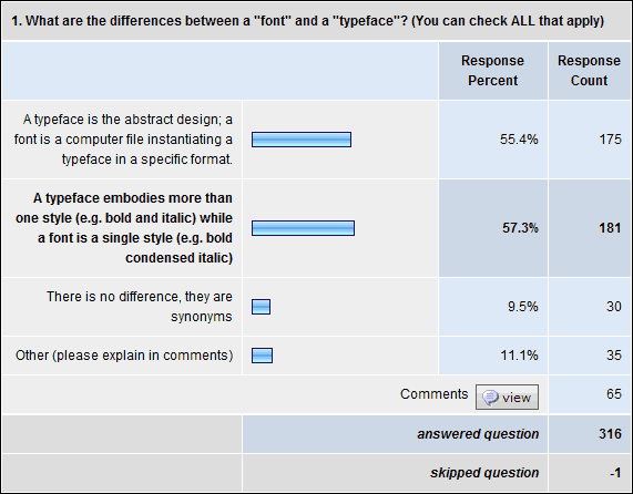
    Q1. What are the differences between a “font” and a “typeface”? (You can check ALL that apply)

    • 57% say “a typeface embodies more than one style (e.g. bold and italic) while a font is a single style (e.g. bold condensed italic)”
    • 55% say “a typeface is the abstract design; a font is a computer file instantiating a typeface in a specific format”
    • 11% say for “other” and made comments
    • 9.5% say “there is no difference, they are synonyms”

    With increasing expertise, people were much more likely to pick the “abstract design” option and somewhat less likely to go for “more than one style.” Type industry professionals went 73%/48% on these, while average users went 46%/63%, differences of 27% and 15%, respectively.

    Given the industry expert responses on question 2, I think one key issue here was that a typeface can have more than one style, but doesn’t necessarily. The other key thing is that there is much more consensus around the definition of “font” than the definition of “typeface.”
    Question 2

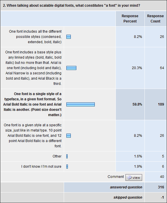
    Q2. When talking about scalable digital fonts, what constitutes “a font” in your mind?
    • 60% went for “One font is a single style of a
      typeface, in a given font format. So Arial Bold Italic is one font and Arial Italic is another. (Point size doesn’t matter.)” That went up to 85% for font industry professionals.
    • 20% went for “One font includes a base style plus any linked styles (bold, italic, bold italic) but no more than that. Arial is one font (including bold and italic), Arial Narrow is a second (including bold and italic), and Arial Black is a third.” Only 5% of industry professionals said this.
    • 8% say “one font includes all the different possible styles (condensed, extended, bold, italic)” (4% of industry professionals)
    • 8% wanted the extra specificity of size being included, the traditional definition from metal type: “One font is a given style at a specific size, just like in metal type. 10 point Arial Bold Italic is one font, and 12 point Arial Bold Italic is a different font.” Interestingly, only 4% of industry pros picked this.
    • 2% each went for “other” or “don’t know /​ not sure”

    Question 3

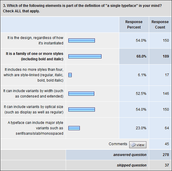
    Q3. Which of the following elements is part of the definition of “a single typeface” in your mind? Check ALL that apply.
    • 68% say “It is a family of one or more styles (including bold and italic)” (64% of industry pros)
    • 54% say “It is the design, regardless of how it’s instantiated” (62% of industry)
    • 54% say “It can include variants by optical size (such as display as well as regular)”
    • 52.5% say “It can include variants by width (such as condensed and extended)” (48% of industry)
    • 23% say “A typeface can include major style variants such as serif/​sans/​slab/​monospaced” (17% of industry)
    • 6% say “It includes no more styles than four, which are style-​linked (regular, italic, bold, bold italic)”

    Question 4

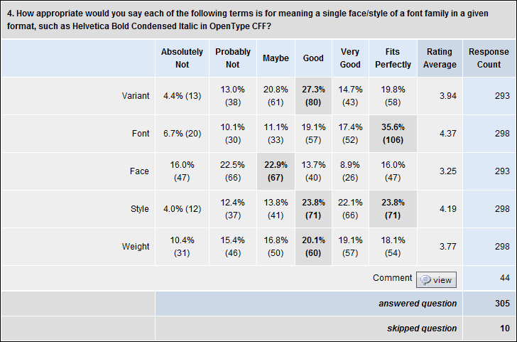
    Q4. How appropriate would you say each of the following terms is for meaning a single face/​style of a font family in a given format, such as Helvetica Bold Condensed Italic in OpenType CFF?

    Available responses ranged from “Absolutely Not” (1) to “Fits Perfectly” (6). So for each term, one can give the average rating on this 1-​6 scale, as well as percentages who gave each specific rating.
    • Font” was the highest rated at 4.4 on average, with 36% saying it “fits perfectly.” This dominance was greater with industry pros, at 4.7 and 45%.
    • Style” was rated 4.2 on average, with 24% saying it “fits perfectly” (just as many said it was a “very good” or “good” option). It tied with “variant” for having the fewest people hating it at 4%.
    • Variant” was rated 3.9 on average, with 20% saying it “fits perfectly” (27% said it was a “good” option)
    • Weight” was rated 3.8 on average, with 18% saying it “fits perfectly” (20% said it was a “good” option). Industry gave this a 3.5 on average
    • Face” was rated 3.3 on average, with 16% saying it “fits perfectly” (and 23% saying “maybe”). Industry gave it a 3.1.

    Question 5

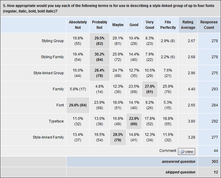
    Q5. How appropriate would you say each of the following terms is for use in describing a style-​linked group of up to four fonts (regular, italic, bold, bold italic)?

    Same response options as above, yielding the same 6-​point scale equivalent.

    • Family” came out on top with a 4.4 average, which surprised me. I’ve always thought the term better suited to a broader group, perhaps a synonym for “typeface.” But I may need to broaden my thinking.
    • Typeface” got 3.8 on average for this (3.4 from industry), which also surprised me because it was higher than I expected. Seems to me that industry agrees that “typeface” is broader than this, but too many people think of typefaces as only having four members.
    • Style-​linked Family” got 3.3 on average (but 3.7 from industry). I have previously gone with “style-​linked group” but I think I’ll adopt this instead. It’s the most popular term which is still unambiguous.
    • Style-​linked Group” got 3.0 on average. This is the term I have previously used.
    • Styling Group,” “Styling Family” and “Font” all got 2.7 on average, which is below the midpoint (and even lower from industry, with 2.5, 2.3 and 1.9, respectively). Adam Twardoch recently invented “styling group” to be his preferred term for FontLab tutorials, which is why I put it in the survey. I don’t think I would suggest sticking with it, though.

    Question 6

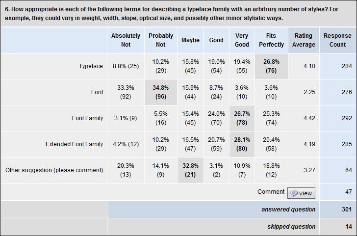
    Q6. How appropriate is each of the following terms for describing a typeface family with an arbitrary number of styles? For example, they could vary in weight, width, slope, optical size, and possibly other minor stylistic ways.

    Same response options as above, yielding the same 6-​point scale equivalent.

    • Font Family” got a 4.4. I have long considered this a synonym for “typeface,” and may start using it more.
    • Extended Font Family” got a 4.2.
    • Typeface” got a 4.1.
    • Font” got 2.25 (the surprising part for me was that 4% of respondents thought it “fits perfectly”!)

    Question 7

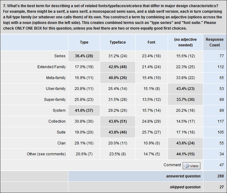
    Q7. What’s the best term for describing a set of related fonts/​typefaces/​etcetera that differ in major design characteristics? For example, there might be a serif, a sans serif, a monospaced semi-​sans, and a slab serif version, each in turn comprising a full type family (or whatever one calls them) of its own. You construct a term by combining an adjective (options across the top) with a noun (options down the left side). This creates combined terms such as “type series” and “font suite.” Please check ONLY ONE BOX for this question, unless you feel there are two or more equally good first choices.

    i sort of threw this question in to attempt to explore the question, and maybe narrow the range of reasonable options a bit.

    Collection,” “Extended Family,” and “Suite” were the most popular main terms, with optionally sticking in “Typeface” as in “Typeface Collection,” “Extended Typeface Family” and “Typeface Suite.”

    Personally I prefer “Type” as an adjective if one is to be used at all, but that was only popular in conjunction with second-​tier popularity terms such as “Type System” and “Type Series.” (The other second-​tier term was “Super-​family” which was most popular with no qualifier at all, or with “Typeface.”)

    I don’t really get why anybody would want to put “Typeface” and “Family” in the same term. It seems redundant to me.

    Other terms ranked much lower, including “Type Series,” “Typeface Meta-​family,” “Clan” and “Uber-​family.”

    Question 8

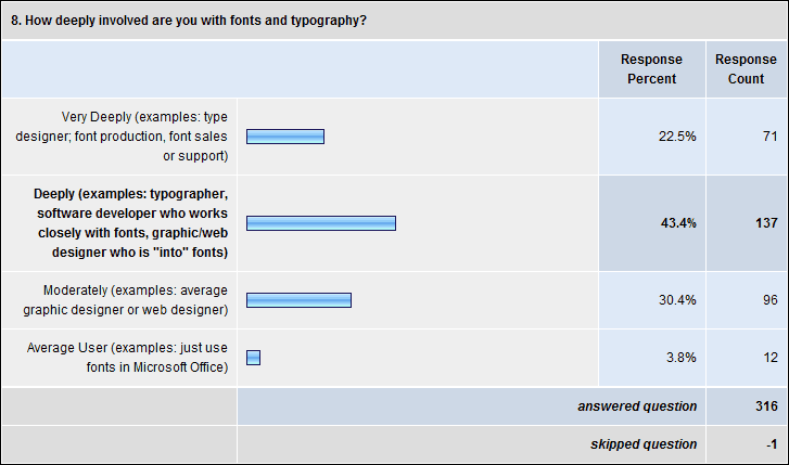
    Q8. How deeply involved are you with fonts and typography?

    • 22.5% Very Deeply (examples: type designer; font production, font sales or support)
    • 43% Deeply (examples: typographer, software developer who works closely with fonts, graphic/​web designer who is “into” fonts)
    • 30% Moderately (examples: average graphic designer or web designer)
    • 4% Average (example: just use fonts in Microsoft Office)

    Q9. Where are you from, and where do you live?

    (Update: I deleted the chart version of this, because SurveyMonkey really made a mess of what it did with percentages. But the results are….)

    Mostly educated in:

    • 59% USA/​Canada
    • 30% Western Europe
    • 4% Central or Eastern Europe
    • 4% Australia /​ New Zealand
    • 5% elsewhere

    (Adds up to more than 100% because some people checked more one location, and because of rounding.)

    Live:

    • 59% USA/​Canada
    • 28% Western Europe
    • 4% Central or Eastern Europe
    • 4% Australia /​ New Zealand
    • 5% elsewhere

    Almost identical to the results for “educated.”

    [Post updated 8 April 2009 to correct a couple of minor transcription errors. These did not materially effect the results, being differences of 0.5% and 1.5%. – T]
    [Post formatting updated 3 May 2011 to work better with current CSS template.]

  • Battlestar Helvetica

    Check out this short (33-​second) clip from YouTube.

    My colleague Si Daniels at Microsoft actually had a Battlestar Helvetica t-​shirt made a year and a half ago, about 40 copies or something like that. But I think the video is brand new.

    Yes, those promised survey results are in the works. I’m 95% done, but I have jaw surgery tomorrow, so it may be several more days.

    ADDENDUM: My assumption is that the video maker might have seen or heard of Si’s shirts, but that they the video was probably not done by Si or his immediate colleagues. The MS folks did a nicer job on the logo than the one seen at the end of the video.

  • Spring/​summer 2009 speaking

    I have a few talks coming up in the next little while. Currently planned:

    WorldWare Conference, 17-​19 March 2009, Santa Clara, CA
    Font Handling in Multilingual Software
    Um, well, yes, this talk is today. Fonts are a critical part of making software world-​ready, and applications must test with the right fonts. Various font formats take different paths to dealing (or not dealing) with the needs of the world’s languages. Operating systems offer varying levels of support for the different formats. Learn how to navigate and escape this maze!
    45 min

    Justified West Conference, 25 April 2009, Vancouver, BC, Canada

    Justified West 2009 Conference poster image—click for higher-​res version

    To register, phone 604-​323-​5322. Email Dr Shelley Gruendler for more info
    Forensic Typography
    Thomas Phinney discusses and shows cases of forged documents and other typographic investigations he’s been asked to investigate, from a
    father’s will to the NFL’s Pro Football Hall of Fame, to the US
    presidency. Learn how choices of fonts, typography and output devices
    have ruined perfectly good forgeries.
    30 min


    HOW Design Conference, 24-​27 June 2009, Austin, Texas
    10 Things You Didn’t Know Fonts Could Do
    Join type guru Thomas Phinney on a whirlwind tour of advanced typography using OpenType, from the incredibly useful to the bizarre. You’ll learn how advanced typographic effects formerly only available to experts can now be automated, and see how cutting-​edge fonts can do everything from emulate realistic handwriting to translate languages. You’ll get plenty of tips and tricks (including tips for more legible type in print and onscreen), and there will be time set aside for Q&A—so be sure to bring your burning type questions.
    75 min

  • Matthew Carter in WaPo

    There was a new article about famous type designer Matthew Carter by Rachel Saslow, last Thursday in the Washington Post.

    It’s mostly a really good article. Well written, entertaining, gets to a few good truths about the work and type design (though it never mentions that that most people would find the work insanely tedious).

    There is just one goof that jumped out at me, which led me to some other thoughts:

    When Carter designs a typeface, he typically starts with a lowercase h. It has an ascender (the stroke going up on the left), but it also reveals a lot about the character of the typeface. From a lowercase h, he explains, you can tell what a lowercase l, m and n will look like. Graphic designers, however, usually identify typefaces by more flamboyant letters of the alphabet, such as a capital “Q” or a lowercase “g.” The fact that Carter is more of a lowercase h guy says much about his design style.

    I hate to break it to Ms Saslow, since it’s a great line, but no, it doesn’t say much about Carter’s design style:

    • Folks should look at Carter’s full body of work. He’s just as comfortable with the flamboyant (Shelley Script, Walker, the italics in Galliard) as with the subtle. I’m not sure I would even call his low-​res work for Microsoft (Verdana, Georgia) subtle designs, although there are some lovely subtleties in the details of their execution.
      Shelley Script by Matthew Carter
      Galliard italic by Matthew Carter
    • The overwhelming majority of typeface designers start designing with the most representative letters. This is true whether the typeface itself is subtle or flamboyant. There are whole threads on Typophile about “which letters to start with” and the common wisdom is usually something like “hamburgefonstiv.”
    • Type design and typeface identification are two different things. People identifying a typeface from a sample will tend to focus on the most distinctive elements available in the sample text to identify the letters. I know I do, and I’ll bet Matthew does, too.

    None of which is to put down the article in general. I’m just a typographic curmudgeon, is all.

  • A font by any other name?

    [UPDATE 5 Mar 2009: Survey is now closed. I am analyzing and writing up the results.]

    I’ve noticed over the years that there isn’t a perfect consensus on the use of certain terms, such as “font” and “typeface.” I am of the opinion that there is a strong majority usage, and historical precedent, but I’m curious to understand better current usage, and how it differs by degree of font expertise (a.k.a “geekiness”) and/​or geographic location.

    Please take my survey. I’ll let it run until I feel like I’ve got enough responses, then I’ll post the results and my analysis.

    I’m eager to learn more. Is there a gap between expert usage and the average user? Maybe we’ll discover that I’m just a stick in the mud regarding terms that have mutated over time… or maybe I’ll get ammunition to defend the Wikipedia definitions from the clueless, and persuade type foundries to standardize their langauge. Stay tuned!

    SPOILER ALERT! Please don’t read the comments below until after you’ve done the survey! There are definitely some… well, not spoilers, but potential influencers and links to other pieces on the subject. Thanks!

    [UPDATE: Survey results are here.]

  • 24″ 1920×1200 pivoting LCD monitor $210 refurb

    [UPDATE 18 Feb 2009: They are all out of monitors, sorry! – T]

    I tried to resist, but broke down and ordered one myself. Normally I don’t talk about hardware, nor directly shill for products. But I figure this will be of interest to a fair chunk of my readers…. But it probably won’t be around for long.

    Now, this monitor is refurbished, but still, it’s an awesome deal at $209.99 including shipping: a refurb pivoting 24″ 1920×1200 widescreen LCD monitor. Pivoting means that you can rotate the screen to switch between landscape and portrait orientation.

    They say in the ad it’s “comparable to” the HP monitor, but sources say that it’s literally the same monitor, that if you peel off a bit of tape on the back, there’s the HP logo (or in some cases there’s just a little block missing where the logo would have been inserted). PC Magazine reviewed the HP-​branded version a year ago.

    Other details/​specs/​gossip:

    • Very big color gamut (much more than the average consumer monitor)
    • hard (impossible?) to calibrate
    • Very very bright
    • Glossy screen can be overly reflective, causing glare problems
    • Good viewing angles may not be as wide as one would like – from below is particularly bad (which ends up being from one side after you rotate it)
    • HDMI and VGA inputs, but no DVI (would require an adapter cable, but those are cheap)
    • Has audio in and built-​in speakers, but the speakers are not too great
    • Also acts as a USB hub with USB in and four USB outputs
    • You’ll need to download manuals from the HP web site. Depending on your video card, it may also be useful to download HP’s drivers as well. They have a “My Display” app that is reportedly helpful….

  • Bob Hayes NFL Hall of Fame forgery

    This is a sad case, really. Bob Hayes was a fabulous athlete back in the 1960s, first as an Olympic sprinter, and then as wide receiver for the Dallas Cowboys NFL football team. He set and tied various world records as a sprinter. He forced the Cowboys’ opponents to invent the new concept of a “zone defense,” because he was simply too darn fast for them to keep up using the man-​to-​man defense (previously used universally in the NFL). Even today, Hayes remains the only person to have won both an Olympic gold medal and a Superbowl.

    Hayes’ career ended with drug use and other problems, which may have had something to do with why he never made it into the Pro Football Hall of Fame during his lifetime (he died in 2002). Or perhaps it was racism? I’m no football historian, so I can’t say.

    What I can say is that the letter from Hayes, which his purported half-​sister read on national television last weekend, when he was at long last elected to the Hall of Fame, is a forgery. Or at least, it was printed and supposedly signed by him after he was dead, so I don’t know what else to call it.

    Supposedly he wrote the letter well before his death in the fall of 2002, and gave it to his half-​sister when he last saw her in 1999. The idea is that he knew his health was poor, and wanted to write up a statement to be read if he were to be inducted into the Hall of Fame post-humously.

    So in some ways the fact that it’s a forgery is kind of trivial. The only reason anybody cares is that there were touching words and it was a teary-​eyed moment for this statement to be read from this fellow long after he was gone. This letter being a forgery doesn’t—or at least shouldn’t—detract from celebrating this person’s athletic accomplishments.

    In that sense, this is akin to the furore over the Bush National Guard memos, where the near-​certain forgery of those particular memos distracted from the broader legitimate questions about the president’s military service.

    That being said, for those of us into typographic trivia, here are some more details. 🙂 

    I was in an email exchange yesterday from a reporter from the Dallas Morning News, which resulted in a brief quote from me in the article in today’s paper (“Letter purportedly from former Dallas Cowboy Hayes under more scrutiny,” access may require registration.)

    The paper also kindly also gave me permission to repost the photo they sent me, which is ignificantly better resolution than the one seen in the online version of the paper. Click on the low-​res one below to see the high-​res version.


    Purported posthumous letter from Bob Hayes, click for 600K high-res JPEG

    Here’s my reproduction as described in my letter to the reporter below (click for the PDF).

    My easy repro of purported letter from Bob Hayes, click for 28K high-res PDF

    Below is the full analysis I sent to the Dallas Morning News, with just a couple of minor edits.

    I am taking as given that Bob Hayes died in September 2002, and the question is whether this document could have been produced for him to sign it, whether in 1999 as claimed, or in fact any point prior to his death.

    I conclude that (1) the typeface is Calibri, (2) the document shown in the photo could not have been printed when Hayes was still alive to sign it (for instance, in 1999), (3) it is highly probable that the document was set in Microsoft Word 2007 (Windows) or 2008 (Mac), which were not available while Hayes was alive.

    I recreated the entire document in Word 2007 (here’s a PDF of my version) using that application’s default settings, which include 1″ margins and 11 point Calibri type. Besides the massive visual similarity to Calibri, the pattern of line endings precisely matches the purported Hayes document. By that I mean not only do the lines break on the same words, but how the letters line up from one line to the next at the end of the lines is identical.

    It’s worth noting that in older versions of Microsoft Word, the default font was Times New Roman (12 point in 2003/​2004, and 10 point in earlier versions), and default margins were 1.25″. Given that the document matches perfectly with the Microsoft Word 2007/​2008 defaults compared to previous versions, and that these settings are unlike those of any major application available prior to that time, it seems highly probable that the document was created using a version of Microsoft Word that did not exist while Hayes was still alive. However, it would be possible to use other programs to set the document and get the same results, though one would have to change the default settings to more closely mimic MS Word.

    Some people have commented that they have an older version of Word, yet they also have the Calibri typeface. Calibri can be installed by any of a number of Microsoft applications and updates, including the compatibility update that makes Word 2003 more compatible with Word 2007. Calibri really wasn’t available while Hayes was still alive to sign the letter.

    There are other issues besides the typography. Perhaps Hayes would not misspell names such as “Stauback,” “49rs” and “Mathew” (for “Staubach,” “49ers” and “Matthew,” respectively). The family says the signature doesn’t match, either. But as far as I’m concerned, the typeface alone is sufficient to invalidate the letter.

    [Updates: 07 Feb 2009, minor rearranging to improve clarity/​flow; 09 Feb 2009, more of the same]

  • Greek Support in Fonts: Truth & Lies

    A recent thread over on Typophile prompts me to explain why one sometimes sees OpenType CFF fonts that don’t actually support Greek, claiming that they do (by means of the Unicode Range and Codepage bit settings).

    Originally, when Adobe converted the Adobe Type Library to OpenType, in the early stages we were thinking we wanted to be as compatible as possible with the Type 1 versions of the fonts.

    In the absence of codepage bits and the like in Type 1 fonts, Windows GDI used to do a test for specific codepoints in the font to determine whether given codepages were supported, I believe one codepoint per codepage. I believe the codepoint to determine Greek support was the one for the “mu”… but it was definitely a test for a character that was present in the basic ISO-​Adobe character set (now Adobe Latin 1). This even though the character set didn’t really support Greek, it just had a few Greek characters because of their use as math symbols.

    So, the Type 1 fonts were (arguably erroneously) detected as supporting Greek by GDI. The idea at the time was that the OpenType fonts with the equivalent character set should behave the exact same way, and therefore the determination of whether to give them the flag saying they support the Greek codepage should be based on the same test… so basically all the fonts would claim to support Greek, even though they really didn’t.

    Somehow, even though the idea of near-​perfect compatibility between the OpenType fonts and their Type 1 predecessors was abandoned, this principle stuck during the initial conversion of the Adobe Type Library (“Alchemy”). Unicode ranges were set more-​or-​less in compatibility. Additionally, the AFDKO “makeOTF” tool used to build fonts would automatically do this, unless specifically over-​ridden. So you could see third-​party fonts doing this as well if they were made with older versions of Adobe tools.

    I thought this was a mistake, and eventually convinced other folks of my opinion, so this decision was changed in the revision of the Adobe Type Library (“Facelift”) a couple of years ago, released about October 2007. The AFDKO was changes as well, to match this new preferred behavior.

    So, you’ll find that the 1.x version of Adobe Caslon Pro built in 2001 has bits set to claim it supports the Windows Greek codepage and the Greek Unicode range, but this claim was dropped in the 2.0 version of 2007.

  • Video: OpenType, cross-​app text, Flash, etc.

    Worst Presentation EVAR

    I almost didn’t blog about this, because it was probably the most messed-​up presentation I’ve done in the last many years. I was trying to do a PDF-​based presentation interleaved with a demo in InDesign, but my keyboard stopped working completely when I was in full-​screen mode in Acrobat… meaning I also had no way to get out of Acrobat to do the demo! So I had to reboot, re-​order my presentation on the fly, and improvise talking through from memory some stuff I had intended to do with accompanying slides, while waiting for my computer to complete the reboot and then for InDesign to launch (which last took 3x as long because I had rebooted while it was running). I also had a cold, so I am clearing my throat every 30 seconds. On top of that, the guy doing the presentation in the next room was REALLY LOUD and somehow his presentation included loud heavy metal music…. Which you can’t hear it on the recording, but I and the audience could hear it very clearly, and it was seriously distracting. Aaargh!

    All of which threw me off my pace a bit, even if I seem to be handling it with aplomb on the recording. So even after I’m out of the part where my computer is totally hosed, I’m not at my best.

    That being said there’s still some decent stuff in several spots of this AdobeTV recording from Adobe MAX, November 2008. See below for key bits to watch: