Author: Thomas Phinney

  • Debating Bush memos (with Rather?) on Reddit

    Yes, that really is me trying to debate the Bush National Guard Memos with Dan Rather on Reddit.

    There are a zillion posts in that thread, so he may never see my comment, and has every excuse to ignore it if he does. I wish I could get him to come out to one of my “Font Detective” talks that covers that case, preferably the one in NYC that is more open-​ended. But if not, the talk at SXSW in Austin a week later.

    In a funny coincidence, it turns out that Mr Rather currently has two main residences, one in NYC, and one in Austin. So you would think the odds would be good that he could come to one of the talks, if he wished.

  • Font ID Reward! (SOLVED)

    [EDIT: I believe this is solved, though I won’t have time to reach 100% certainty until much later today. The current leading candidate is Swiss 721 Medium, horizontally squished, as demonstrated by Florian Hardwig.]

    Sometimes even a font detective can use help. Particularly when running out of time….

    At the bottom of this post are some samples from a document, a legal notice printed as a classified ad.

    Here are the rewards if you give me an ID by 6 pm Pacific time, Friday Feb 8, 2013. If you are the first to give me a definite read on what font is used in this document, I will pay you $200! If you are the first to give me the right lead without definitive proof (for example, you name a couple of typefaces, and I investigate and one of them is it) then I will give you $100. I can pay by PayPal or personal check.

    Why a reward? Well, I’m getting paid for my time and effort in the case, so why not share that? Plus I hope to motivate some folks to assist. 🙂

    Half the above reward is available for an ID after the above deadline, but before 6 pm Pacific time, Sunday Feb 10.

    So what is the story here? Many of you have heard of my various “font detective” work; cases where I have been called on as a font expert to investigate the authenticity of a document or some typographic issue that drives a legal case. This is one of those cases.

    Right now I am in the depths of two cases. The one I am writing about involves a document that is set in something like Helvetica Condensed (but not actually, of course). Although the actual issues in question are elsewhere, identifying the font would be an immensely helpful piece of the puzzle for me. 

    Looking carefully at the font, I have noted that it is a highly condensed sans serif, in the same general style as Helvetica Condensed. Part or all of that horizontal compression may have been achieved by means of simply squishing the type horizontally to fit more in. The letterforms have some distortion that is typical of that kind of artificial condensation.

    Typefaces I have tested that did not seem to match: Helvetica, Helvetica Condensed, Helvetica Neue, Helvetica Neue Condensed, Swiss 721, Swiss 721 Condensed, Pragmatica, Pragmatica Condensed, Nimbus Sans, Nimbus Sans Condensed.

    I have an entire document at 2400 dpi, but the file is huge. Several chunks are available here for download, and if you’re somebody I know/​trust I will share the full document for you to download.

    All files are in PNG format unless otherwise specified. The type is roughly 5.5 or 6 pt high, and the entire text block is about 6.5 inches wide (

    mystery-ad-lowercase-clip (High-​res image clip of lowercase section, 4 MB)

    mystery-ad-caps-clip (High-​res image clip of caps only section, 5 MB)

    mystery ad text (RTF file of one paragraph of the ad, 3 KB)

    mystery ad med-​res (PDF file of entire ad, 930 KB)

    On the side, I hope to see some of you at one of my “font detective” talks:

  • Crafting Type” intro font design workshop in Portland

    I am joining Dave Crossland and other type designers (depending on registration levels) to teach a 3-​day intro type design workshop here in Portland at the Pacific Northwest College of Art (PNCA). I am really looking forward to this, even if I don’t know that I can live up to the hype from the initial teaser post about it. But I love type, and I have spent a lot of time thinking about how to teach the basics of type design. I am looking forward to helping do that in a workshop environment, and doing so with other instructors so we can divide up the material, and even dynamically discuss things in front of the class. Dave comes from a very different perspective than I do in some respects, but we share our love of type and type design.

    Thanks to Paul Platosh at PNCA for helping make this happen!

    Here is some of my own work:

    Hypatia Sans poster style sample

    Hypatia Sans poster on Adobe’s site, click for high-​res PDF.

  • New York: WebVisions + Font Detective (discount!)

    Friends of Speakers (like me) Save 15%!
    WEBVISIONS NEW YORK + FONT DETECTIVE

    Feb 27th – March 1st
    Theater for the New City

    WebVisions explores the future of web and mobile design, technology, user experience and business strategy with an all-​star lineup of visionary speakers, including author, filmmaker and futurist Douglas Rushkoff, Ethan Nicolle, creator of Axe Cop and Jason Kunesh from the Obama for America campaign! Oh, and also me. 🙂

    The event kicks off with a full day of workshops followed by special evening events, including my “Font Detective: Extra Bold” talk about cases of forged documents (sponsored by AIGA). And of course, two days of sessions, keynotes and panels, including my talk “Typography is the New Black.”

    The “Font Detective: Extra Bold” talk sold out in Chicago, and it will be a much shorter version at SXSW a week later, so this is your best opportunity to come hear some really fun stuff. The Chicago audience refused to even take a bathroom break when given the option to hear more cases instead, so I gather people find it pretty compelling. Or maybe Chicagoans just have unnaturally strong bladders.

    To receive the conference discounts, click the link “Enter promotional code” by the Order Now button and enter the code “DOGOODERY

    Register online at http://wvnyc-2013.eventbrite.com/#

  • Obscure PANOSE issues for font makers

    For a long time I thought of the PANOSE numbers in fonts as only used for things like font matching, without any practical impact in most day-​to-​day use of fonts. I am reminded this week of how dangerously wrong that belief is.

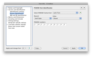
    For those who are unfamiliar with it, the PANOSE number of a font is a chunk of metadata that describes the font with a sequence of digits, an encapsulated description. Here’s the PANOSE section in FontLab Studio’s Font Info pane.

    PANOSE settings in FontLab Studio 5
    PANOSE settings in FontLab Studio 5 (click for full size)

    This week, for the second time in the past 15 years, I discovered a WIndows font bug caused by improper PANOSE numbers in fonts, which I had never heard of before.

    The first bug was simple: if you set the appropriate PANOSE digit to say the font is monospaced, Windows will ignore the actual advance widths in the font and treat every glyph as having the same advance width. This means that you had better not set the PANOSE to monospaced unless the font is utterly and completely monospaced. This may seem simple, but consider that some supposedly-​monospaced fonts still have ligatures. If, say, the fi ligature is to have a different width than the i by itself, then the font is not truly monospaced and setting the PANOSE to monospaced will mess up that glyph’s advance width (at least, in many Windows applications, though not most Adobe apps).

    If my understanding is correct, the new bug is also simple: if you have a style-​linked family such as a regular and an italic, the general PANOSE class had better be the same for every family member, or else Windows will get very confused. In my case, the regular was of the “Latin Decorative” class and the very early build of the italic was “Latin Text” (because I hadn’t bothered developing the PANOSE number yet for the italic). Some very odd symptoms occurred for a user with an existing document in Word 2010 on Windows 7.

    This is also a lesson in font testing. Even something as simple as coordinating family members for Windows, a mostly well-​understood area, and one in which I have considerable expertise, can fail for unknown reasons. There is no substitute for actual testing in apps: this issue was not identified by Adobe’s fabulous CompareFamily test tool, probably because they had never encountered it. I had used the italic by itself in Word on Windows, and both the fonts together in Creative Suite apps, and all was well. That was simply insufficient.

    Definitely a major error on my part. Certainly, this was not a final release, but even a pre-​alpha build released to my Kickstarter backers, as the new italic was, should behave more reliably than this one did.

  • Cristoforo Italics update

    Some screen shots and info on the font production process posted as an update on my Kickstarter page, including some thoughts on why ATF called it “American Italic” instead of “Columbus Italic,” the transition to standard type alignment around 1900, and illustrating good vs bad curves.

  • Fontmageddon? Windows security patch KB2753842 of Dec 11 (fixed!)

    OpenType /​ PostScript font support killed in many apps (FIXED Dec 20, 2012)

    (UPDATED repeatedly, first with more details and then because of the Dec 20 fix.)

    Was it Fontmageddon? For users who use fonts in some applications (see below), Windows security update KB2753842 of Dec 11, 2012, caused more harm than good. Luckily MS got it fixed and re-​released it nine days later. The current version of the patch does NOT have the problem, and can be installed over the original release to fix the problem caused by the original.

    Kudos to Microsoft for fixing it quickly and including interested outside parties in testing it. I was able to seed Extensis tech support manager Romeo Fahl with the fixed patch, so we participated in helping verify it worked.

    WHAT THE BAD PATCH DID

    (1) installing the update breaks some very tiny number of fonts at the system level and for all apps, including potentially malicious fonts. That’s what it was supposed to do. BUT ALSO….

    (2) with the original version of the update, for certain apps text set in all PostScript Type 1 (.pfb/.pfm) and OpenType CFF (.oft) fonts became invisible. This can even affect font menus when the app has a WYSIWYG font menu.

    FIXING THE PROBLEM

    Installing the revised version (2.0) of the patch from Microsoft will fix the problem caused by the original release.

    If your computer is part of a domain administered centrally by an IT team, you should alert them that the issue is fixed, so they can decide whether to roll it out now that the patch is safer.


    PROGRAMMER DETAILS

    The apps that were especially affected are those that use the GetGlyphOutline() API to grab font outlines of PostScript fonts (both Type 1 pfb/​pfm fonts, and OpenType CFF .otf fonts). With the bad version of the patch, that API no longer returned the memory size needed to get the curves, but instead returned a bogus value of zero. This effectively renders some apps unable to render the glyph on screen. At least, at 15 points and higher.
    I gather there are other APIs apps can use, but that GetGlyphOutline() works all the way back to XP, unlike the alternatives.

    AFFECTED OS VERSIONS AND SOFTWARE

    I strongly suspect that in many more applications than those listed, “convert to curves” functions will fail or result in lost text. I also suspect that in most cases where a current version of an application is affected, so are older versions not listed. What we know is that affected OSes and apps included:

    • Windows: All desktop and server versions of Windows from XP to Windows 8, it seems.
    • PowerPoint, but only in presentation mode (an especially dangerous failure, as a user might think things were fine… until they tried to do an actual presentation)
    • QuarkXPress 7, 8, 9.5 (but only affects fonts at 15 pts and larger)
    • CorelDRAW X3 to X6. Workaround: view in “draft” mode works because it does not use the problematic API.
    • Serif PagePlus
    • Adobe Flash (authoring at least, probably not the running of Flash apps?)
    • Flexi and SignLab (signmaking apps)
    • Avid Marquee (video titling)
    • Bentley MicroStation (CAD /​ information modeling)
    • The Secret World (Alternate Reality Game)
    • Inkscape (vector drawing)
    • Xara Designer Pro X (vector drawing) and possibly other Xara apps

    MICROSOFT RESPONSE
    The MS Knowledgebase article has a standard section for “known issues.” On Friday Dec 14, 2012, Microsoft updated it to read: “We are aware of issues related to OpenType Font (OTF) rendering in applications such as PowerPoint on affected versions of Windows that occur after this security update is applied. We are currently investigating these issues and will take appropriate action to address the known issues.”
    On Thursday, Dec 20, 2012, Microsoft released version 2.0 of the patch that fixes the problems in the original. The “known issues” section now reads: “The original version of security update 2753842 had an issue related to OpenType Font (OTF) rendering in applications such as PowerPoint on affected versions of Windows. This issue was resolved in the version of this security update that was rereleased on December 20, 2012.”

  • Town Hall meeting for TypeCon coming to Portland in 2013

    All sorts of folks are getting involved, but I’m one of those helping bring TypeCon to Portland OR for August 2013!

    My colleague Jim Kidwell and I will be hosting a Town Hall for volunteers and interested parties 7 pm Tues Nov 27 at Extensis in downtown Portland.

    More details and RSVP.

  • Conferences & Talks: Chicago, Hong Kong, Vegas, NYC

    The Case of the Special Sack
    The Case of the Special Sack

    I am doing a lot of fun talks and workshops I am doing in the next couple of months, starting tomorrow night in Chicago! If you’re in one of these cities listed below, I’d love to meet up with fellow typophiles and anybody who wants to talk fonts, over coffee, lunch, dinner, or a drink.

    Chicago Tues Sep 25, 2012
    AIGA presents: Font Detective, Extra Bold

    7 pm at Harrington College, admission is $5 for AIGA members, $10 for non-members.

    Probably nothing is more fun for me than talking about the legal cases I’ve been called in to consult on. Whether it’s a forged will, a pioneer mail bag, the NFL Hall of Fame, or the US Presidency, I’ve been asked to look into a bunch of fascinating cases involving fonts, printing, and logic. This long-​form version of my presentation has only been seen once before, at the Type Director’s Club in New York City.

    Chicago Fri 28 Sep 2012
    WebVisions talk : CSS3 OpenType Fonts, the new web typography frontier

    11:15–noon, WebVisions @ Siskel Film Center.

    CSS 3 brings support for OpenType layout features to browsers. Most already have this support today. But what good is it? I show you everything from everyday workhorse typographic functionality like ligatures, true small caps, and oldstyle figures, through to the fascinating and bizarre: fonts that censor naughty words, predict the future, or translate languages. If you are coming to WebVisions, check it out!

    Chicago Sat 29 Sep 2012
    WebVisions workshop : Control the Web with Fonts & Type

    1:30–5:00 pm, WebVisions @ Harrington College. Conference info here.

    Join me for an immersive, hands-​on workshop on using CSS3 typographic controls to create great web typography, from the basics of ideal type setting to enabling custom web fonts with @font-face. A live web site will be provided for each participant to practice and experiment on, along with access to WebINK web fonts.

    You will also learn:

    • How “real” web fonts are transforming the web, and exactly how to implement them.
    • How to pick the perfect font for a web site
    • How to choose fonts that work together
    • The common crimes against legibility and aesthetics, and how to avoid them
    • Issues around color, spacing, line length and font size

    REQUIREMENTS: Laptop and basic familiarity with HTML and CSS.

    Hong Kong, Wed 10 Oct 2012
    ATypI talk: Crowdsourced Font Funding

    10:20–10:40 am, ATypI “Research, Case Studies & Workshops” sessions @ Icon Hotel. Full talk description on the ATypI site.

    All about the impact of Kickstarter (and similar services) on type design, from my own experiences and surveying everybody else using Kickstarter for fonts. What is involved, how should you structure your campaign, and what distinguishes successful campaigns?

    Las Vegas, Tues 16 Oct 2012
    PubCon panel: CSS & HTML 2012

    3:10–4:25 pm, PubCon @ Las Vegas Convention Center

    On this panel I plan to do an intro to web fonts and a small portion of my talk from Sep 28, above.

    Las Vegas, Thurs 18 Oct 2012
    PubCon Labs Q&A Session

    11–noon, PubCon @ Las Vegas Convention Center

    Meet with me one-​on-​one to ask questions about web fonts, web typography, or anything to do with fonts!

    NYC, Tues–Wed Oct 23–24
    Future of Web Design: booth & workshop

    I will be at our booth most of Tuesday, and giving my web fonts and typography workshop all day on Wednesday.
  • Conferences & Cristoforo

    Wow, it has just been a crazy time lately. I wrote most of this yesterday at 36,000 feet, on my way home from a quick tour of Europe for work: Barcelona, Paris, Hamburg and Munich. This included numerous customer meetings and three speaking engagements:

    My “Type Detective” talk at Typo Week Barcelona

    Now I have a break for a couple of weeks before my next conference, TypeCon in Milwaukee (Aug 1–5), where I’ll host a panel to talk about Kickstarter as a means of funding new type design. I’ll also be doing a talk on the same subject at ATypI in Hong Kong (October 11-15).

    In the meantime, I have been hard at work in my off-​hours on my Kickstarter-​backed typeface, Cristoforo, with help from my fabulous intern, Andrea Harrison. The full details are available to my backers in an update on Kickstarter, but for public consumption, I’ll just say that work continues on the upright face, and has started on the italic, and I am predictably enough wishing that I hadn’t promised to add so much language coverage (central European, Greek, Cyrillic). But it’s coming along, and the extended language support offers some greater design challenges than just digitizing an old typeface.

    My day job has kept me pretty busy, and has presented me with some one-​sided decisions. Gee, I have exactly one day free in Paris: work on Cristoforo, or visit the Louvre? Okay, so I’m probably not going to collect a lot of sympathy votes here. But after spending less than 48 hours in each of Paris, Hamburg and Munich, then flying back to Portland, I am pretty beat.

    Finally, I need to thank my backers for Cristoforo! Without them I would not have tackled the typeface, or would have done something much less ambitious and done it more slowly. Here is the backer listing (and yes, some of these are pseudonyms, it’s whatever they use on Kickstarter).