Author: Thomas Phinney

  • LA IDUG: Variable Fonts, Color Fonts & FontLab

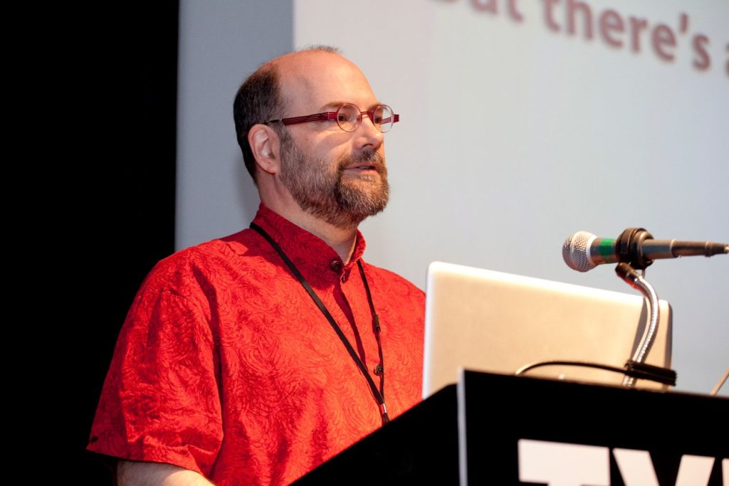
    I will be presenting to the Los Angeles InDesign User Group (IDUG) on September 20, 2018 in Van Nuys, CA, for their 13th anniversary meeting! Come see the cool and even sometimes amazing things being done with variable fonts, as well as a bit on color fonts and how fonts are made.

    Register free on EventBrite!

    Be entertained and enlightened with the joys of variable fonts and color fonts in InDesign and friends. This demo night unlocks the secrets of OpenType variations, aka variable fonts and color fonts. Learn how they work, how you use them, and why they work the way they do. Bonus: some pointers on font creation and font editing.

    You will learn:

    Font Creation and Editing:

    • How fonts are made and modified
    • Font drawing compared to Adobe Illustrator
    • OpenType features are easy
    • Variations and color
    • Highlights of FontLab VI

    Color Fonts:

    • The four different color font formats and where they each work
    • What they can and can’t do
    • The secret of the color fonts (cluster bleep) and its impact
    • How Adobe made the best color font bet
    • What it means that InDesign color font support is a “Tech Preview” feature
    • How color fonts work in InDesign, Illustrator and Photoshop today

    Variable Fonts:

    • How they work in Illustrator and Photoshop today (we hope in InDesign “real soon now”)
    • Origins of variable fonts (older than you think!)
    • Previewing variable fonts: Axis-​Praxis, FontView, etc.
    • Standard axes: weight, width, optical size and others
    • Common other axes: optical size and animations
    • Great uses of variations
    • Weird, wacky and wonderful uses, too
    • Resources: more info, free fonts, and others
  • Font Detective Site Launch

    It’s still a sideline from my day job running FontLab, but I have been doing enough font detective work (identifying fonts in backdated documents, analyzing point size, and other font consulting) that I realized I really ought to formalize this whole line of work a bit more. So: a dedicated web site! Plus, I am attending my first conference of forensic document examiners in a week and a half. I did my first case way back in 1999, but this work has been ramping up a lot in recent years and months

    Regarding the new site, the formatting and graphics of the secondary pages is still a work in progress, it is in pretty good shape now. I did much of it myself, and hired a talented web designer to get it over the finish line. My initial logo was a bit off for the colors, and my web designer Josh Korwin cleverly suggested simplifying it to be just black-​and-​white, and now it pops! So I am happy with it.

    Font Detective logo
  • Why Variable Fonts Will Succeed

    Third time’s the charm? Why OpenType Font Variations (variable fonts) will likely succeed where predecessors failed.

    OK, this is kind of funny: a post I wrote in November 2016 that languished in my “drafts” afterwards when I was busy with work, waiting on illustrations/​graphics that I never did add. Just for fun, I’m going ahead and publishing it exactly as is, showing what I was thinking at the time, just after Variable Fonts were announced. The only other note I want to add is that if you want to play with variable fonts, check out Axis-​Praxis.

    OpenType 1.8 was announced in September, featuring variable fonts. In short, variable fonts allow for packaging an entire family of fonts in a single font file, using master designs and interpolating between them, on what are called “design axes.” The type designer who makes the font can use this for whatever they like, but varying weight or width are among the more common standard uses.

    What makes this exciting is that in a savvy environment, someone using the fonts can specify any in-​between variation they like, within the “design space” (dynamic range) covered by the font. So for example, in a font with weight and width axes, a user could dial in the precise degree of boldness and level of condensing or expansion they desire.

    Font families built as variable fonts are vastly more flexible than before, yet can use less file storage than traditional font families—vastly less if you have large, complex families with a ton of styles.

    More details:

    Which is all very well, but this kind of tech has been tried twice before: GX Variations (the basis of the new tech) from Apple, and Multiple Master from Adobe. Neither ever got very far. Why should this time be different?

    First, I will note that when it comes to traditional design, it is only when there is support for the designer/​user picking their own arbitrary instances from the design space of the font, rather than just relying on pre-​specified instances, is there a benefit to designers. This means that traditional desktop design/​authoring apps need to implement sliders or some user interface to reap the benefits of the technology (although this is not so much of an issue for the web).

    Second, the other benefit of variable fonts, more compact representation of large families, was barely noticed the first time out. But with web fonts being a big deal and file size a huge concern, this is a newly important benefit.

    So, right off the bat, it is clear that it is more work to make this work with desktop apps, and that the circumstances make the web benefit more and get easier adoption.

    Speaking of adoption, it is worth noting that neither all existing nor all future font families need to be delivered as variable fonts for the format to be useful and successful. It may always be a minority of fonts available, yet still be a success with strong niche use in some areas (such as web design).

    Why GX Variations Failed

    Apple introduced what is essentially the same tech back in 1991, as GX Variations, part of TrueType GX. While many other aspects of TrueType GX survived in varying degrees, I can’t even find a good list of GX Variations fonts. I know only three offhand: the OS-​supplied Skia GX (by Matthew Carter), the Monotype demo masterpiece Buffalo Gals (by Tom Rickner), and Adobe’s Tekton GX (by David Siegel).

    GX Variations, in its original instantiation, would have required apps to give up control of their line layout to Apple’s line layout engine. Of course, this would also mean that any such app would have been Mac-​only. Although there are certainly some Mac-​only design apps, the Mac-​only aspect meant that the relevant heavyweights of the era, Quark and Adobe, never supported it.

    Apple supported GX with font dev tools, but they were largely command-​line based and hardly designer-​friendly. None of the font editing tools of the era supported GX Variations, either.

    With only a tiny handful of demo fonts, no major app support, and no major font tool support, GX Variations has never seen much pickup.

    Why Multiple Master Failed

    Adobe developed their multiple master (MM) tech at the same time as Apple did GX Variations, but completely independently. MM is a slightly less sophisticated/​complicated version of the same concept as GX variations, handled as an extension to Adobe’s PostScript Type 1 format. The MM technology was even briefly (1996–98) incorporated in the original OpenType spec, although only for OpenType fonts with PostScript outlines.

    MM did a tad better than GX Variations in terms of real-​world use. There were 27 families offered by Adobe in the MM format, one by Monotype, and about eight free families from four different independent designers. Adobe also used MM internally in Acrobat’s font-​substitution technology. Illustrator added “sliders” for MM fonts, but only just before Adobe pulled the plug.

    And pull the plug, Adobe did, back in late 1998. Adobe was already moving away from Type 1 fonts, and they withdrew the MM functionality from OpenType. The then-​manager of the Adobe type group, Dan Mills, believed that OpenType adoption might be significantly hampered if we were telling people they had to support this major added complication in order to properly support OpenType. Plus, OpenType ally Microsoft had never been very enamored of MM and had no interest in the tech at the time. So, Adobe pulled the plug.

    Why didn’t MM get better traction before that? Well, it was an Adobe invention competing with a similar Apple technology. The folks on the Adobe font team failed to realize early enough how important it would be to actively evangelize this technology to Adobe’s own apps as well as outside apps, and devote real resources to that effort. Because Adobe apps competed with third party apps, this hindered Adobe outreach to third party app developers. And few others were involved and supporting MM, outside the Adobe type team: it was an Adobe thing.

    Axis-​based Fonts Behind the Scenes

    Although development of new MM fonts ceased around 1998, many type designers saw that axis-​based font technologies were very helpful in developing large families. Crude support in Fontographer followed by more sophisticated support in FontLab allowed type designers to use MM capabilities to design fonts. It is simply easier to design two weights and interpolate the rest, than to design three, six or ten weights separately. If one adds in width variations or other axes as well, that can further multiply the savings in design work. One doubts that Robert Slimbach would have designed 156 styles of Kepler individually!

    Even more sophisticated tools emerged in later years, such as Erik van Blokland’s Superpolator.

    As a result, even while MM and GX Variations died off, and only about three dozen families used those technologies, scores more families have since been developed using the exact same concepts—just upstream in the design process.

    Other Lessons

    Two other font technologies have launched later, and were informative in their own ways.

    The Microsoft/​Adobe collaboration on OpenType, which later widened further into an open standard, has done well and become the primary font standard for the future. Many choices made in that process reflected learning from the MM and GX history, and it shows.

    More recently, the addition of color font support to OpenType has been more disjointed; I blogged about that at some length, explaining how this served as a bit of a wake-​up call to the big players as far as the need to cooperate and collaborate on variable fonts.

    What’s Different with Variable Fonts

    Variable fonts are being backed from Day One by a much broader coalition than ever got behind MM or GX. The same four players who came up with four different solutions for color fonts are backing a unified approach to variable fonts. Apple, Microsoft, Adobe and Google made the initial announcement jointly (at ATypI 2016 in Warsaw), with representatives of all four companies on stage and presenting. Every one of the major players in type design tools and related utilities (including my company, FontLab) have already started implementing support, many of us having started that work before the announcement.

    Assuming Mozilla joins in, this stuff is just going to work in all the latest web browser versions in pretty short order.

    Because of the ongoing behind-​the-​scenes role of axis-​based fonts in development of regular fonts over the past 15-​20 years, many type designers already know how to design type families in this way, understand the flexibility and power inherent in variable fonts, and even already have existing type families that could be “relatively easily” re-​issued as variable fonts (with varying degrees of added work).

    There are no guarantees. The variable fonts story still has some weaknesses, notably around formatted text interchange, and of course with desktop app support for an interface to interact with the variability. But the odds are good of at least moderate success. The alliance supporting it is strong. There are significant benefits, albeit not as compelling as OpenType as a whole.

    Some Predictions

    • Variable fonts will see rapid adoption in a few very high-​impact and high-​visibility places, including as system fonts.
    • Variable fonts will take a little time to become popular or widespread on the web, but some sophisticated and design-​intensive web sites will love them.
    • Within three years, variable fonts will become a common format for many new fonts, particularly for large or sophisticated families from major foundries and high-​end boutique foundries. But for (at least) the next few years, the same families will usually be issued as static (non-​variable) fonts as well.
    • Success of variable fonts is partly dependent on app support. Thanks to subscription models for Creative Cloud and Microsoft Office (and live app updates for Google Docs), any support from apps will be rapidly seen by end users, but… these big companies tend to operate in fairly siloed ways. Cool though this tech is, it is unlikely to attract the attention that results in a top-​down dictate from on high that everyone in the company must support it. This means that the Adobe, Microsoft and Google fonts teams’ support for the fonts is no guarantee at all of front end app support by Creative Cloud, Microsoft Office or Google Docs. Such support, or the lack of it, will influence type foundries in their adoption.
    • Because Apple’s existing GX Variations represents a large subset of the variable fonts technology, system-​level and desktop app-​level support for variable fonts is likely easier for Apple than for just about anyone else. Yet I still won’t bet on how quickly Apple will support this in iWork (their Keynote, Pages, and Numbers apps).
    • Very few foundries, and no large ones, will release what Ben Blom calls “static variable fonts” that in essence prevent interpolation and work like a family of old static fonts while preventing user interpolation. It misses on the big advantage of variable fonts, which is the ability to pick arbitrary points in the design space. The sole advantage of such fonts is smaller file size, but potential (or actual) user confusion will cause most foundries and users to avoid this experiment.
    • Variable fonts will not be the majority of retail font revenue ten years from now. They will not completely displace static fonts any time soon, if ever.
  • Truth” is hard to come by

    Truth was a late 2015 film about the Bush National Guard memos (a.k.a. the Killian memos), and the downfall of Dan Rather and Mary Mapes at CBS News. It stars Cate Blanchett as Mapes and Robert Redford as Rather, with very good performances, a solid script and decent direction. But, like the Mapes memoir book the film is based on, it does not quite reach “the truth,” ignoring that the memos were proven to be forged.

    Yes, there is evidence that former President Bush, like many young men of elite backgrounds, avoided service in Vietnam thanks to string-​pulling to get into the National Guard. There is no doubt that Bush didn’t fulfill his Air National Guard service obligations (which was verified by many other reports, both before and after the CBS coverage). There are records mysteriously missing from the National Guard that might have explained the details. But what was presented as the smoking gun of the tale was the set of purported National Guard memos acquired by CBS and aired on 60 Minutes II—and they are simply forgeries.

    As Mapes complains in her memoirs (and via Blanchett in the movie), the focus ever since has been on “botched reporting” and said forgeries, and has ignored the story. Even without the memos, yes, there is a story there. (This is not the only case I have been involved in where a forgery distracted from something more important: see Bullet Bob Hayes & Pro Football Hall of Fame).

    But sadly, Rather and Mapes, the subjects of the tale, are still in a flat-​earth reality-​denial mode about the authenticity of the memos and the possibility that the reaction to the memos was anything other than a political plot—matters which I have been deeply involved in. Although some news outlets do not question the assertion that the memos have not been proven to be bogus, others accept evidence-​free flat-earth—style denials as enough that they need to present both sides in the name of balance. From my point of view, this nonsense this makes it harder for me to set the issue aside and focus on the rest of the story.

    Background

    For those who do not recall, CBS on their investigative news show 60 Minutes II aired a story shortly before the 2004 election, alleging that the incumbent President Bush had failed to perform duties required of him in the Texas Air National Guard, during the Vietnam War. The newest pieces of evidence included an interview with the politician who claimed to have pulled strings to get Bush into the Guard… and the memos, purportedly written by Bush’s commanding officer. But immediately after the show aired, the blogosphere erupted with conservative bloggers and a few others claiming that the memos were self-​evidently fake, likely done on a modern word processor such as Microsoft Word using Times (New) Roman.

    At first CBS ignored the nay-​sayers, then it dug in, but eventually it conceded that it might not have investigated the memos adequately, and launched a commission which came to the same conclusion. Oddly, the commission was not tasked with determining whether the memos were actually authentic, hence it did not come to a strong conclusion on that question, only interviewing one expert other than those originally consulted by the producers of the show. This strange decision is perhaps the strongest evidence supporting Mapes’ assertions of political interference. I suppose it makes sense 

    Producer Mapes was fired. Rather was essentially demoted and eventually left. He sued CBS over it later, but his suit was dismissed.

    The Memos

    Reading Mapes’ book, and some excellent commentary in New York Magazine, I can totally understand why Mapes and her team got taken in by the fake memos. They thought they had plenty of verification from numerous sources. The quantity and nature of details in the memos suggested that only someone intimately familiar with the details of Bush’s service could have written the memos.

    But Mapes’ post-​facto thinking is simply out of touch with reality. She suggests in her book that if only she had properly presented that additional evidence, the firestorm of controversy wouldn’t have happened. People would have believed. This is nonsense: the fact that the memos could not have been physically produced with office equipment in the early 1970s is unaltered by the other evidence. They don’t stop being forgeries (or recreations, if you prefer) just because there is supporting evidence that caused you to believe them.

    Rather than believe in one or more well-​informed insiders making an imperfect forgery, Mapes chooses to believe in a larger and more active conspiracy behind the social media uproar against the memos, claiming it to be orchestrated by Republicans and apparently the White House itself. While not impossible, it is much less likely than the simpler story that somebody did an imperfect forgery trying to bash Bush. It could have been Bill Burkett, who gave her the memos, who even she acknowledges as a rabid anti-​Bush partisan, and whose story about the origins of the memos has changed and remains highly suspect. Or it could have an equally anti-​Bush friend of his. Burkett’s lawyer’s comment on the memos was to suggest that “someone” who was familiar with the case might have “recreated” documents they believe existed at the time.

    So, there are really two questions worth asking here, in my mind. First and most important, does the CBS story stand up without the memos? Let us pretend that everyone concedes that the memos are forgeries. Fine, what about the rest of their evidence? Well, even without the memos, they have plenty of evidence of preferential treatment of Bush—as was common for many young men of elite families, by the way. He was one of many. However, the memos are the only conclusive evidence that he failed to complete his domestic National Guard service—without them there are just open questions about his service.

    Of course, the other question is, were the memos forgeries? Here one should probably ask “to what standard of proof?” If you seek a “preponderance of the evidence” (needed in a civil suit), then there is no doubt the memos should be considered forgeries. If you want “beyond a reasonable doubt,” we have also achieved that over time, thanks to the inability of anyone to produce a device available at that time that could have created the memos, outside of a high-​end typesetting device only found at a printing office.

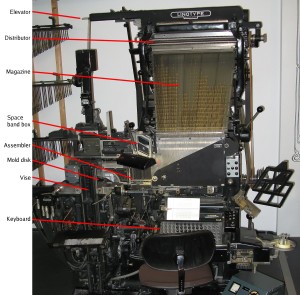
    So, yes, the memos could have been made on a Linotype or Monotype machine, but those would not have been used to produce an office memo for filing. (Note relative size of office chair in front of the machine.)
    Linotype-vorne-deutsches-museum-annotated

    Linotype machine Model 6, built in 1965 (Deutsches Museum), with major components labeled . Original photo by Clemens PFEIFFER, Vienna. Annotations by Paul Koning. Licensed under Attribution via Commons.

    Sadly, both Mapes and Rather have remained steadfast in their belief and public statements that the memos have not been proven to be forgeries. I wish they would concede the point so that we could move on to the rest of the discussion.

    So… yes, the memos are forgeries. Every device seriously proposed to date, I have specifically disproved. Devices such as the IBM Selectric Composer or IBM Executive typewriter simply could not duplicate the memos. I have long offered a $1000 cash reward for anybody who could propose another device that could have produced the memos, including the relative line endings. I mention it in every presentation I make about my font investigations. Not only has nobody collected the reward, but nobody has even proposed another device I didn’t look into the first time.

    One of the other key problems with the defense of the memos is that it relies on irrelevant rhetoric. First off, Mapes and Rather call out all their attacks as coming from right-​wing bloggers. That would explain these people’s  motives in investigating the memos, but it does not mean the attacks are wrong—that is the classic ad hominem logical fallacy.

    It is particularly irksome because Mapes’ book literally dozens of times, over and over uses adjectives such as “extreme,” “rabid” and the like to describe her opponents. At the same time she is incensed that anyone would question whether her own reporting might be influenced by her politics.

    Unfortunately for her unending rhetoric, not all of the memo critics are right-​wing extremists. I both donated money and voted against Bush in both of his elections, I dislike the overwhelming majority of his policies and positions, and would have been thrilled if the memos had been authentic. So saying that all the accusers were politically motivated was nonsense. My own political preferences would have pushed me hard in the other direction. I got pulled into looking at the case by a “yellow-​dog Democrat” friend who was hoping I could explain away the apparent issues with the typesetting of the memos. I made a valiant go of it, but found the evidence in the other direction overwhelming. I went where the evidence led me.

    When I found early on that Mapes had given access to better (photocopied, but not faxed) copies of the memos to one of her defenders, I asked Mapes for the same, and she never replied. However, he published an analysis based on the better copies, and when that was published it was easy to figure out where he went wrong insofar as the typeface is actually Times Roman.

    Second, defense of the actual typesetting of the memos relies on two key straw-​man arguments.

    Most importantly, in claims about the proportional spacing, Mapes simply says there were plenty of proportional-​spacing typewriters at the time. But the claim made by experts is not that there were no proportional-​spacing typewriters (although there were only a few models), but rather that none of them could duplicate the spacing in the memos, because of its very fine degree of proportional spacing (an 18-​unit spacing system). No typewriter available at the time had that fine a spacing system, with the same variety of wide and narrow letters. The Selectric Composer used a 9-​unit system, and its widest letters were much narrower than the widest letters in the memo. The IBM Executive used an even cruder system, and its fonts were just generally wide, including the ones that look even vaguely Times-​like. Nothing like the memos.

    As the typewriter expert Peter Tyrell explained, for the Boccardi/​Thornburgh Report, typewriters capable of doing this did not appear until the 1980s.

    Yes, many other things appeared to match. The dead officer’s signature is one that Mapes cites in her book. It is even possible, as Professor Hailey argues, that the memos were typed. I can’t discount that, although I am not entirely persuaded. But if they were typed, they certainly weren’t typed on a 1972–73 era typewriter, but rather something more modern, and backdated.

    Bloggers didn’t bother looking at the entire forest— the content, the context, the totality of the documents. They peered through soda straws at individual twigs,” wrote Mapes. To continue her analogy, discovering that the forest’s trees are made of metal is enough to prove that a forest is manufactured. If the document could not physically be created in the year on the document, it is a fake! That aspect of the case really is that simple. No arguments about consistency of the content and the context can change that; that additional information instead then only tells us more about who could have manufactured the forgeries.

    The memos’ font was not Times New Roman, recent examination has confirmed.” True: it was Times Roman, an equally improbable result. Most likely, the forger was a Mac user.

    The font also existed in 1972 and 1973.” Yes, but only on high-​end typesetting machines like the one pictured above. Not on a typewriter. Neither Times Roman nor Times New Roman, with their shared distinctive letter-​widths, was available on a typewriter until years later. Yes, there were typefaces that bore some general resemblance, but they did not even come close to matching the distinctive letter-​widths. Many people have tried, and all failed, to identify a specific typewriter-​class device that could have created the memos in 1972–73. I say again: there was no such device. It did not, and does not, exist.

    Personally, I’ve presented about the memos and my critique repeatedly over the years as part of my “Font Detective” talks, in front of over a thousand typographers, type designers, graphic designers and computer geeks. I ieven nvited Mr Rather to come so I could give him stage time to rebut me, when I did such presentations in his two home towns, NYC and Austin. Of course he did not reply, either.

    Some of my previous writings and interviews about this:

    Places I have presented about the memos and offered a reward to anyone who could identify a typewriter that could have produced them in 1972–73:

    • London, St Bride Printing Museum Conference, 2004
    • Vancouver, Justified West typography conference, 2009
    • New York City, Type Directors’ Club, January 2012
    • Chicago, Harrington College of Art & Design /​ American Institute for the Graphic Arts, Sep 2012
    • New York City, WebVisions conference /​ AIGA, Feb 2013
    • Austin, SXSW, March 2013
    • Chicago, Harrington College of Art & Design /​ AIGA, January 2015
    • San Francisco, Typo SF, March 2015
    • Boston, Lesley University College of Art & Design /​ AIGA, April 2015
  • Will Calibri leave Pakistan sans Sharif?

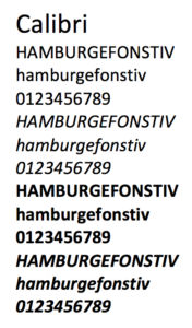
    Calibri font samples
    Luc[as] de Groot’s Calibri, which entered wide use in 2007.

    Update 26 Feb 2018: The Calibri cases just keep coming, fast and furious. I have done many hours of research since I wrote this, and now understand far too much for anyone’s sanity regarding the details of Calibri’s availability during its development. Besides past cases, I am currently consulting on three court cases about this, including providing assistance to another expert.

    I answered a question on Quora early last week about the availability of Microsoft system font Calibri before its official release in 2007, and quickly found myself caught in a maelstrom centered on the family of the Prime Minister of Pakistan. I have now been interviewed by both the BBC and NPR about the case, and quoted in various other places. Sensibly enough, one publication got feedback from Luc[as] de Groot, the designer of Calibri.

    Pakistan has seen a high-​level corruption inquiry based on the Panama Papers leaks last year, that incriminated many public figures. Several of the Pakistani PM’s children appear to have investments in offshore companies. The question is, who owned the investments? The PM’s daughter Maryam Nawaz Sharif (who purportedly has political ambitions) produced a document that purported to prove that she was a “trustee” while her less-​politically-​interested brother was the owner.

    The document had a date of early February 2006, and was set in Calibri, although that typeface wasn’t formally released until January 2007.

    As my writeup on Quora explains, Calibri was available in “preview” versions of what would become Windows Vista as early as 2004. But normal people were not using this for office documents before it came out in 2007. One can debate whether it qualifies as a “smoking gun,” but it is at least highly suspicious, and I have no inclination to argue that the Pakistani Supreme Court is being unreasonable to say that the burden of proof is now on the defense to explain this improbable situation.

    I have testified in court about a backdated document using Calibri before—although in a clearer case where the document was dated prior to even 2004. I am pretty sure that I will again—plenty of people will not remember or hear about this case, so being the default font in both Word and Excel it will come up again in future forgeries.

  • The Lesson of Color Fonts for Variable Fonts

    Today’s announcement of variable fonts in OpenType 1.8 represents a renaissance of the functionality of multiple master and GX Variations capabilities in mainstream fonts. With the announcement made jointly by Microsoft, Google, Adobe and Apple, it also marks a surprising and new level of multi-​company cooperation in font standards, at a level I for one have never seen in my nearly two decades in fonts.

    The need for increased cooperation has been brought home in the past couple of years with the lurching and dispersed movement towards color fonts. The idea with color fonts is that there are uses for being able to spec multiple specific colors in the glyphs of a font, whether for colorful emoji or multi-​color letters. For color fonts, there were four different approaches that all deployed and are now in OpenType. Microsoft invented one, Apple another, Google a third, and Adobe plus Mozilla a fourth. One can debate the merits of each approach, but clearly developing them in isolation and putting four competing approaches into the OpenType spec has not helped the adoption of any or all of them. (Apple originally said their approach was only intended for internal use and did not submit it for OpenType standardization, but changed their mind and submitted it at the last minute for OpenType 1.8, so the spec just went from three to four color fonts approaches.)

    In the end, although developing separately allowed for the secrecy and control, it did not yield an ideal long-​term outcome. Sure, each vendor can make fonts that work in isolation in their environment, but it should come as no surprise that users and font creators have been slow to embrace these color font solutions that worked with only  platform and limited browsers.It seems clear that the decision-​makers and reps of the companies involved were at least somewhat chastened by this outcome. I believe this lesson helped inspire increased cooperation on variable fonts.


    More reading:

  • Brazil visa for ATypI São Paulo

    UPDATE: The workaround described below has apparently been closed. As mentioned in comments below, the SF Brazilian Consulate page has been updated and no longer mentions this possibility. If you look into it and verify that this option no longer exists, please let me know.

    Summary: Americans can still get last-​minute visas for Brazil in less than four weeks, but for many of us it is only possible if we go in person to a distant consulate. Details below. Atlanta, Chicago, Houston and DC are currently the best Brazil consulates to hit for a quick visa.

    Like some other Americans going to ATypI in São Paulo this year in mid-​October, I waited too long to start my visa process. What I didn’t understand was that some (many) of the Brazilian consulates have a big backlog, including the one serving my area. This means that I, or my designated visa service company, need to make an appointment six weeks in advance, plus allow for processing time of two weeks, and a few days for the visa to get back to me. Call it nine weeks altogether.

    I didn’t realize there was an appointment issue, so I didn’t start pursuing the visa until I got back from my last trip that I had to have my passport for—which was just a week ago. Big mistake. But I have learned some more options, and am hereby sharing them so as to save my colleagues the hours of research I had to do.

    (Note: Because the USA requires visas for Brazilians, Brazil does the same to Americans. So my Russian, Polish and EU colleagues don’t need a visa to go to Brazil, but I do.)

    Now, whether you have a problem, and how much, depends on where you live. Some regions are served by an office that does not take appointments, but you just walk in. Others have up to six or seven weeks wait for an appointment. Some process applications in as little as a week. Others take as much as three weeks. So… it depends.

    Also, you can check back with the online scheduling systems, because sometimes appointments are canceled and you can find an early opening. If you are lucky.

    There is an online form to fill out, and much additional documentation they want, which you can upload. Beware of surprising inconsistencies, like the fact that the picture you upload has to be in 4:3 aspect ratio but the one you paste on the form must be two inches square. Also, the documentation required varies by which regional consulate you go to! Some require no financial records, some require one, three, or four months of bank statements.

    You can hire a visa service company, which can save you from going to a consulate in person. Or get a friend to take your paperwork in. But in either of those cases, you must deal with your particular regional consulate. So what happens if your regional Brazilian consulate is San Francisco and you had to start the process nine weeks in advance to get your visa?

    Well, it turns out there is an out. Not a very attractive one, but an out. You can apply to any Brazil consulate you like, as long as you do it in person. So last night I flew to Atlanta to apply for my visa, and I did, and today I am flying back.

    Being restricted to applying to your regional consulate applies when doing it by mail (not all the consulates even do it by mail any more), and when using a third party—whether it is a friend or a visa service. I talked to a visa service and their supposed Brazil visa expert denied that I could go anywhere other than my regional consulate. She was wrong. I just did.

    From the San Francisco consulate’s appointment scheduling calendar page:

    The applicant does not have to come in person to submit his/​her application. Any friend, relative or colleague can act as a proxy. If you don´t have any relatives or friends in San Francisco who would be able to act as a proxy and submit your visa application, your other option is to use the services of a visa agency.

    Tourists to Brazil have four (4) options: (a) check multiple times a day our online visa appointment system for possible cancellations and new available slots; (b) contact a visa agency to check if the agency is able to schedule an earlier appointment (visa agencies have different slots); (c) check availability of appointments at other Brazilian Consulates in the USA – Tourists are allowed to request Tourist Visas at any Brazilian Consulate regardless of the Consulate’s jurisdiction; or (d) reschedule your trip to a later date.”

    Emphasis added. Note that a tourist visa is perfectly valid for going to a conference, although you may also need a letter from ATypI inviting you to come if you tell the consulate you are coming for a conference.

    I had already looked at almost all the consulates, and now have looked at all. Here is what I know.

    NOTE that processing times given are for in-​person appointments, and may be longer for mail or visa agency processing. Most consulates mail back the visa. You may need to supply a self-​addressed pre-​paid express mail envelope, which you can buy at the post office at the same time as your $160 money order.

    SUMMARY: Atlanta, Chicago, Houston and DC are the best. Miami may also be an option.

    Atlanta: same-​day appointments available. One week processing time.

    Boston: Dubious viability. About two week delay for an appointment. Up to two weeks (10 business days) processing time.

    Chicago: No apppointments! Two weeks (ten business days) processing for in-​person visa applications.

    Hartford: Not viable, first app’ts in October.

    Houston: You have to have your electronic paperwork submitted to even check on their app’t calendar system. Processing time is only up to four days for tourist visas, and may be same day!

    Los Angeles: Not viable, first app’ts six weeks out.

    Miami: Marginal. No app’ts! Up to three weeks (15 business days) processing time for in-​person applications.

    New York City: Not viable, first app’ts a week or two out, plus three weeks processing time.

    San Francisco: Not viable, first app’ts six weeks out.

    Washington, DC: No app’ts, and one week (five business days) processing time. but they recommend at least a month in advance of your travel.

  • Women’s voices in type & ATypI

    I need feedback!

    Prior to this year’s TypeCon Denver conference, which I’m at right now, there was a fairly hot twitter discussion about the relative lack of female speakers in the lineup, at about 17%. The discussion was nicely captured by Indra Kupferschmid. It got an eloquent response on Medium from Elizabeth CareySmith, and spurred major interviews and research from Dyana Weissman, which you can read in her epic article/​series on Typographica.

    When I saw the Twitter discussion (a few days late, due to travel), I started a discussion with my fellow ATypI board members, and started crunching numbers about our own conference. I found that we have about 30% female attendees the past two years, and also about 30% female speakers last year and in the coming conference this year. (Although this year is differently skewed, with 50/​50 women in the opening two-​track day with workshops, and fewer in the single-​track portion of the conference—unlike last year.) This also tracks well with the percentages of submissions, at least for this year.

    Women have a much higher participation level in type and type design in the younger generation, the last 5-​10 years has really seen a big shift. Given that, it might be tempting to think that if our speakers reflect the same diversity as our (younger-​skewing than speakers) attendees, we are doing okay. Is that a fair assessment? Or do we need to do more?

    (Oh, and yes, I and others are also aware that there are other diversity issues not only among conference speakers but in our entire industry: quick, how many black TypeCon or ATypI speakers, or type designers, can you name?)

    This is an active plea for feedback about gender diversity in the ATypI conference in particular—most especially from women in type and type design. You can message me privately if you’d rather not say something public.

    (I’ve already had one board member say that, which made me sad. Damn. but it turned out she just meant she thought it was boring and didn’t think we had a problem with gender at ATypI conferences. Anyway, I welcome feedback, really.)

  • Awesome: Fiona Ross receives 2014 SOTA Typography Award

    I was standing at the side of the room at TypeCon 2014 in DC for the SoTA Typography award, given to one person each year for contributions to the field of type design. Honestly, I was trying to decide whether to bag out early and get some dinner, or wait and hear the speeches. I was sure the award recipient would be somebody deserving, but that leaves a lot of room. Victor Gaultney of SIL, who specialize in fonts for global language support, was standing next to me. We chatted and agreed that we had no idea who was going to get the award this year.

    Fiona Ross receiving SoTA Typography award
    Fiona Ross receiving SoTA Typography award. Photo © 2014 Laurence Penney, all rights reserved, used with his kind permission.
    When the award presentation began, in the first few moments it became apparent to us from the preamble who was getting the award. I couldn’t help myself. “They’re giving it to Fiona!” I burst out, turning to Victor. We looked at each other, did a spontaneous fist bump, and shouted “YES!” in unison, doubtless disturbing the nearby attendees (sorry about that, folks).

    I simply couldn’t imagine a more appropriate recipient for the award, and certainly nobody as deserving whose early career was so long unsung in public. Needless to say, I stayed through to the very end of the speeches and ceremony.

    While it is not precisely true to say my younger daughter is named after Ms. Ross, neither is her first name being Fiona completely coincidental. Fiona Ross is an amazing person in both her professional achievements and as a human being, so sharing a name with her hardly seemed like a bad thing. Ms Ross has made immense contributions to global type design: in her work heading up Linotype’s non-​Latin type design team; as an educator at the University of Reading for their MA Typeface Design program; and creating and overseeing commissioned type designs at Tiro Typeworks (with John Hudson, Ross Mills and Tim Holloway, among others) for clients such as Adobe, Microsoft, and Harvard University.

    Typefaces designed personally by Fiona (such as the Linotype Bengali) or by her team remain among the most widely used typefaces in the relevant parts of the world, their equivalents of Times and Helvetica.

    I had the occasion to hire Tiro, and hence Fiona, when Adobe needed Arabic, Hebrew and Thai typefaces. The team did splendid work on all three, as well as developing a quote on a set of Indic typefaces, some of which would eventually be commissioned by Adobe, years later. Fiona was polite and gentle early on when I made a criticism showing my complete and utter ignorance of the norms of Thai type design, about which I can only say… I was young and foolish.

    That is another theme in her career: Fiona Ross has also been unfailingly helpful and absurdly humble. She does not like to be called an “expert” on non-​Latin type design, preferring the term “specialist.” But as must undoubtedly be clear by now, if she is not an expert, then there must be no experts, as she is in the top tier of the most knowledgeable people in the world in this area. This willingness to share her knowledge and erudition has magnified her impact on the world and on the field of type design. No better award candidate could be imagined.


  • Fabulous Adobe font/​format history article

    The good folks at Adobe just posted a huge article by Tamye Riggs covering Adobe’s type history from about 1991–2006 or so, focused especially on the invention and later abandoning of multiple masters and the rise of OpenType. It features the first and only public comment from Carol Twombly on her departure from Adobe and type design. It also has several quotes from me. 🙂

    In general this is a really comprehensive article. Still, I am thinking I will write some more about the reasons OpenType succeeded where GX and MM did not.

    (Note: Tamye’s series of articles on Adobe Type has been released as a full book. Very nice. Copies were in the conference-​goers’ goody bags at TypeCon 2015 in Denver.)