Cristoforo: looking for American Italic

American Italic 2 med res
American Italic 2 med res
American Italic 1 med res
American Italic 1 med res

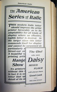
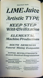
As mentioned previously, I’m working on a revival of the Hermann Ihlenburg typeface Columbus (1892, MacKellar, Smiths & Jordan /​ American Type Founders), under the name Cristoforo. But now I’m looking for samples of its differently-​named italic companion, American Italic (Hermann Ihlenburg, American Type Founders, 1902). I have two from the ATF 1906 specimen book, shown at right. But neither shows a complete character set at a reasonable size. If anyone has the actual metal typeface, especially in a medium to large size, I would love to get a full specimen. Or, if you have a printed sample showing all or most characters at a largish size, that would also be great!

[Update April 21/​22: Just got some great pics from Jackson Cavanaugh (Okay Type), showing the relevant pages from the ATF 1899, 1900, and 1903 specimen books! Amelia Hugill-​Fontanel at the Cary Library is also digging into it. I am still thinking about scans, but the pics are a fab start. I am already in good shape for Columbus Initials, the swash caps font. I’d love to hear from anybody who has metal type for any of these faces!]
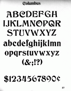
Columbus charset showing

I’m already in decent shape for a sample of the upright version of Columbus, unless it turns out the full typeface has more characters?

Click on any image for a larger version.

Watch this space for news on the related Kickstarter campaign coming in a few days! Get in touch if you would like a sneak preview.  [UPDATE 23 April 2012: I am now funding development of this typeface on Kickstarter! Deadline is May 19.]

Comments

18 responses to “Cristoforo: looking for American Italic”

  1. […] nerdy genug, sich für Typographie und Schriftsatz zu interessieren: Auf Kickstarter sammelt Thomas Phinney für ein Revival der Columbus, der Schriftart der CoC-​Bände. Ab 48$ bekommt man den vollen […]

  2. The Columbus lettering looks brilliant. Nice and consistent. Especially the C, G, and O characters.

  3. George Thomas

    American Italic is shown in 24 point full-​font in McGrew’s Book, “American Metal Typefaces of the Twentieth Century”.

  4. Yes, thanks! That’s great, but as a second-​generation print it is not quite as crisp as I’d like. At 24 point that’s a bit of a problem. I’d much rather work from something that was printed directly from the original metal type, if possible.

  5. Yes, it is a gorgeous old Victorian, waiting for restoration.

  6. […] game books before, but you won’t be seeing the Columbus font for much longer. Typographer Thomas Phinney has created the Cristoforo kickstarter to try to save this forgotten font along with Columbus […]

  7. Bill Roach

    Just curious, What would keep someone like me from doing exactly what your doing – i.e. revive an ancient public domain letter style by converting it into a digital font –

    which I can do on my $200.00 font creation software and my scanner VERY EASILY – 

    and then releasing that said typeface under a GPL, GUST, OFL/​SIL, GNU, CC, or public domain license – where I would need NO PLEDGES, NO BACKERS, and would charge NO ONE for a “commercial use” or ANY license fee?

    All that you might need “backing” and “pledges” for would be theoretically for research – which is what – gas money to drive to the library? PRESUMABLY you already have in your possession the specimen book. 

    Not being fecesious, just a little confused.

  8. Hi Bill,

    Of course, you could do that. People have already done that, producing both a free and a commercial version of Columbus. Their fonts sucked because they didn’t know what they were doing, and they didn’t put in the requisite time. The thing is, it takes significant expertise, previous practice and time to do this well. I’ve been a typographer by profession for a lot of years, and studied type design for most of that time. Say, do you know type design for central European accents, Cyrillic and Greek?

    People have also used Kickstarter to fund open source type design. Just because the result is going to be open source does not mean the creator doesn’t need to eat, you know?

    If you like the inspiration for this typeface, and think it should be open source, go right ahead and do it yourself! Or pick some other typeface that has no decent digital version, and make an open source version.

    But, back to the commitment and specialization…. To be really good at this stuff, it has to be your job, or close to it. (I’m in the latter category.) So to get really good free fonts, you need somebody who is willing to do serious craftsmanship, which they have trained in, for free. Or you need somebody else to be willing to pay for fonts that they want to make freely available. Both of these things happen occasionally, but the reality is that of the free fonts that are of professional quality, at least half were developed with some arrangement that paid people for their time.

    I’m not trying to make what I would for a commissioned typeface. Given the language support and character set I’m not aiming for, I’d imagine I’d be looking at $12-20,000 USD. I expect my net after expenses on this to be about $5,000 or so. If the typeface doesn’t sell at retail (and I don’t expect it to sell a lot), who knows, maybe in five or ten years I will make it open source.

    Also, note that there are rewards besides the fonts themselves, including various desktop wallpaper, T-​shirts, posters, and more goodies. I don’t think your open source model will give people T-​shirts and printed posters. 🙂

    Finally, having just looked at a typeface of yours from earlier this year, it appears you don’t yet understand vertical metrics, horizontal spacing, or any number of other really basic things about type design and font production. Your cap height is 1.4x your em square in Mirkwood Chronicle, which is about twice what it should be. The font lies about its character set, claiming various language support it lacks. Your accents are too light. Accents are critical functional parts of characters, not some wimpy adornment (a common beginner mistake, I made it too, back when). I suggest you pick up a used copy of Stephen Moye’s book “Fontographer: Type by Design.” It’s long out of print, and you probably don’t use Fontographer, but there’s some great info in there, and 80% of the book is still relevant today—and nothing is clearer and better written about outline construction, spacing, and the like. Then try Karen Cheng’s “Designing Type.”

  9. Firstly – I changed my email addy fom the now defunt “[email protected]
    Just letting you know…Check the current response email addy that I inputted if you would like to respond.

    Now on with MY response…

    The reason why I seemed so insensed is that I am currently a “modest income” non-​professional (but life long and PRESUMABLY very talented) artist. I have fonts on Dafont and Abstract Fonts that I have created and uploaded for free use by others under OFL /​ SIL (thinking of switching to the GUST license next time). I saw your font blog, and yes – I did drool over your font – you’ve done splendidly.

    I was a little upset because I am thinking of creating an entire series of new,high qaulity free fonts for limited income artists and desktop publishers (or anyone who wants them), and I am frustrated that most of the free fonts out there available for poor folks with nairy a pot to tinkle in – are more or less crapola. I saw your font – marvelled at how good it was – I then “percieved” the presence of a price tag – and got ticked off, lol. – sorry sir for my moment of delusional indignation (or rather – misplaced sense of social injustice). 

    Firstly – yes, I am just beginning in the font making world – and I yet have MUCH to learn, granted sir. Many of the problems that you cited however deals more or less with my personal choice of artistic embellishment, rather than cast in stone rules and regulations – (namely dealing with the accents). I have yet to recieve complaints – minus yours. I do however, have respect for you considering your greater experience in typography,and I do know that these pre-​liminary fonts DO have considerable, albeit not dreadful errors. Overall your observations concerning my fonts are well founded and sufficiently accurate.

    I am a proponent of free software, and the free exchange of ideas and creative tools and materials, and I make it a point to do whatever I can to further that ambition. I do realize – however – that although it’s good to give away your coat and jacket to someone who needs it – to give anymore than that makes one nude – and more a fool than a philanthropist in the eyse of the masses, hence – I do acknowledge our mutual need to eat.

    My apologies if I seemed rather turse (I was at the time, lol),and my thanks for referencing additional educational materials.

    Regards – B.R.

  10. Hey Bill,

    So, just to make sure I got you right, you saw the typeface and thought it was free, and were momentarily pleased about finding quality free fonts, then were ticked off when you realized that no, it was another commercial font? Okay, I can understand why you might be saddened or grumpy about that, just not sure why that would make you unhappy with me, is all! It is my time and energy, and my call when I want to give that away and when I want to get compensated for it.

    Not that this precludes me giving away my time for free when I feel like it, either: I don’t get paid a cent for being treasurer of ATypI, for instace; and although I usually charge for my font detective consulting services, I have been known to do some of it pro bono as well, as long as the case seems worthy (which includes two of my current cases).

    Anyhow, I suppose I disagree that there is some great social injustice in there not being more high quality free fonts out there. I think that high quality free fonts are great for the users of such things, but I am not convinced they are so great for type designers and the long term health of type design as a profession… unless it turns out that Kickstarter and private commissions can generate enough cash to completely replace retail sales as a means of income for quality type design. That’s another whole discussion! Come to my panel at TypeCon or my talk at ATypI and we can thrash through the Kickstarter part of that equation. 🙂

    I quite like the idea of free software, myself. But I am not one of those people who views commercial software as somehow immoral in contrast. If it turns out that there are viable ways to make a living doing quality type design, that end up with the fonts themselves being free, so much the better!

    Many of the problems that you cited however deals more or less with my personal choice of artistic embellishment, rather than cast in stone rules and regulations – (namely dealing with the accents). I have yet to recieve complaints – minus yours.” Perhaps rather than dismissing it because nobody else has complained, you should talk to some professional type designers whose native languages actually use accented characters? Those are the people who I learned that principle from.

    Here are a couple of good articles on diacritic design, by experts:
    http://ilovetypography.com/2009/01/24/on-diacritics/
    http://www.twardoch.com/download/polishhowto/intro.html
    http://scripts.sil.org/cms/scripts/page.php?item_id=ProbsOfDiacDesign (though be warned, this one is very long!)

    Type design is a craft, combining elements of art and science. It would be fair to say that most of the issues I was citing are more on the order of strong guidelines rather than rules and regulations. Moreover, there is sometimes more than one reasonable approach to an area—for example, with spacing and kerning. But I will stick with the idea that there are some choices which are simply poor choices. Type design may not be a realm of absolutes, but neither is it a realm of pure relativism. (I should add that I am no paragon of type design perfection myself. Would that I were! But I am trying and learning, to this day.)

    Best of luck with your own type design endeavors. If you would be interested in a more detailed, personal feedback session on one of your typefaces, I’d be happy to do so in person or by phone + screen sharing… but we can take that up outside the comments thread, I think.

    Cheers,

    T

  11. Hello T.

    Yes – I would be delighted if you critique my fonts as I make them. No problemo – and like the rest of life – it will be a learning experience.

    Judging from the prior post – I get the point that perhaps I misworded my statements a bit – because it seems that I’ve given you the erroneous impression that I’m either a militant socialist – or the biggest “cry baby” in the world.
    Naaah – That day that my original post was made could more or less be chalked up to a bad case of “Post Man-​ipausal Grouchiness”, lol.

    I had been looking for sweet freebies for my stock folder with little or scant luck for hours upon hours that day -(I’m a horrible moocher)- I’d thought I’d found one that was tastey – discovered the fly in my proverbial chardonnay – and had a minor meltdown, lol.

    Most folks that get to know me will tell you that until I have my first booster shot of Caffiene – and a nice stinky cigarette – my diatribes are best taken with a half hearted smirk and a grain of salt.

    Anyway – Best regards to you to sir, and off to school I go…

    B.R.

  12. Full alphabet specimens, American Italic

    300 DPI tiff image (requires quicktime or alternatiff)

    http://patft.uspto.gov/netacgi/nph-Parser?Sect1=PTO1&Sect2=HITOFF&d=PALL&p=1&u=%2Fnetahtml%2FPTO%2Fsrchnum.htm&r=1&f=G&l=50&s1=D035838.PN.&OS=PN/D035838&RS=PN/D035838

    PDF

    http://www.google.com/patents?id=gKtwAAAAEBAJ&pg=PA1&dq=d35838&source=gbs_selected_pages&cad=1#v=onepage&q&f=false

    Duh… I had never noticed that American Italic is based on Columbus–Thanks for pointing it out. 

    When you get around to finishing American Italic, please let me have a set of vector outlines (embedded PDF is okay) to illustrate The Type Heritage Project textbook series!

    Thanks, Anna

  13. P.S. P22 digitized Columbian as Victorian Swash:

    http://www.p22.com/products/victorian.html

    More here

    http://typeheritage.com/history/uspto-02/

    –Anna

  14. Ooh. I hadn’t thought of checking the patent database, though I have seen originals for some of the ATF patent filings in the archives at Columbia. Thank you so much for the tip and links! I have not yet gotten the images to load, but I got the PDF version.

    Good news: the character set shows a couple of things not present in the McGrew book, specifically the Æ Œ æ œ and £. The last I had a good rendition of from Ihlenberg’s original drawings, but the diphthongs I had not seen previously as far as I recall.

    Bad news: This specimen from the patent application is surprisingly small, looks to be on the order of 24 point again. Sigh. The proportions and weight will be very different than the much larger sample I used for the upright. That combined with being “only” 300 dpi means the scan is not going to be detailed enough to do much more than provide a general idea of shapes and weight. Dang.

    Still, progress! I wonder if I could pay the patent office some money to do a high-​res scan of the original. I wonder if they even have access to it? It is probably filed away somewhere inaccessible.

    Of course I would be happy to provide samples when it’s done. If it’s just basic alphabetic letters you are interested in, you could have Columbus (Cristoforo Regular) today, even.

  15. Thanks again! I knew about the P22 version of Columbian. In fact, I have it in the WebINK web font library that I manage in my day job, meaning it’s one of the typefaces I license for Extensis to provide in their web font hosting service for web designers.

    There are a bunch of digital versions of Columbian available, but P22 Victorian Swash is probably the best that I have seen so far. In fact, I used a sample of it in my presentation about Columbus and Cristoforo at the Type Americana 2 conference back in May.

    Cheers,

    T

  16. I read somewhere that the USPTO destroyed the original documents (dated before 1973?) after scanning them–eeek! Even so, there may be a higher-​rez ver of American Italic available for a price.

    Meanwhile I could easily zip my own tiffs and send them to you–just drop me a line so I have your return eAddress. Maybe if you shrink the existing page to 50% you would end up with a 12-​pt specimen @600 dpi?

    Too bad it was discontinued by 1912–I own a copy of that catalog. 

    Thanks for the font offer–I’ll gladly take you up on it! I don’t really need a “font” with metrics and non-​keyboard glyphs [except the “cent” symbol]. Just the basic charset as a specimen.

    The easiest thing for you may be to type both alphabets, numerals, etc. as a document and then embed it in a PDF [I use Acrobat Pro 7]. I can easily extract the outlines to arrange the way it looks best. In my dreams… Do you have the gorgeous initials too? 

    BTW in my research on John F. Cumming, I’ve learned a lot about J.W. Phinney along the way. For starters, have you seen this (hey, you’re probably IN it somewhere!)?

    http://www.phinneysplace.com/genealogy/p2247.htm#i9702

    Articles so far at my site that involve him:

    http://typeheritage.com/jfc/03-patents/
    http://typeheritage.com/jfc/table-3/

    Cheers back at’cha, Anna

  17. Destroyed? How sad. For the documents in general, but especially the design patents.

    Yes, shrinking the image while maintaining pixel count would increase the dpi, but I am basically griping about two things:

    1) The total pixel count. Not helped by shrinking. 🙁

    2) The original point size chosen to set the sample. The design differences between 24 pt and 72 pt are huge in this family (as was common in metal type). If the letters are simply scaled to the same size, the letters that started at the smaller size look like a bold weight next to the ones from the larger optical size. I can be quite certain of this, because we tried it, and it was striking, but not in a good way. (On the plus size, I have a rough digitization of cap A-​Z in what could function as a bold italic.) Also not resolved by scaling.

    I have a bunch of ATF catalogs (I bought a couple more different ones with the proceeds of the Kickstarter). The 1900 one is the oldest I have, and has American Italic. But it only has a few words at larger sizes, and then a large sample at a much smaller size. I’ve scanned it and passed it on to Andrea, but it is mostly useful just for general guidance due to the size issues.

    I know at least one very obscure thing about John F. Cumming, which is that he was once on the hook to do punches for a typeface by Eric Gill, circa 1909-​11. Gill was in discussions to do a proprietary typeface for the Metropolitan Museum of Art, similar to what eventually happened with Bruce Rogers and Centaur. As far as I can tell it never happened, but there is a little correspondence about it in the ATF archive at Columbia. It’s in one of the two uncataloged boxes of miscellany, as I recall. (I spoke about this abandoned project at the ATypI conference in Vancouver in 2003.)

    I have lots of other stuff about J.W. Phinney, by the way, including a copy of his memoirs, and a copy of the letters home written by his daughter Ellis Phinney (later Ellis Taylor). I have been in touch with a couple of his descendants, and even met one of them, his great-granddaughter.

    Thanks!

    T

  18. Hi again Mr. “T,”

    [Comments inline—T]

    WOW–you have Phinney’s memoirs! Maybe you can answer a question that’s been bugging me: Do you remember reading when he become a partner of Dickinson Type Foundery?

    [I don’t remember reading this. I rather doubt it is in his memoirs. This is a volume of some 50-​100 pages, printed in 50 copies, mostly focused on the experiences of his childhood and youth, stuff of interest to family. There is some stuff about his earliest days working as a typesetter, but IIRC it ends maybe around when he joins Dickinson.—T]

    Bullen writes (Discursions, Inland Printer June 1907) that JWP became a DTF partner in *1885*. BTW Mr. Bullen made quite a few mistakes and contradicts himself. For example, he says that ATF Jeson Old Style was introduced in 1893 (this is not possible–it was definitely 1895). More here: http://www.flickr.com/photos/51266334@N08/sets/72157629715484240/.

    Between Bullen’s account and Loy’s article on William Jackson (Designers and Engravers, Inland Printer October 1889) an interesting story emerges about how Phinney comissioned Jackson to cut his handwriting: 

    Jackson told Loy that he cut two LCs [plus a zillion alternates, ligatures, etc.]. Fast forward… Jackson patented the face with a different set of alts and sold it to MSJ/​ATF in *1883*. More here: http://typeheritage.com/history/uspto-02/

    Loy writes that this face was called Phinney Script by the trade “from being an exact facsimile of the handwriting of the active *partner* in that foundry.” 

    [Yes, but I am not so sure that means he was a partner in that foundry when the typeface first came out. After all, he could have made partner in 1885, and Loy writing four years later could have said the same thing. No?—T]

    Back to Bullen… He says that before JWP became a partner, he had trouble convincing his super-​conservative [super-​thrifty] superiors to implement his ideas. So if he was NOT a partner in 1883, he wouldn’t have had the authority to hire Jackson in the first place.

    [Perhaps not. But having difficulty convincing people doesn’t mean he was never successful, just that it was time-​consuming or intermittent. I think you have a decent amount of circumstantial supporting evidence, but it doesn’t get to “beyond a reasonable doubt.”—T]

    Besides, Loy’s articles were VERY well researched–I’ve discovered only a few things, and they are easily explained. For example, he accidentally attributes Jackson’s Hazel Script to James West. He was probably confused because West’s son John [not chronicled by Loy] cut [and patented] Hazlet Script for BBS.
    ____

    Thanks so much for the tidbit on John F. Cumming! Steve Saxe thinks that he may have cut William Dana Orcutt’s Humanistic for University Press [Cambridge] in 1904—a wild tale that segués to Stephenson-Blake’s Bologna in the 1940s and back again as ATF Verona in c1951 [McGrew 180-​181, 324-325]. 

    At first, I thought JFC quit cutting type after Montaigne—Eason & Rookledge [141] write that Rogers was “disappointed with the punch-cutter’s interpretation of his drawings.” Now I’m convinced that he left ATF as early as September 1896 and thereafter worked for Hansen and the book publishers in and around Boston.

    BTW he lived in Worcester, MA—according to google maps, about 50 miles from Boston. Quite a commute back then, huh?

    [Indeed. Perhaps he worked from home and only came in once or twice a week? Or took a train? That would be rather excessive for a daily commute at horse-​and-​buggy speeds.—T]
    ____

    My offer to send you the patent specimen of American Italic is still open. Since it’s a native tiff file, it may be a tiny bit better than the google PDF. The only other specimen I have is a PDF of ATF 1906, and you already have that one.

    [Thanks, I will be in touch offline.—T]

    Thanks again for your interest in my work, Anna

Leave a Reply

This site uses Akismet to reduce spam. Learn how your comment data is processed.