About a month and a half ago, I explained a bunch of reasons I was migrating my own content off of Quora, the knowledge-sharing site. I failed to mention one of the most egregious issues: Quora has its own AI assistant bot that provides “helpful” but often (usually?) false answers to questions, and often inserts them ahead of real answers created by humans. It lies.
Here is a great example, answering “What font did the US military use in World War 2 era documents? (an example is in the details)”
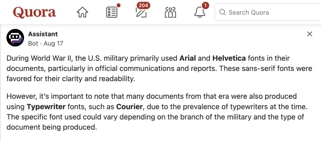
During World War Il, the U.S. military primarily used Arial and Helvetica fonts in their documents, particularly in official communications and reports. These sans-serif fonts were favored for their clarity and readability.
However, it’s important to note that many documents from that era were also produced using Typewriter fonts, such as Courier, due to the prevalence of typewriters at the time.
The specific font used could vary depending on the branch of the military and the type of document being produced.
Most egregiously, every specific font reference in that blurb is a lie. World War II ended in 1945. Courier was invented about 1956, Helvetica about 1957, and Arial in the 1980s (only popular after 1992 when bundled with Windows 3.1 and Word). So none of those three typefaces even existed yet, during the war.
Oh, also the example in the question details?

That is Bernhard Gothic, which wasn’t even mentioned by the AI bot.
Google’s Slightly Less Awful Answer
Of course, AI hallucination is hardly unique to Quora. Google today helpfully answered “what fonts did the us military use in ww2” with an AI summary, claiming that:
The US military used a variety of fonts during World War II, including:
LL Akkurat, Akzidenz-Grotesk, Albertus, GT America, Avenir, Caslon No. 471 & 540, Cooper Black, Franklin Gothic, Futura, Futura Condensed, Futura Extra Bold Condensed, Georgia, Gotham, Harbour, Helvetica, TWK Lausanne, Microgramma, Montserrat, Optima, Suisse Int’l, and Windsor.
About half of those did not exist yet, specifically: LL Akkurat, GT America, Avenir, Georgia, Gotham, Harbour, Helvetica, Microgramma, Montserrat, Optima, Suisse Int’l.
I guess 50% is considerably better than Quora’s zero percent, but still, ouch.
Interestingly, as my colleague and font ID expert Florian Hardwig points out:
Google’s answer is swiped from @FontsInUse. The non-standard phrasing with “Caslon No. 471 & 540” being grouped together and “Futura”, “Futura Condensed”, and “Futura Extra Bold Condensed” being listed separately suggests as much. All names appear in the site’s top menu – which is identical for all pages, including those related to WWII. Very intelligent.
@[email protected] ’s recent contribution lists some of the fonts actually used by the U.S. Army: Army Talk Orientation Fact Sheet 64, “FASCISM!”
Although a serious contribution, of course this last is only what the US Army happened to use in a single document, and is not an attempt to provide a general answer. But unlike the Google AI failure it at least does exactly what it claims to do.
I should add that Florian is one of a very small handful of people who are the world’s true masters of font ID. He is incredible—I have gotten his help on a couple of especially troublesome font forensic cases; never regretted, always impressed!
Another Quora Howler
What are the differences between Times and Times New Roman? Which one is considered better?
Right after I first posted this, I went to grab some more of my own content for a post about the history of Times Roman, to add to a draft-in-progress adapted from a couple of my Quora answers. This was literally the very next Quora bot post I read, after I created this blog post. Once again, it is howlingly, insanely wrong (and tops all but one of the human answers):

Every single section of this is wrong. False. All of it.
Name: Properly it is Times Roman rather than just “Times.” Personally I often use “Times” when I want to refer to both Times Roman and Times New Roman. (Or I will write Times (New) Roman, that also works.)
Origin and Design: The two typefaces are the same design. To the extent that they differ, Times New Roman is the original designed by Morison (with one r not two) and Lardent at Monotype, and Times Roman is the adaptation by Linotype. But they both went into general use on the same day, at different locations printing The Times of London. So this section is wrong in about three different ways, plus it spells the name of the designer wrong.
Character Design: All lies. Neither is more compact. Every normal character for each is exactly the same width, because they needed to be perfectly compatible!
Legibility and Aesthetics; Which One is Better: All lies. Although the serifs of Times New Roman are indeed the tiniest hair finer in modern digital versions, the real answer is, normal people can’t tell them apart, and even most typographers need to look at one of just a few particular characters to be sure which one they are looking at.